Blush makeup: why shade presentation matters as much as the formula
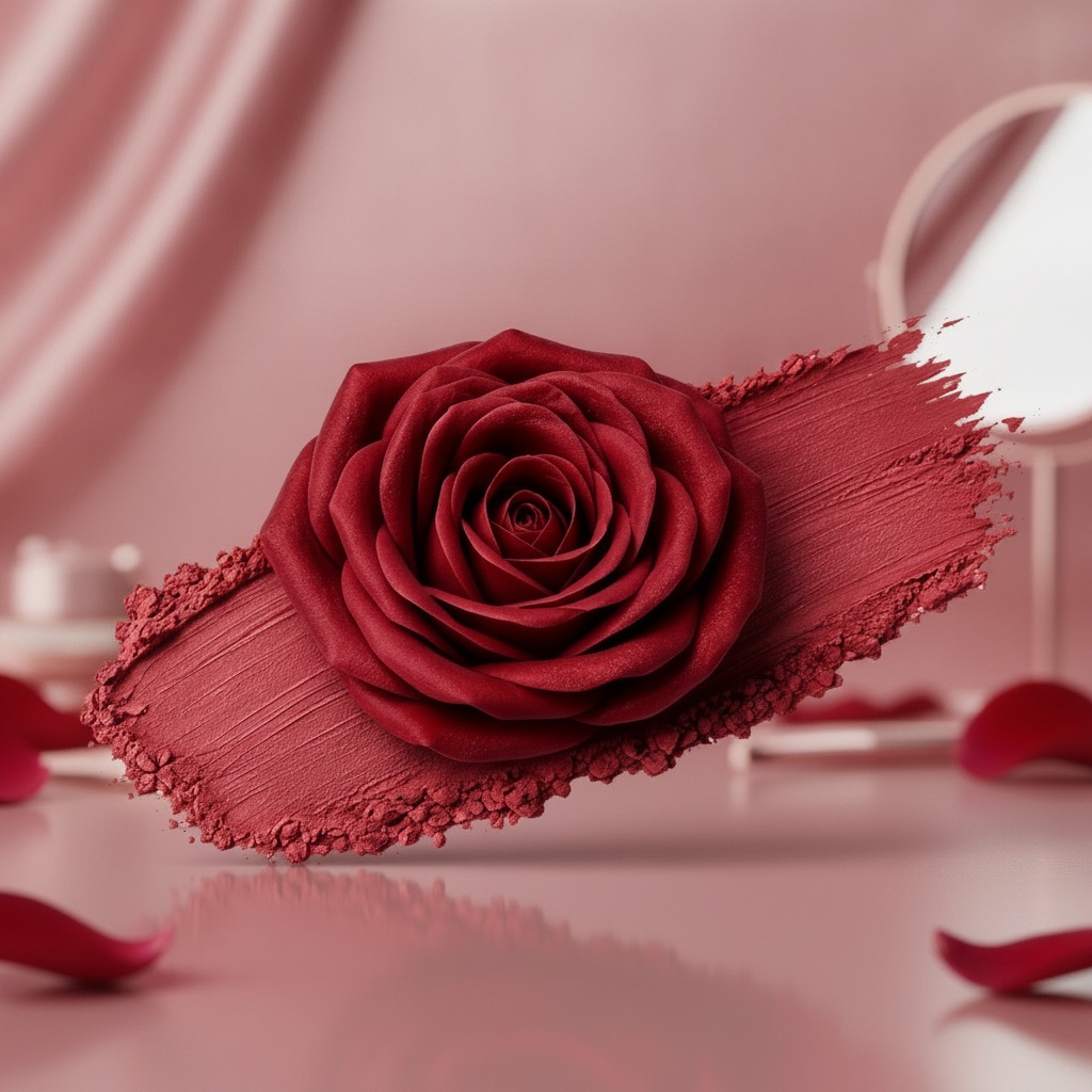
When teams shop for blush makeup, they are rarely choosing color alone. They are choosing how that color will photograph, how it will read in a compact or on a retail page, and whether it will look believable on a range of skin tones. The product image you have in front of you may be a decorative rose-shaped cosmetic color piece or a shade swatch graphic rather than a finished retail item, but the signal is clear: strong color saturation, a satin-to-matte visual finish, and a presentation designed to sell by eye.
That matters because blush is one of those categories where consumers buy with their fingers, so to speak. They want a shade that feels flattering, not harsh; fresh, not chalky; visible in marketing, but wearable in real life. For sourcing managers and product teams, the decision is not just “does the color look good?” It is “will this shade story hold up across packaging, catalog imagery, and actual application?”
What the image suggests about the product direction
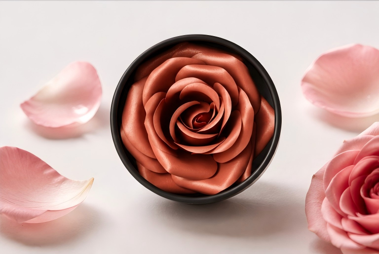
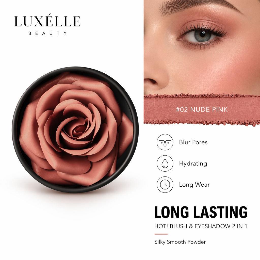
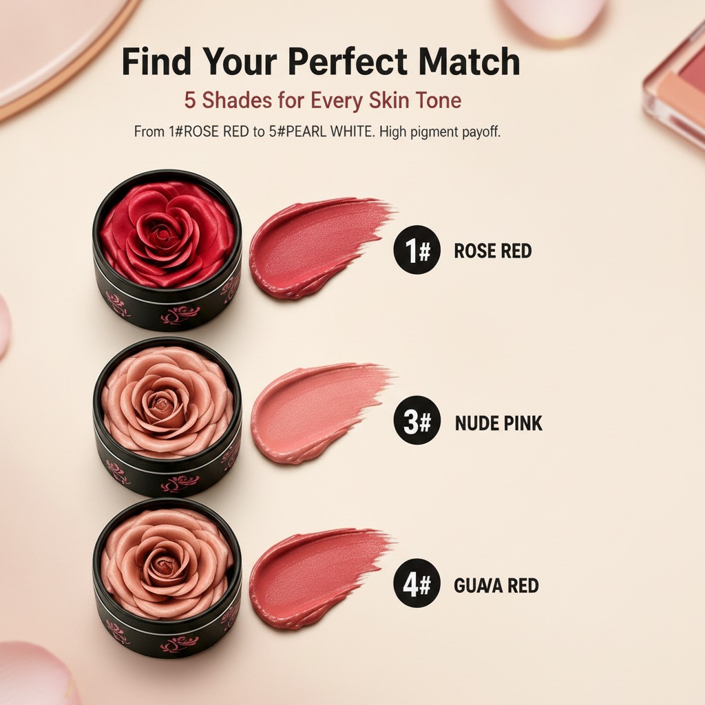
The visible form is a deep red-maroon cosmetic color with a layered, petal-like center and a broader swatch around it. That kind of presentation usually tells you a few useful things. First, the brand wants drama. Second, it is leaning into a flower-inspired visual language, which can work well for premium beauty positioning, gift sets, or seasonal launches. Third, the texture appears smooth but not glossy, which often suggests a cream, lipstick-like, or pressed pigment presentation rather than a wet liquid finish.
That said, it would be a mistake to read too much into one image. The exact product type is not identifiable from the visual alone. It could be a lipstick concept, a pigmented blush design, a marketing swatch, or even artwork built for a beauty catalog. Buyers should treat it as a shade and presentation reference first, not a finished specification sheet.
Why blush shade selection is harder than it looks
In cosmetics, red-family shades create both opportunity and risk. A rich maroon or deep rose can look elegant in a campaign, but the same tone may appear too intense on lighter skin tones or too muted under warm store lighting. On the other hand, a softer rose may disappear in photography and fail to convey value on shelf.
This is why blush makeup decisions should be made with use context in mind. Is the product meant for prestige retail, mass-market private label, or promotional kits? Is the main selling channel online, where macro images and shade labels do a lot of the work, or in stores, where consumers compare products side by side? Those questions change the ideal finish, pigment load, and even the visual shape of the compact or applicator.
Key takeaways for buyers and product teams
1. Confirm the shade story early
If the visual direction is centered on a deep rose or maroon tone, align marketing and formulation teams before samples go too far. A beautiful swatch means little if the production shade drifts during scale-up.
2. Match finish to channel
A satin-matte appearance can read as sophisticated in photography, but it may need careful balancing so it does not appear dry on skin. This is especially important for blush makeup sold in curated beauty sets or premium packaging.
3. Treat presentation as part of the product
Flower-shaped or rose-inspired visuals are not merely decorative. They can help a product stand out in catalogs, but they also raise expectations. If the actual packaged item will not resemble the concept image, buyers should manage that gap before launch.
Common mistakes when sourcing cosmetic color products
One frequent error is approving a shade based only on digital imagery. Screen rendering can exaggerate saturation and hide undertones. Another is ignoring how texture changes the perceived color. A crumbly edge in a swatch might suggest powder, but it could just as easily be a photo effect from a cream product dragged across a surface.
There is also a tendency to overvalue novelty. A rose-shaped cosmetic concept can be memorable, but if the filling process, mold release, or decoration step makes production unstable, the idea may become expensive very quickly. Beauty teams should always ask whether the visual concept can survive scale manufacturing without introducing inconsistent output.
Practical buying advice
Request multiple shade references, not one hero image. Ask for daylight and store-light views if available. If the product is intended for a physical formulation program, ask how the visual color relates to the real application on skin, because swatch boards and actual wear are not the same thing. It is also worth clarifying whether the rose motif is part of the product itself, the packaging, or just the marketing artwork. Those are three very different cost structures.
For private label teams, this is especially important. A strong image can help win a listing, but the final decision usually comes down to consistency, manufacturability, and whether the shade can be repeated across batches. That is the practical test, not how dramatic the first render looks.
FAQ: quick answers buyers usually need
Is the pictured item definitely blush?
No. The visual may represent blush makeup, lipstick, or a cosmetic swatch concept. The exact product type is not identifiable from the image alone.
Can this kind of presentation help sales?
Yes, if the brand is targeting beauty shoppers who respond to color storytelling and premium visual design. It works best when the image matches the final product experience closely enough to avoid disappointment.
What should sourcing teams verify first?
Shade consistency, finish, packaging format, and whether the decorative presentation can be produced reliably. Those four points usually tell you whether a concept is commercially realistic.
What to do next
If you are evaluating blush makeup for a new line, start by separating the visual concept from the manufacturable product. Approve the shade direction, then test how it behaves in packaging, under lighting, and on skin. A strong cosmetic color can carry a launch, but only if the story survives the factory floor. That is the part worth checking before anyone signs off on the final artwork.