If you are trying to learn how to apply blush to lift sagging cheeks, the main idea is simple: move the color higher than you probably think, and keep it away from the area that already drops the face visually. Blush can bring life back to tired skin, but it can also pull attention downward if it sits too low on the cheek. That is why placement matters more than color trend, especially for readers who want a more lifted look without heavy contouring.
Why blush placement changes the shape of the face
Blush is not just about color. It creates a visual cue that can make the cheekbone appear higher, the face a little narrower, and the midface more energetic. On fuller or mature faces, placing blush too close to the mouth or too low on the apple of the cheek often emphasizes heaviness instead of lift. The same product can look fresh or dragging depending on where it lands.
A practical rule: think upward and outward. You want the color to guide the eye toward the temple, not straight down the center of the cheek. This is one reason many makeup artists favor a diagonal placement rather than a round one.
A quick-reference approach that actually works
Start with the highest point
Locate the top of your cheekbone by feeling where the bone rises when you smile lightly. That is the area to build around. Apply blush slightly above the apple of the cheek, then blend upward toward the outer eye area or temple. Keep the center of the cheek soft, not heavily saturated.
Use less product than you think
A lifted cheek effect depends on controlled placement. A dense patch of color in the middle of the face makes blending harder and can flatten the result. Build in thin layers. If the first pass looks faint, that is usually better than overloading the brush or sponge.
Blend in an upward direction
Brush strokes matter. Horizontal blending can widen the face, while upward blending creates a cleaner line of movement. That does not mean the blush should look sharp; it should just follow an upward path before it softens out.
Choosing the right formula for a lifting effect
Formula affects both placement and finish. Cream blush can give a skin-like flush and is easier to press into the cheek for a natural look. Powder blush can be helpful if you want more control or if your base is already set. A matte blush often gives the most structured look because it does not reflect light as much, so the shape of the application reads more clearly. That said, matte can also look flat if the color is too heavy or too cool for the complexion.
If you are asking, can you wear cream blush over foundation, the short answer is yes, usually. The better question is whether the foundation has been set too firmly. Cream blush tends to glide and diffuse best over a base that still has a little tack or over foundation that has been lightly powdered rather than locked down. If the base is fully matte, tap the blush on with fingers or a damp sponge instead of dragging it with a brush.
Technique: where to place color for a lifted face
For most faces, the best placement starts just above the apple and moves diagonally toward the outer eye, stopping before the temple area gets too saturated. If your cheeks are sagging more in the lower half, resist the urge to bring color down toward the jawline. That tends to reinforce the very area you are trying to visually minimize.
Here is a practical sequence:
1. Apply foundation and concealer as usual.
2. Set only where needed, not everywhere.
3. Tap blush onto the upper cheek area.
4. Blend upward and outward in small motions.
5. Check the face in neutral expression, not only when smiling.
The last step matters more than people expect. Blush that looks flattering on a smile may sit too low when the face relaxes.
Common mistakes that make cheeks look heavier
The most common mistake is placing blush directly on the apples and blending in a circle. That can be charming on some young faces, but it often makes sagging cheeks more obvious. Another problem is choosing a shade that is too dark or too red for the skin tone; the product then reads like a stain instead of a lift.
Over-blending is another quiet issue. If you diffuse the color so much that it spreads across the whole cheek, the lifted shape disappears. You want softness at the edges, but the placement itself should remain intentional.
Buyer advice: what to look for in the product itself
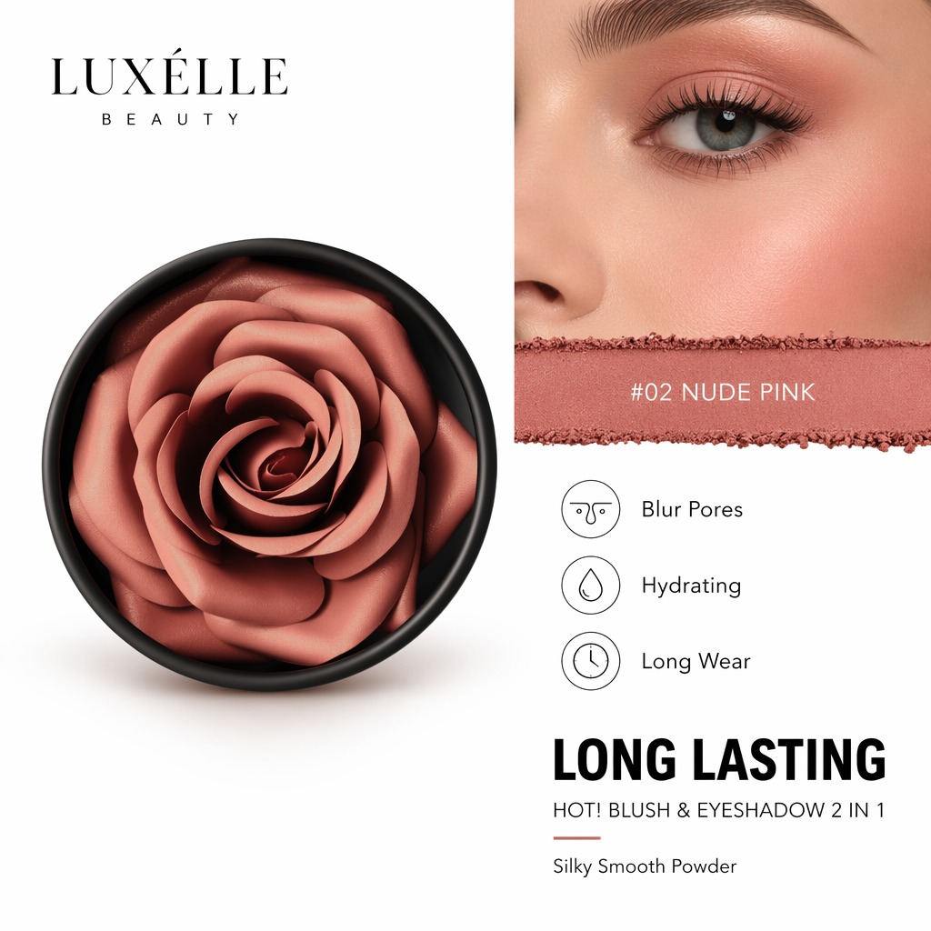
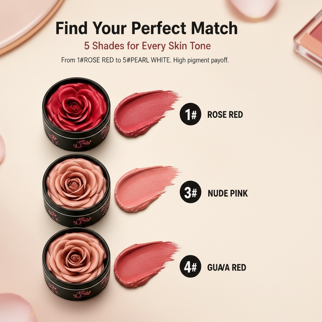
A blush with a smooth, creamy texture can be easier to place precisely and then shear out into a thin layer. The cosmetic finish visible in some product styling can range from matte-to-satin, and that can matter a lot on mature skin. Very dry matte formulas may emphasize texture, while overly shiny ones can exaggerate fullness in the wrong spot. The middle ground is often most useful.
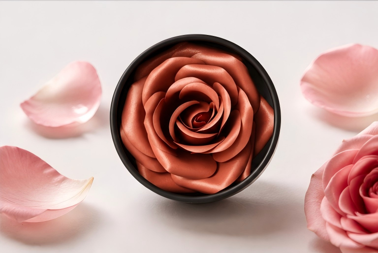
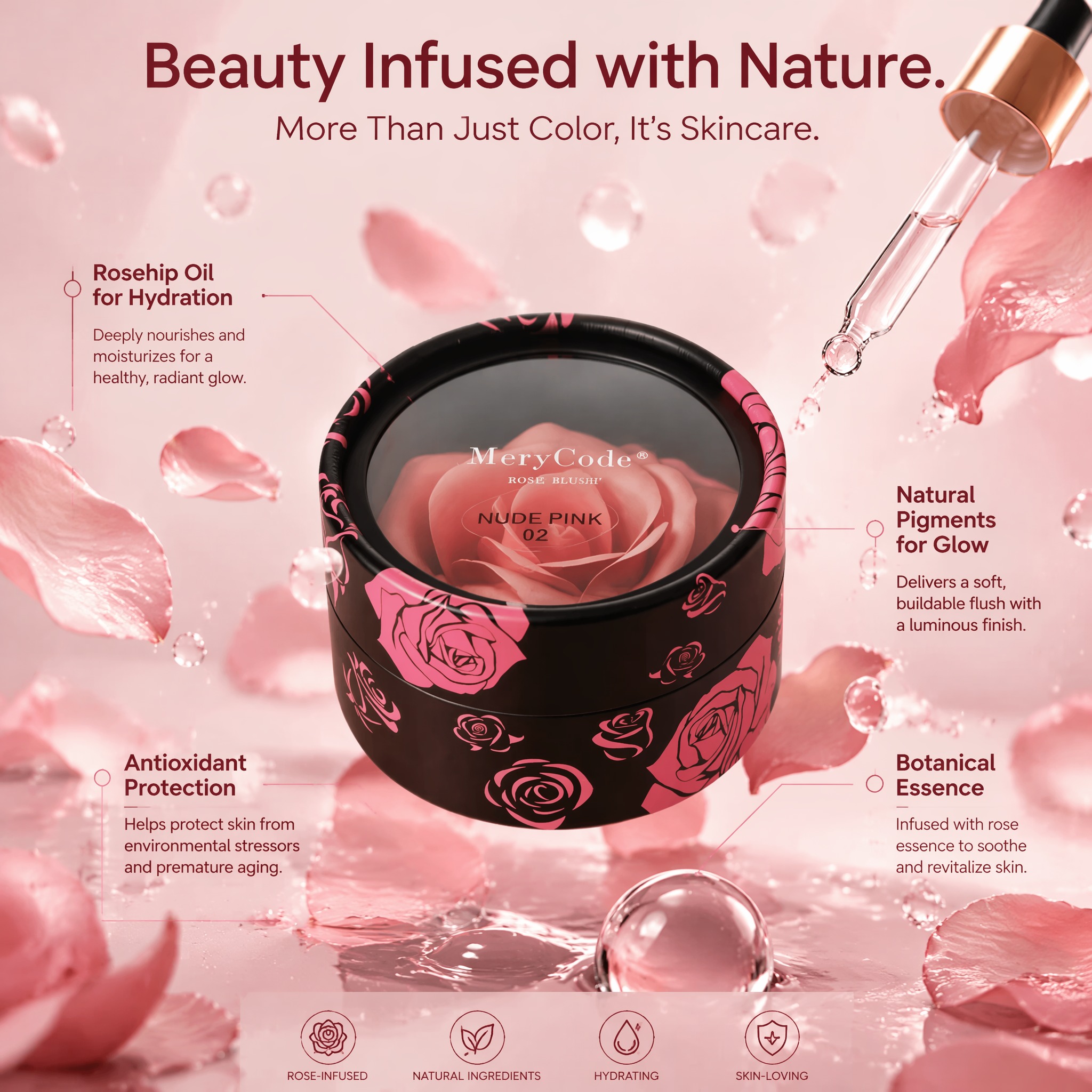
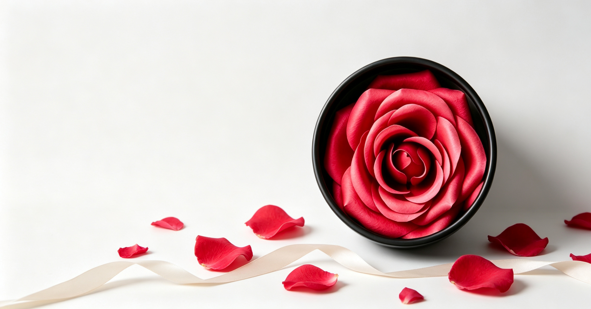
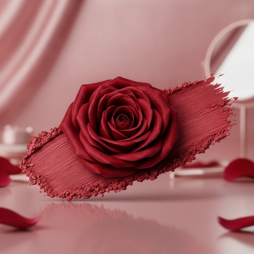
The product style matters for branding and, frankly, for how a consumer imagines the formula will behave. A rose-shaped molded cosmetic or a dense cream-like swatch suggests a spreadable texture, but packaging visuals are not the same as final performance. Shoppers should still look for application notes, finish claims, and compatibility with their foundation routine rather than assuming the photo tells the whole story.
FAQ
Is cream blush better than powder for sagging cheeks?
Not always. Cream blush often looks more skin-like and forgiving, while powder blush can create cleaner shape definition. The better choice depends on your base makeup, skin type, and how much control you want.
Should mature skin avoid bright blush?
No, but bright shades need careful placement. A vivid color can look modern and healthy if it is kept higher on the cheek and blended well. The problem is usually position, not brightness alone.
Does matte blush help lift the face?
Often, yes, because it gives a flatter, more defined read. Still, too much matte product can make skin look dry or harsh. The safest route is moderate pigment with careful blending.
What to do next
If your goal is a more lifted look, start by moving your blush placement slightly higher than usual and test the result in daylight. Then adjust formula and finish. Small changes in angle, color density, and blending direction can make a bigger difference than buying a new palette. That is the part many people miss: blush is less about the shade on the pan and more about where the eye lands when the face is at rest.