Why dewy cream blush has become a packaging-first category
Shoppers may ask for dewy cream blush because they want that fresh, skin-like finish, but in practice they are buying more than pigment. They are buying texture, convenience, and a small object that has to survive handbags, vanity drawers, and the occasional drop onto a tiled floor. For brands and sourcing teams, that means the product story begins long before the formula is tested. The package has to signal softness, quality, and daily usability the moment it lands in the customer’s hands.
That is where packaging starts to matter in a very practical way. Cream blush often sits in a premium or giftable part of the beauty shelf, so the container has to look tidy, feel substantial, and protect the formula from drying out or looking messy. If the product is being sold alongside hair care, cosmetics, or salon retail items, the outer box also becomes part of the brand language. A well-chosen container does quiet work: it supports display, supports shipping, and helps the buyer justify the purchase.
What the right outer box should do for a cream blush launch
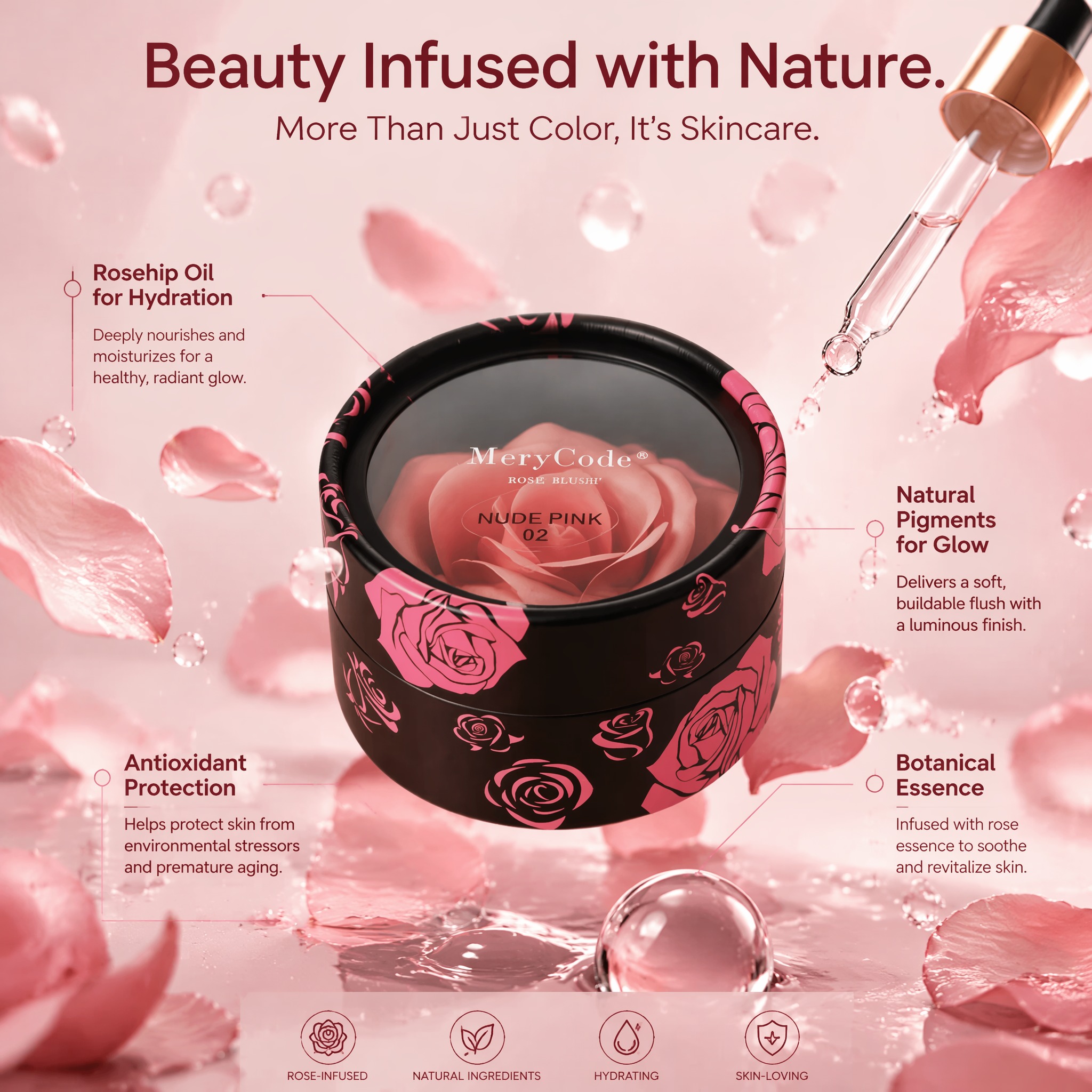
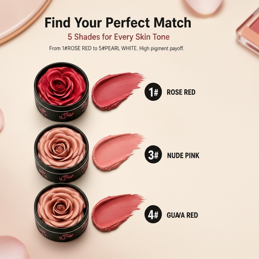
For a beauty item like a cream blush, the outer packaging is rarely just a shell. It is a sales tool, a shipping buffer, and sometimes the only place where the brand gets to make a strong visual impression. A rigid cylindrical box, such as a compact round container with a separate lid and base, can create a more gift-like presentation than a standard folding carton. The visible product example here suggests a short round format with a printed exterior, a clear or glossy top window, and bold branding on the lid. That combination is familiar in beauty retail because it feels decorative without becoming fussy.
There is also a functional side to it. Cylindrical packaging can work well for small cosmetic items, limited editions, or sets that need a slightly more premium reveal. The round silhouette softens the shelf presence, which suits a dewy or natural makeup position better than a sharp, clinical box. That matters when the formula itself is supposed to look effortless and skin-like. Buyers tend to trust a package that matches the product promise.
How a decorative rigid box changes the buyer’s perception
The visible package in the product reference uses a matte black base with glossy floral graphics and prominent lid branding. That is the sort of design choice that does not scream for attention, but it does hold it. A floral motif usually points toward femininity, giftability, or a softer beauty narrative. In retail terms, that can be useful for a dewy cream blush line, especially if the brand wants to communicate freshness rather than heavy color payoff.
One practical note: decorative printing can make a package look upscale, but it has to remain legible under shop lighting and in e-commerce thumbnails. If the variant name is hidden in fine text or the color cue is too subtle, buyers may struggle to distinguish shades. That creates avoidable returns and customer service noise. Packaging that looks elegant on a photo shoot can still fail at the shelf if the shade identifier is not obvious enough.
What sourcing managers should compare
When evaluating packaging for a blush product, teams usually compare structure, print durability, and presentation value. A rigid box offers better shelf presence than a lightweight carton, but it may also raise cost and shipping weight. A clear top window adds visibility, yet it must be checked carefully for scuffing, fogging, or adhesive issues. If the package is intended for salon retail or gifting, the unboxing experience matters almost as much as the exterior graphics.
For brands considering a long lasting cream blush message, the package should not accidentally suggest fragility or short-life use. Strong closures, clean edges, and a container that looks reusable can support the idea of a product people keep in rotation. A flimsy box sends the wrong signal even if the formula itself performs well.
Packaging choices that fit natural makeup positioning
Many buyers looking for a natural cream blush respond to packaging that feels calm rather than loud. Soft-toned graphics, minimal clutter, and a compact shape generally help. That does not mean the box has to disappear. Quite the opposite. A natural-positioned product often benefits from a refined physical object that feels safe to carry, easy to display, and pleasant to open.
For manufacturers, the question is less “Can we make it pretty?” and more “Can we make it consistent?” Printed cardboard, laminated finishes, and clear inserts or windows all introduce variables in color accuracy and surface quality. The buyer should ask for samples, inspect how the lid meets the base, and check whether the printed surface scratches easily. Beauty packaging tends to look simple right up until a small defect appears under store lighting.
Common mistakes when selecting packaging for blush products
One common mistake is choosing a package that overstates luxury while underperforming in handling. Another is treating the outer box as a one-time visual exercise instead of part of the product experience. If the container is awkward to open, does not stack well, or looks flimsy after one shipment cycle, it can work against the formula inside. There is also the issue of shade communication. A blush line needs clear naming and color identification, especially when multiple shades are sold together.
Buyers should also be cautious about assuming every decorative structure is suitable for every formula. A cream product may need different protection than a dry powder, and not every beautiful container is practical for daily use. The best packaging is the one that aligns with the formula, the channel, and the customer’s expectation of value.
A simple buyer checklist before placing an order
Ask whether the box is intended for retail display, gifting, or direct e-commerce shipping. Confirm the visible material and finish, especially where a clear top or insert is used. Review how the lid and base fit together. Check print quality in daylight and under LED light. If the package will carry shade names, make sure those names remain readable at a glance. And if the product is meant to support a dewy makeup story, see whether the final design actually feels fresh and modern, not just decorative.
FAQ
Is cylindrical packaging common for cream cosmetics?
It is not universal, but it is a practical choice for gift sets, salon retail, and branded beauty items that need strong shelf presence.
Does a decorative box help sell a blush formula?
Often yes, especially in premium and gift-oriented channels. It helps the product look considered rather than generic.
What should a buyer verify first?
Start with structure, print durability, and whether the design matches the product’s positioning. A packaging sample tells you more than a spec sheet alone.
If you are planning a new blush line or refreshing an existing beauty SKU, the next step is straightforward: test the package in hand, not just on screen. The finish, closure feel, and shelf presence will tell you quickly whether it supports the product story or fights it.