Why a face blush buyer should care about the formula, not just the shade
A good face blush does more than put color on the cheeks. For product teams, sourcing managers, and anyone comparing compact cosmetics, it is often the small details that decide whether a blush gets used every day or forgotten in a drawer. The shade may be what catches the eye first, but the texture, compact structure, wear behavior, and finish shape the actual user experience.
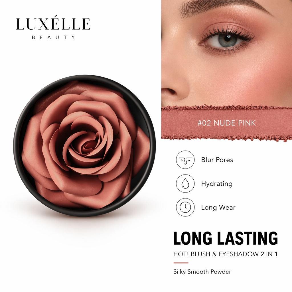
That matters even more when the product is built as a blush makeup item with multi-use appeal. The compact in front of you is presented as a blush & eyeshadow 2 in 1, in a nude pink shade marked #02 NUDE PINK. It is also described as a silky smooth powder with blur pores, hydrating, long wear, and long lasting claims. Those are exactly the kinds of selling points that raise practical questions: what does the product do well, where does it fit in a routine, and what should a buyer verify before treating it as a line-ready SKU?
What this type of compact is trying to solve
For most retail users, the problem is simple: they want one color that looks natural, feels easy to apply, and works across more than one part of the face. A cheek blush that can also shade the eyelids reduces friction in the morning routine and makes the compact easier to justify in a travel bag or everyday makeup pouch.
That is where a soft nude pink tone has an advantage. It is usually safer for daily wear than a highly saturated color, and it can help the product sit between a subtle cheek color and a light wash for the eyes. In merchandising terms, that is useful because it broadens the audience. In manufacturing terms, though, it also means the powder needs to press cleanly, release smoothly on brush or fingertip pickup, and stay visually consistent in the pan.
Key takeaways from the product form
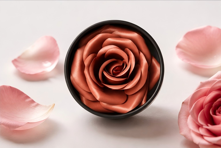
The visible format here tells a fairly specific story. This is a round compact with a shallow pan and a molded rose or flower swirl surface. That decorative press pattern is not only cosmetic. It gives the product shelf appeal and can signal a more premium presentation, even when the formula itself stays simple and practical.
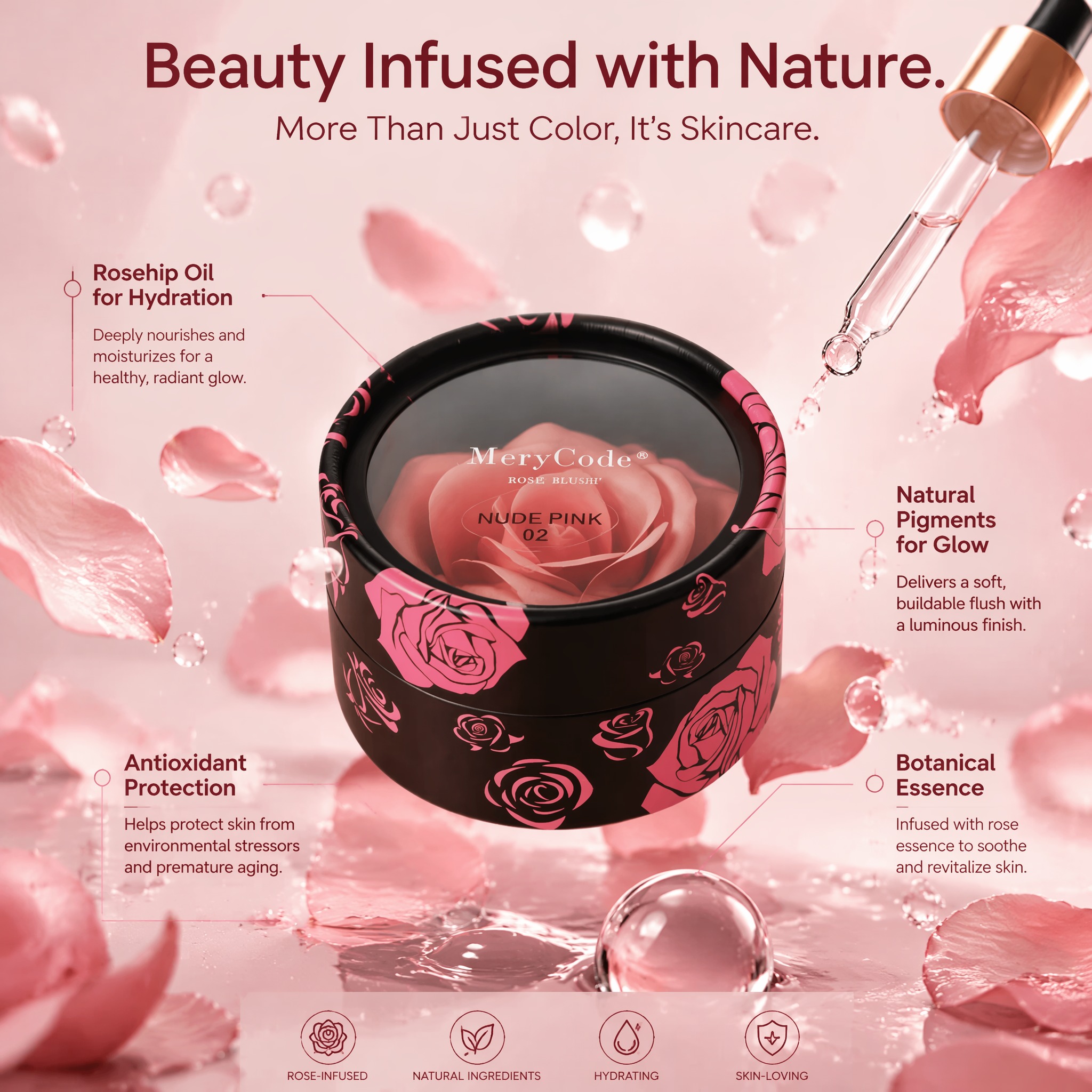
The black-rimmed compact also suggests a standard, carry-friendly makeup package rather than a bulky palette. For buyers, that usually means easier display, simpler packing efficiency, and fewer complications in transit. Small format products are often judged quickly by how cleanly they close, how well the powder sits in the pan, and whether the surface decoration survives handling.
What the claims suggest, cautiously
The image-based claims point to a powder that aims to feel smooth, blur the look of pores, and deliver hydration alongside long wear. Those are appealing claims, but they should be treated as product-positioning language unless testing data is available. “Hydrating” in a pressed powder blush, for example, may reflect emollient selection or a softer skin feel, not the kind of moisture performance buyers would expect from skincare.
Likewise, “long wear” can mean different things depending on skin type, climate, application method, and base makeup underneath. It is a useful claim, but procurement teams should ask for the supporting test method if it matters to the brand story.
Blush makeup selection criteria that actually matter
When evaluating blush makeup for a line extension or private label program, it helps to look past the palette photo and ask a few grounded questions.
Does the powder press hold together without crumbling during shipping or repeated use? Does the shade read natural in indoor light, not just in a studio image? Is the finish soft matte or satin enough to suit both cheeks and eyelids without looking flat? And does the compact size support the intended price point and channel?
A buyer should also think about application behavior. A silky smooth powder can feel pleasant, but if pickup is too light, the user may need several passes to build color. If it is too dense, the product may apply unevenly and look patchy on drier skin. That balance is often the difference between a compact that looks attractive and one that performs reliably in real routines.
Common mistakes when sourcing a face blush product
One common mistake is overvaluing the decorative press pattern and underestimating formula stability. A rose-shaped top surface looks good in a listing photo, but if the powder chips easily or the embossing collapses after handling, the product can look tired before it reaches the shelf.
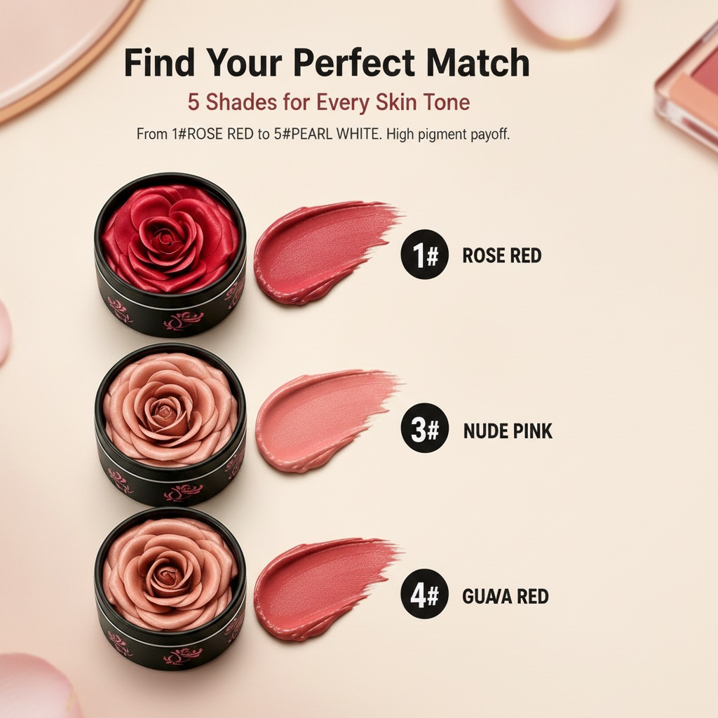
Another mistake is assuming one nude pink shade works for every market. Shade naming can be deceptively simple. #02 NUDE PINK may be versatile, but buyers still need to check how the pigment reads across skin tones and under different store lighting.
It is also easy to miss the practical issue of multi-use positioning. A product marketed for both cheeks and eyelids needs a formula that behaves reasonably in both areas. That does not always mean using the exact same product as a dedicated eye color, but it does mean the texture and finish need to be controlled.
What this compact is best suited for
Based on the visible product information, this kind of compact fits everyday face makeup, travel kits, and natural-looking routines. It is the sort of item a consumer reaches for when they want one small powder to do two jobs without looking overly made up.
For retailers and brands, that is a straightforward story to tell. For manufacturers, it is a reminder that compact cosmetics live or die on consistency: the press, the shade, the feel, and the package all need to work together.
Practical buyer advice before you commit
If you are sourcing a product like this, ask for sample evaluation under real usage conditions. Check rub-off, pickup, and how the swirl press holds after a few days of handling. Confirm the exact product format and packaging details before you plan a launch, because image-led cosmetics listings can leave important gaps.
And if the line is going into travel, gifting, or fast-moving retail, a neat, compact blush powder with dual-use positioning may have stronger commercial value than a more complicated palette. Simplicity often wins, though only when the formula is steady enough to back it up.
Next step for teams comparing options
If this face blush fits your brief, the next move is not another round of adjectives. It is a structured sample check: color accuracy, powder feel, compact durability, and how convincingly the product performs as both cheek blush and eye color. Those four points usually tell you more than the marketing copy ever will.