Cheek color in gift packaging and floral presentation: why the small details matter
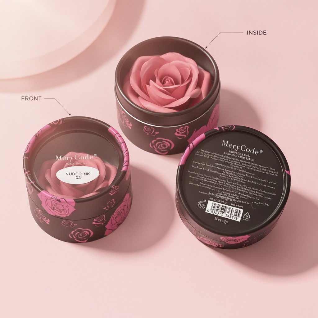
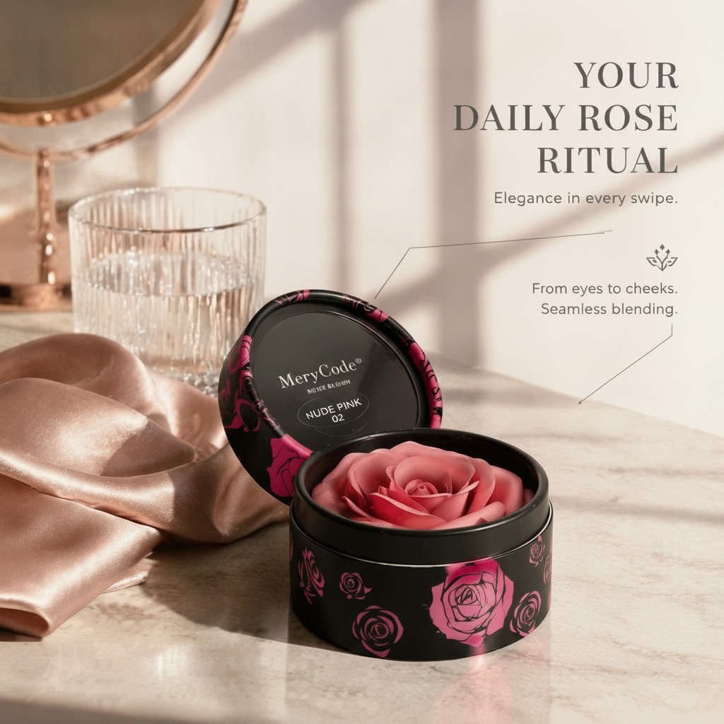
In floral packaging, cheek color is the kind of detail that seems minor until the product is on a shelf, in a gift box, or held at arm’s length by a customer deciding whether it feels premium. With a compact rose presentation like the one described here—a vivid red-pink bloom set in a small round black container—the color balance does most of the selling before anyone reads a label.
That matters for sourcing teams and product developers because decorative flower packaging is rarely judged only on the flower itself. Buyers look at the whole composition: the petal tone, the contrast against the black base, the symmetry of the rose head, and whether the presentation looks neat enough to gift without extra handling. A good arrangement can feel polished and romantic; a weak one can look cheap even if the materials are acceptable.
What the presentation suggests at a glance
The visible structure is straightforward but effective. A layered rose head sits in a small circular container with a smooth black rim and a matte-to-satin finish. The petals are tightly arranged around the center, which gives the bloom a controlled, boutique look rather than a loose floral one. The darker shadows in the folds deepen the visual texture, and that is where cheek color becomes relevant: the saturated red-pink tone works against the black container to create contrast and focus.
From a manufacturing perspective, this type of product usually sits somewhere between floral gift packaging and decorative assembly. The exact material cannot be confirmed from the image, but the petals appear consistent with synthetic foam, fabric, or molded decorative material. The container could be paperboard, plastic, or coated cardboard. In procurement terms, that means the buyer should not assume performance from appearance alone.
Why color coordination affects perceived value
Color is one of the fastest signals in retail display. A strong cheek color can make a small rose presentation look fuller, fresher, and more deliberate. In practical terms, that helps with three common use cases: gift box inserts, tabletop décor, and retail floral presentation. The same item can feel romantic in a gift context or decorative in an event setting, provided the color and finish are controlled.
Black packaging is often used because it sharpens the visual edge of red and pink tones. It also hides small shadows and gives the product a cleaner silhouette. That said, black can be unforgiving if the finish is uneven or if the petal color is too thin. Any mismatch tends to show quickly. A buyer reviewing samples should look at the product under bright light and softer ambient light, because the rose may read differently depending on the setting.
Selection criteria buyers should actually use
1. Petal structure
The rose shown here relies on a centered spiral and layered petals. That geometry matters because it creates a realistic focal point and keeps the bloom from collapsing visually. If the petals look too flat, the product loses depth fast.
2. Color consistency
Cheek color should be even enough to look intentional, but not so uniform that the flower appears plastic or lifeless. Slight variation inside the folds can help. Excessive blotching, however, reads as low quality.
3. Container finish
A smooth black container can elevate the whole piece, but only if the edge is clean and the surface is not visibly scuffed. Matte-to-satin finishes tend to work well for gift applications because they look more restrained than high gloss.
4. Presentation stability
For boxed floral items, the flower should sit centered and stay put. If the bloom shifts too easily, packaging becomes harder and the retail appearance suffers. This is a small point until it becomes a returns problem.
Common mistakes when sourcing decorative rose packaging
One frequent mistake is judging the sample only by its top view. From above, almost anything can look tidy. The real issue is side profile, rim alignment, and whether the rose appears securely seated in the container. Another common miss is over-focusing on the bloom color while ignoring the black base. The two are inseparable in this format; the base is part of the product’s visual identity.
Buyers should also be cautious about assuming that a preserved-rose-style appearance means preserved flowers are actually used. The image does not verify that. If longevity, scent, or moisture resistance matters, those points should be confirmed directly with the supplier.
Practical advice for sourcing and merchandising
If you are selecting this kind of product for retail or gifting, ask for close-up photos of the petal folds, the inner container edge, and the assembled unit in natural light. That usually reveals more than a polished hero image. For event décor, it is worth checking whether multiple units look consistent side by side, since slight differences in cheek color or petal shaping become obvious in group displays.
For packaging programs, this style works best when the customer is meant to open the box and see the rose immediately. The appeal is direct: one focal flower, neat arrangement, no visual clutter. That simplicity is a strength, but only if the manufacturing finish is controlled.
FAQ
Is the flower real or artificial?
The image does not confirm that. It could be synthetic, preserved-style, or another decorative material.
What is the likely application?
Gift packaging, tabletop decoration, romantic presentation, or retail floral display.
What should buyers verify before ordering?
Material, color consistency, assembly stability, container finish, and whether the product is suitable for the intended display environment.
Next step
If you are evaluating this style for a product line, treat the color, container finish, and assembly quality as one package. Ask for samples, review them under different lighting, and confirm the material build before committing to a larger order. In this category, the small visual details carry more commercial weight than they first appear to.