Minimalist elegance in cosmetics packaging: why the compact itself matters
Minimalist elegance is more than a design trend in cosmetics packaging; it is a buying signal. When a compact looks refined, closes cleanly, and presents the product without visual clutter, it tells retailers and end users something important about the brand’s discipline. That matters whether the item is a pressed powder, a complexion palette, or a multi-shade finishing product built for daily carry.
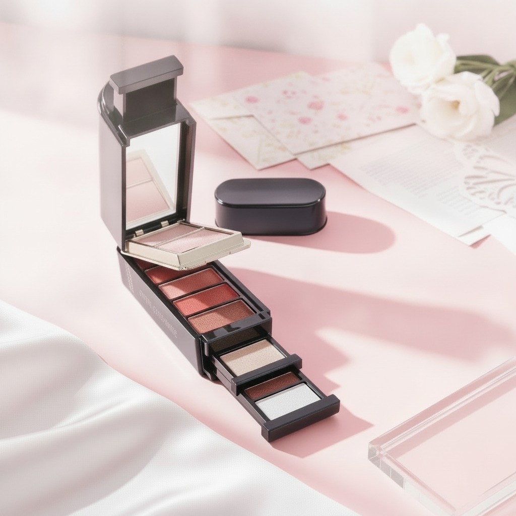
The compact described here is a good example of that logic. It uses a round, metal-looking case with a gold-toned lid, a black rim and base, and a hinged front closure. Inside sits a single molded pan divided into irregular mosaic-like segments in pastel shades. The result is decorative, but not loud. It sits in that useful middle ground between luxury presentation and practical portability.
What the design is trying to solve
For sourcing teams and product developers, packaging is not just a shell around the formula. It shapes shelf appeal, protects the product, and affects how a customer judges value in the first few seconds. In cosmetics, that first impression is often made before anyone knows whether the formula is a setting powder, a color-correcting blend, or something else entirely.
A compact like this addresses a familiar retail problem: how do you offer variety without making the product feel messy or overdesigned? The segmented pastel pan gives the impression of multiple functions in one unit. It can suggest blending, soft-focus finishing, or a customizable complexion effect, even if the exact formula is not disclosed. That flexibility is commercially useful, especially for gift sets and display-led merchandising.
Key features buyers notice quickly
Several visible details carry more weight than they might first appear to. The circular shape is compact and familiar. The gold lid adds a premium cue. The black rim gives it contrast and keeps the overall look from becoming overly ornate. The hinged closure is also practical; it helps the case feel secure during travel and reduces the chance of the compact opening in a handbag or kit.
The interior matters as well. The molded pressed powder pan is divided into irregular polygonal sections rather than a standard uniform split. That kind of mosaic or stained-glass arrangement creates visual interest on the retail shelf and can make a product feel more artisanal, even when it is produced through standard cosmetic compaction and pan filling methods.
Why the pastel palette is commercially effective
Pastel tones such as pink, lavender, pale green, beige, peach, and tan are doing two jobs at once. Visually, they soften the compact and make it giftable. Functionally, they imply correction, balance, and blending. That is useful for buyers looking at product concepts aimed at soft coverage or complexion refinement. The caveat, of course, is that the exact performance depends on the formula, and the packaging cannot promise what the product chemistry has not been designed to deliver.
How this kind of compact is typically made
From a manufacturing standpoint, products like this sit in a familiar process chain: formulation, pressing or molding, pan filling, assembly, and final cosmetic packaging. The decorative segmented surface suggests a pressed or baked composition formed into a single pan with multiple visual zones. That requires consistent filling control, because uneven compaction can affect both appearance and pickup.
For buyers, this is where design ambition meets production reality. Multi-shade pans can look elegant, but they also raise questions about color separation, breakage resistance, and how the product behaves after repeated use. If the design is intended for retail display, the compact must look good unopened and continue to perform once the user begins to swirl a brush or sponge across the surface.
Selection criteria for sourcing and product teams
When evaluating a design like this, teams should look beyond the initial visual appeal. The compact should open and close smoothly, resist scuffing, and protect the pressed surface during shipping. The decorative lid finish should also be checked under store lighting, because metallic gold can read very differently on a shelf than it does in a render or sample photo.
It is also worth asking how the pan geometry affects production consistency. Irregular segment shapes can look elegant, but they may be harder to fill uniformly than a simple round split-pan layout. If the product is intended for repeat manufacturing, small issues in pressing or color migration can become expensive later.
Common mistakes buyers make
The most common mistake is treating packaging and formula as separate purchasing decisions. They are linked. A compact that looks premium but opens awkwardly, scratches easily, or cannot protect the product in transit will weaken the whole line. Another mistake is overcommitting to decorative complexity before confirming manufacturing repeatability. What looks refined in a prototype can become difficult to scale.
There is also a branding risk in leaning too hard on “minimalist elegance” without real material discipline. If the exterior finish, hinge quality, and interior pan presentation do not feel coherent, the design reads as cosmetic in the wrong sense: surface-level. Buyers tend to notice that quickly, even if they do not say it out loud.
Practical buyer advice
If you are comparing compact concepts, ask for samples that reflect real handling, not just photography-ready units. Open and close the case repeatedly. Check whether the lid finish shows fingerprints or wear. Inspect how the molded pan holds up after a few uses. For products meant for retail display, ask how the compact performs under bright store lighting and whether the pastel mosaic remains visually clear after minor abrasion.
For private label or custom development, this style is best suited to brands that want a polished, compact footprint with a softer luxury feel rather than a heavily embellished look. It can work for beauty counters, online gifting, and travel-oriented collections, provided the formula and packaging are matched properly.
FAQ for sourcing and merchandising teams
Is this compact only suitable for one product type?
Not necessarily. Based on appearance alone, it could suit pressed powder, color-correcting makeup, a finishing product, or another complexion-related format. The exact use depends on the formulation.
Does the mosaic design create manufacturing risk?
It can. Decorative segmentation may improve shelf appeal, but it also requires good control during compaction and filling. Uneven edges or color bleed can undermine the effect.
Why choose a compact style like this for retail?
Because it balances portability, a premium feel, and strong visual merchandising. That combination is especially useful when a brand wants minimalist elegance without looking plain.
A sensible next step
For teams assessing a compact cosmetic concept, the real question is not whether it looks attractive in isolation. It is whether the packaging, pressed surface, and intended formula work together in a way that can be manufactured, shipped, and sold reliably. If that alignment is in place, this kind of compact can do a lot with very little visual noise — which is usually the point.