Refined simplicity is not just a look; it is a product decision
In cosmetics packaging, refined simplicity is often the difference between a compact that gets picked up and one that gets passed over. Buyers may talk about shade stories, textures, or seasonality, but the first thing many consumers notice is the object in the hand: its weight, its finish, the way the lid closes, and whether it feels easy to trust. A round compact with a metallic gold lid, a black rim, and a decorative top surface is a good example. It suggests polish without shouting, which is exactly why this style keeps showing up in beauty assortments.
For sourcing managers and product teams, the real question is not whether the design looks attractive. It is whether that restrained look supports the product inside, survives daily use, and fits the brand’s shelf strategy. A compact can be visually calm and still carry a strong signal of value. Done poorly, though, the same approach can look generic or fragile. That is the problem this article helps solve: how to evaluate a simple cosmetic compact as both packaging and product experience.
Why the compact format still works
Round compacts remain practical because they are familiar, portable, and easy to merchandise. The slim clamshell structure suits touch-up use, travel carry, and counter display. In a category where many products compete for attention, compactness itself becomes part of the appeal. Consumers want something that fits in a bag, opens cleanly, and looks presentable when used in public. That is not a small thing in beauty retail.
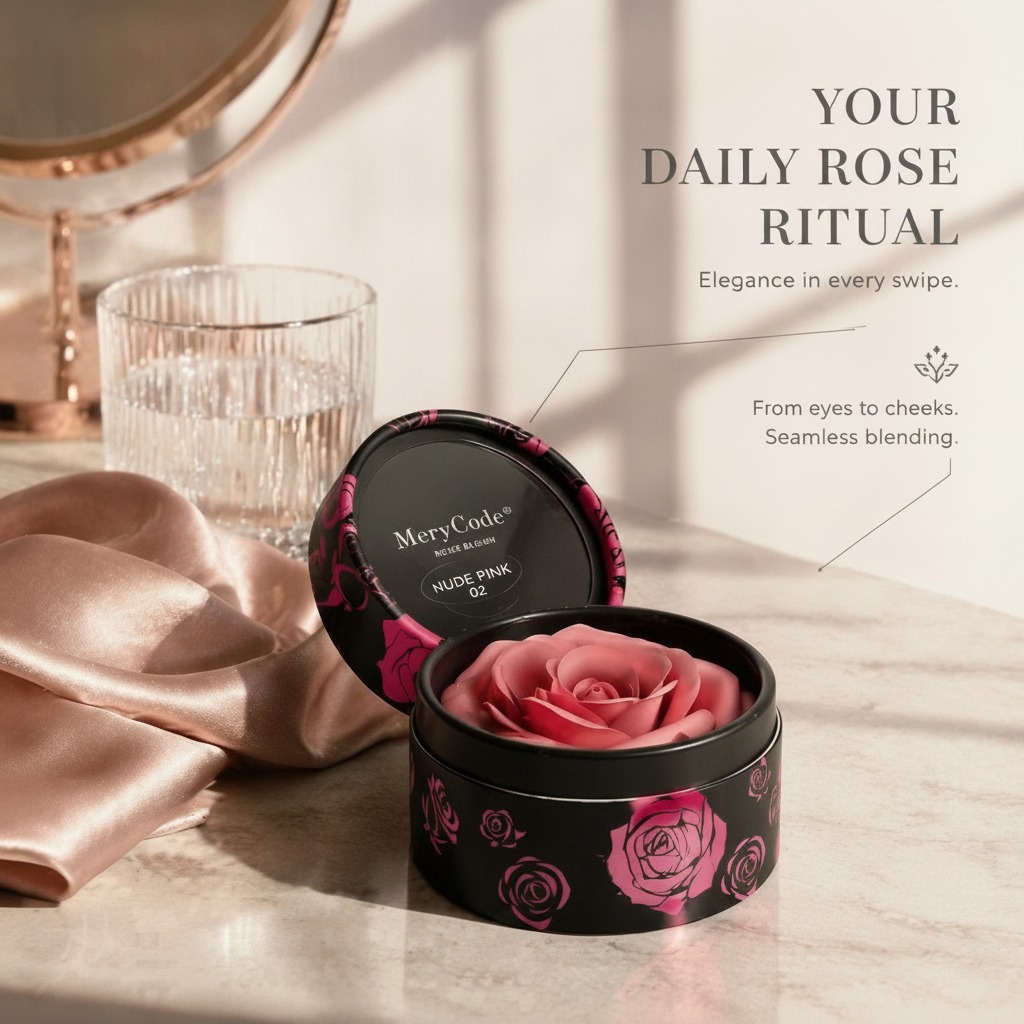
The visible structure here—a hinged lid, circular pan, and decorative top surface—points to a product designed for daily handling. The gold-toned lid gives a premium cue, while the matte or satin feel prevents the package from looking overly flashy. The black outer rim helps frame the design. Together, those details create a controlled visual language: simple, but not plain.
What refined simplicity means in cosmetic packaging
In manufacturing terms, refined simplicity usually means fewer visual elements, but better execution. Instead of depending on heavy ornament, the package relies on proportion, surface finish, alignment, and print quality. If the lid decoration is a printed or inlaid wave-like “S” form with glitter texture, then the quality of that decoration matters more than its complexity. A simple mark looks cheap if the edges are rough, the color drift is obvious, or the finish scratches too easily.
Key details buyers should review
Look closely at the closure feel, hinge movement, surface uniformity, and how the decorative lid treatment holds up under handling. For a compact used in makeup routines, those small mechanical details shape the user’s impression of quality more than the formula description on the carton. If the product is meant for gifting or counter display, the exterior finish has to do even more work.
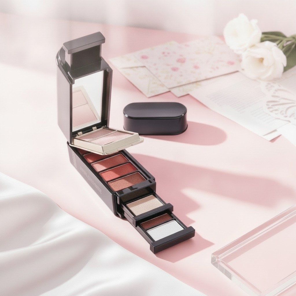
The inner pan also matters. A pastel mosaic or cell-like printed pattern can suggest multiple shades, a decorative pressed powder, or simply a branded surface effect. Since the exact cosmetic type is not clear from the image, buyers should verify whether the pattern is functional, decorative, or both. That distinction affects consumer expectations, formulation decisions, and even how the product is photographed for marketing.
Selection criteria that save time later
When comparing compacts in this style, start with the basics: portability, closure reliability, lid finish, and fill presentation. Then move to retail fit. Does the product read as everyday makeup, a sample-size item, or a gift set compact? A slim round case can support all three, but not equally well without design adjustments.
It is also worth checking whether the packaging supports refillability, a mirror, or an applicator. None of those features are visible here, so they should not be assumed. Yet in the buyer’s mind, those omissions can change perceived value. A compact that feels elegant but lacks practical features may still sell, but often at a different price point or through a different channel.
Common mistakes with minimalist cosmetic designs
The biggest mistake is confusing simple with unfinished. A restrained compact needs disciplined details: clean edge lines, consistent coating, legible branding, and a closure that feels intentional. If the finish is uneven, the whole product can read as budget even when the formula is good. Another common issue is over-designing the interior while leaving the outside weak. In retail, the lid sells first.
There is also a packaging caution that is easy to overlook: decorative metallic or glitter-like surfaces can be attractive, but they should be evaluated for scuff resistance and handling marks. Beauty products are opened, closed, slipped into bags, and photographed under harsh light. A surface that looks strong in a studio shot may not age gracefully in the field.
Practical buyer advice
If you are sourcing a product in this category, ask for samples that represent both the packaging finish and the filled product. Judge the compact on a table, in hand, and under retail lighting. That is where the real differences show up. Ask whether the decorative top is printed, inlaid, or coated, and confirm how the finish behaves after repeated opening and closing. Those questions are mundane, but they prevent expensive surprises.
For product teams building a line around elegant restraint, this kind of compact is useful because it leaves room for branding while keeping the silhouette clean. It can fit a modern, premium, or gift-oriented range without needing a loud visual system. But it must feel precise. In this category, precision is what turns a modest object into a credible beauty item.
What to take away before you specify the next run
Refined simplicity is not about removing detail. It is about choosing the right details and executing them well. In a round cosmetic compact, that means the lid finish, hinge feel, decorative print, and fill presentation all have to work together. If those pieces align, the product can look calm, premium, and easy to buy. If they do not, the design quickly loses its edge.
For teams planning a new compact program, the best next step is to compare samples by finish quality and handling performance, not just by artwork. That is usually where the smarter decision becomes obvious.