Why lip tint oil gloss packaging matters more than many brands admit
A lip tint oil gloss is not just another small cosmetic SKU. It sits in a tricky middle ground between color, care, and sensory appeal, which means the packaging has to do more than simply hold liquid. It needs to protect the formula, signal a retail-ready image, and make the product feel worth picking up in a crowded shelf or online thumbnail. For buyers, brand teams, and packaging managers, that is the real decision point: how to present a lip treatment product so it looks credible, travels well, and still supports the user experience.
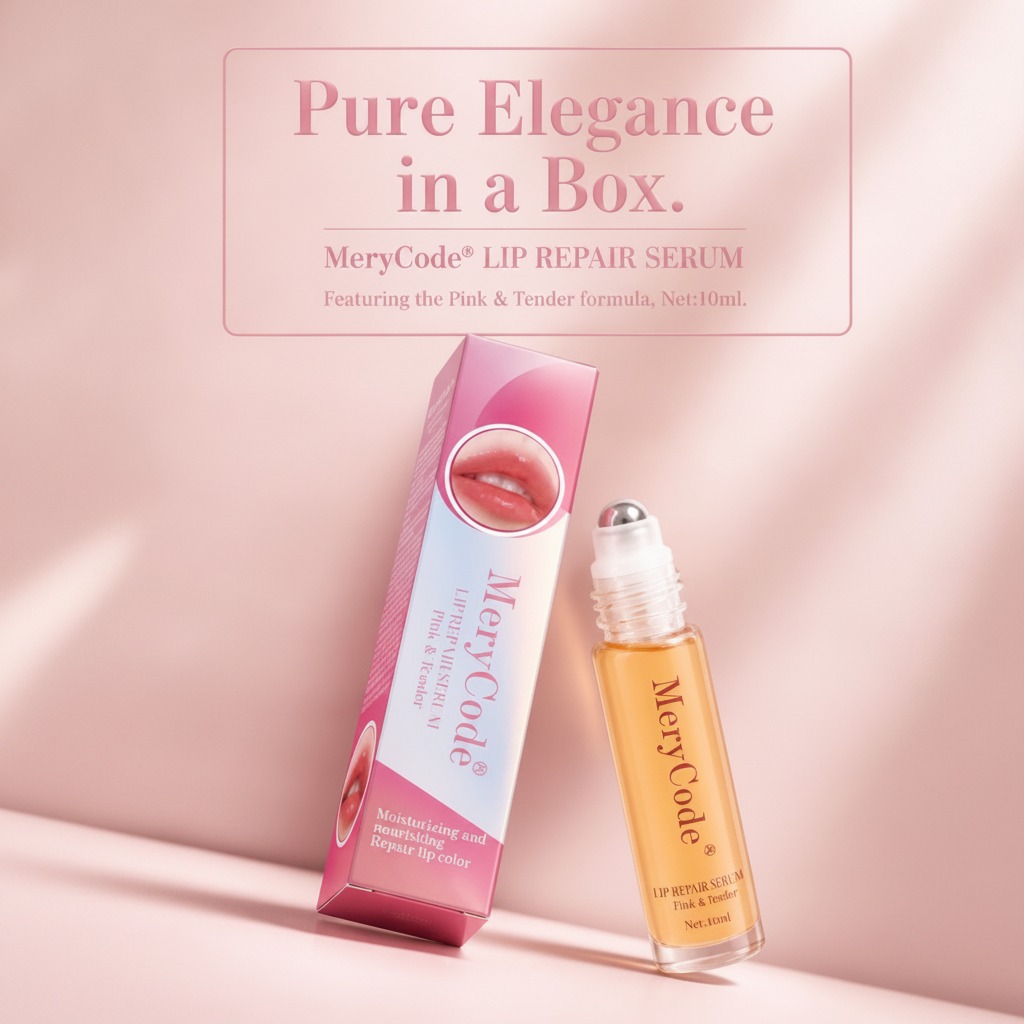
The MeryCode® Lip Repair Serum example is useful because it shows that blend clearly. The product is presented as a boxed bottle with an applicator, in a 10 ml format, with “Pink & Tender” variant text and language that points to moisturizing, nourishing, and repair lip color positioning. That tells you a lot about the commercial intent even before you know the formula. It is meant to live in the same conversation as lip care, lip treatment cosmetic formats, and lightweight color products that people can carry every day.
What this product format is trying to solve
In practical terms, buyers usually want three things from a product like this: stable packaging, a clean application experience, and retail impact. A clear cylindrical bottle with an amber or orange-tinted liquid gives immediate visual feedback. The customer sees product inside the pack, which can help with perceived freshness and premium value. The printed paperboard carton then adds space for branding, usage claims, and shelf differentiation. That outer box also helps during distribution, since small cosmetic bottles can get scuffed fast if they are shipped loose.
The applicator detail matters more than it looks. A white neck and cap with a metal-tipped or roller-style top suggests an application method designed for direct lip contact and controlled dosing. For a lip repair serum, that can be a selling point, because users tend to prefer precise application over messy squeeze formats. Still, buyers should be careful here: a visually attractive applicator is not the same thing as a robust dispensing system. If you are sourcing this kind of packaging, ask early how the applicator behaves with the actual fill viscosity. A glossy mockup can hide compatibility problems.
Quick reference: what the packaging components are doing
Inner bottle
The slim straight-sided bottle gives a clean cosmetic profile and is easy to display. Transparent glass or clear plastic both fit this look, though the exact material should always be confirmed rather than assumed.
Applicator assembly
The white neck and metallic-looking tip create the impression of a premium treatment product. Depending on the final engineering, this may be a roll-on or a metal-ball style applicator, but that should be verified before production planning.
Outer carton
The pink-and-white gradient paperboard carton carries the brand story and protects the pack in transit. It is the obvious place to add product claims, variant cues, and compliance text.
How buyers should evaluate a lip treatment cosmetic like this
For sourcing managers, the first question is not “Does it look good?” It is “Does this structure match the formula and the market position?” A lip repair serum with a tinted oil gloss feel needs packaging that can support a smooth dispense, resist leakage, and keep the user experience consistent from first use to last. If the bottle is too delicate, shipping losses rise. If the applicator is too loose or too stiff, the consumer notices immediately. In cosmetics, users forgive a lot less than industrial buyers sometimes expect.
Retail teams should also think about the visual hierarchy. The bottle itself uses vertical text, and the carton echoes that branding with a printed lips graphic or product image area. That kind of design can work well on shelf because it reads quickly. But if every surface is crowded with claims, the product starts to look noisy. A small lip product has very little physical space to communicate; clutter usually makes it look cheaper, not more informative.
Common mistakes with lip care packaging
One common mistake is over-specifying the packaging before the formula is locked. A serum that behaves like an oil gloss may need a different applicator than a thicker repair treatment. Another mistake is assuming a carton alone can compensate for a weak bottle design. It cannot. The consumer interacts with the inner pack every day, not just the box at purchase.
There is also a temptation to use decorative metal elements because they photograph well. That can be fine, but only if the functional side holds up. If the tip is purely decorative, say so in internal documentation and make sure the package still performs. If it is functional, test it under real handling conditions. Small cosmetic formats often fail at the edges: cap fit, leakage, staining, and transit abrasion.
Practical buyer advice for this product category
If you are developing or sourcing a lip tint oil gloss style product, start with the use case. Is it daily lip care, a travel-size treatment, or a retail display item intended to sit beside color cosmetics? The answer affects bottle material, carton stiffness, and applicator choice. For a 10 ml SKU, compactness usually wins, but only if the pack still feels deliberate in hand.
Also, request real samples early. A carton flat or a beautiful render is not enough. Ask how the print finish looks under store lighting, whether the folded carton keeps its shape, and whether the filled bottle sits securely inside. Those are small details until they become returns, complaints, or damaged goods.
What this kind of packaging can do well
When done properly, the format is strong for daily lip care and light beauty retail. It gives a brand enough room to appear premium without drifting into oversized luxury packaging. It also supports a consumer habit that is easy to repeat: open box, see the product, apply directly, carry it in a bag. That routine is the whole commercial logic of a lip repair serum in this style.
For teams planning a similar product, the takeaway is straightforward. Treat the bottle, applicator, and carton as one system. If one part is under-designed, the entire product loses credibility. The best lip treatment cosmetic packaging looks simple because the engineering underneath was not simple.
Next step for product teams
If you are evaluating a lip tint oil gloss concept for launch or private label development, ask for sample packs, confirm the dispenser behavior with the intended formula, and review carton print quality before mass production. That sequence saves more trouble than any last-minute graphic polish ever will.