Why a classic elegant style still sells in cosmetics packaging
A compact can do a lot of work before anyone even opens it. In cosmetics, classic elegant style is often the signal that the product inside is meant to feel refined, giftable, and easy to trust. That matters for buyers, brand teams, and sourcing managers because packaging is not just decoration; it shapes shelf presence, perceived value, and how often a customer reaches for the item in daily use.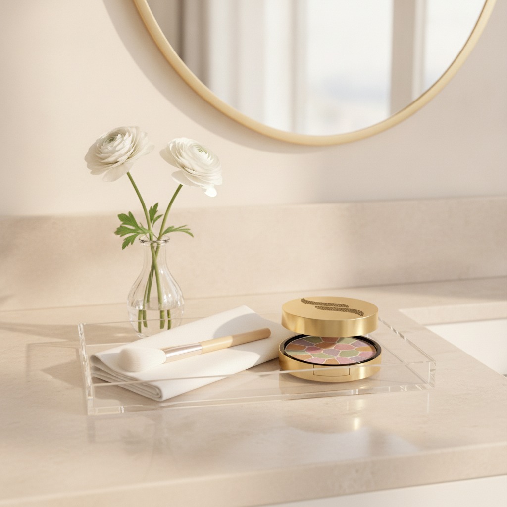
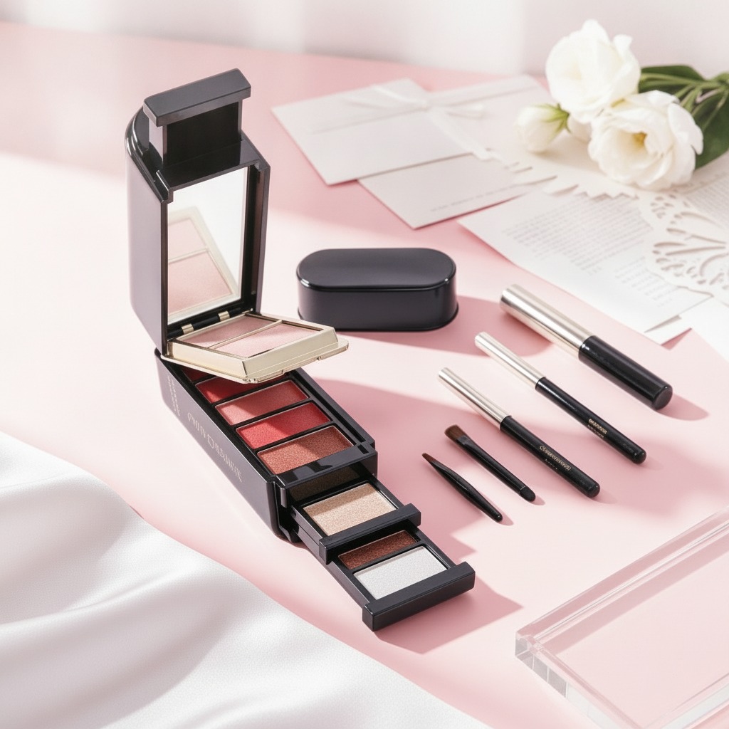
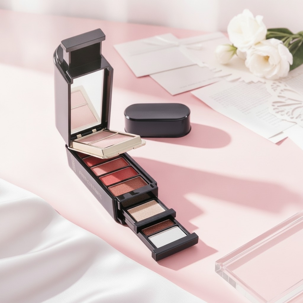
The round compact cosmetic palette described here is a good example. It combines a circular form, a hinged lid, a dark outer base, and a smooth metallic-looking gold finish on top. Inside, the pressed powder is divided into several pastel mosaic-like segments. That mix of presentation and function is exactly why this format keeps showing up in retail beauty lines. It looks premium without becoming overly complex.
What this compact format is trying to do
From a product-planning perspective, this is not a bulky vanity jar or a minimalist refill puck. It is a handheld compact designed for portability and quick application. The rounded shape is familiar, easy to store in a pouch, and comfortable in the hand. The irregular segmented powder pan also suggests a multi-shade or multi-effect formula, which can appeal to consumers who want one item that seems versatile rather than a single flat color.
That said, buyers should be careful not to overread the visual design. A mosaic pressed powder can imply color correction, brightening, or finishing use, but the exact formula is not visible here. If you are sourcing a product like this, the functional claims need to come from testing and formulation data, not from the packaging alone. A compact can look elegant and still perform only as a standard pressed powder.
Key design details that affect buying decisions
Round geometry
The circular form is more than a style choice. It usually supports an even, centered presentation for the pressed powder and gives the product a softer, more traditional cosmetic feel. For brands aiming at a classic elegant style, that matters. Rectangular cases can feel more modern or technical; round cases often read as timeless.
Gold lid and dark base
The visible contrast between the reflective gold lid and the black base creates a high-end look without relying on excessive ornament. In retail terms, this is useful because it holds up across multiple channel types, from boutique displays to mass-market shelves. It also photographs well, which is not a trivial point anymore.
Multi-segment powder surface
The interior pan uses distinct color zones in pastel shades. That kind of layout can be attractive to consumers who like visible variety in a single compact. It can also raise practical questions for sourcing: how stable are the color boundaries during pressing and handling, and does the product maintain its pattern through transport? Those are the kinds of issues that separate a nice concept from a dependable production item.
Manufacturing points worth paying attention to
For a product like this, the main manufacturing topics usually include powder pressing, pan filling, lid closure quality, and surface finish consistency. The image suggests a molded compact package with a hinged closure and a metallic-looking exterior. Whether the lid is actually metal or a coated plastic part is not confirmed, and that distinction matters for cost, weight, and durability.
The pressed powder itself appears matte, which is common for finishing or correcting powders. Buyers should ask suppliers about breakage resistance, edge crumbling, and whether the segmented pattern can be reproduced consistently from batch to batch. Small variations may be acceptable in a handmade-looking premium line, but they are a problem if the design is meant to look precise and repeatable.
Common mistakes when sourcing a product with this look
One frequent mistake is assuming that a premium appearance guarantees premium performance. It does not. Another is focusing only on the compact shell and under-specifying the powder behavior. If the formula is too soft, the mosaic pattern can blur or crack. If it is too hard, pickup and payoff may be disappointing.
A second issue is overcomplicating the brief. If the market wants a classic elegant style, the packaging should probably stay disciplined: clean lines, controlled gloss, and a closure that feels secure rather than flashy. Extra decoration can easily push the item into a different visual category.
What buyers should ask before moving forward
Before committing to a cosmetic compact like this, ask for the product specification sheet, packaging material details, and artwork limits. Confirm the intended function of the powder, whether the compact is refillable, and whether a mirror is included. Those facts are not visible in the image, and they should not be guessed at.
You should also request sample photos or physical samples if the product will be sold as a premium or gift-oriented item. The finish on the lid, the feel of the hinge, and the neatness of the powder segmentation all influence perceived value.
FAQ: quick buyer questions
Is this format mainly for display or daily use?
Most likely daily use, with enough visual polish to support giftable retail positioning.
Does the mosaic powder automatically mean color correction?
Not necessarily. It may suggest that function, but the formula has to confirm it.
Why does the round compact matter?
It supports a familiar, elegant look and makes the product easier to carry.
Next step for sourcing teams
If you are evaluating a compact in this style, start with the formula question, then the packaging details, then the visual finish. A good classic elegant style can lift a product line, but only if the material choices and powder performance hold up in real use. Ask for samples early, and check whether the design still looks refined after handling, shipping, and a few open-close cycles. That small practical test often tells you more than the product photos do.