Why an elegant minimalist compact sells more than it looks like it should
An elegant minimalist compact does more than hold powder; it signals what kind of beauty product a customer is about to experience. In a crowded cosmetics aisle, that first glance matters. The round gold-finish case, the black inner rim, and the polished hinged lid all suggest a premium object before the formula is even tested. For sourcing teams and product managers, that matters because packaging is not decoration alone. It affects shelf appeal, perceived value, usability, and how likely a shopper is to pick up the item in the first place.
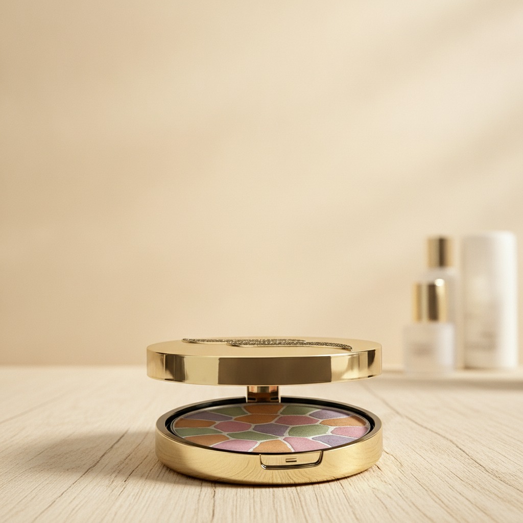
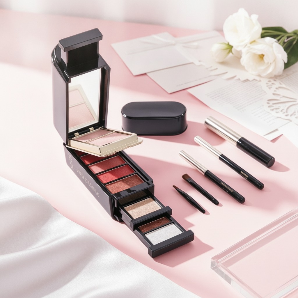
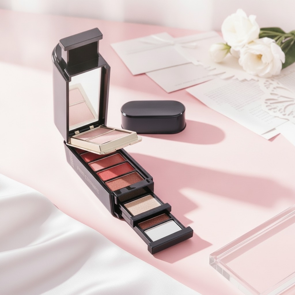
The compact described here is a good example of how restrained design can still feel distinctive. The outside is simple and reflective, while the inside reveals a multicolor pressed surface with pastel segments separated by fine white lines. That contrast is useful commercially. It gives buyers a clean outer presentation and a more expressive product moment once the lid opens. In practice, that is the sort of detail that helps a retail cosmetic item stand out without looking noisy or overworked.
What this compact suggests about the product strategy
From a manufacturing and merchandising perspective, this is not just a powder case. It appears suited to blush, highlighter, finishing powder, or an eye and face palette format, depending on how the formula is developed. The product surface looks like a baked or pressed cosmetic with a marbled, mosaic-style arrangement. That kind of presentation often supports a premium story: layered color, visual richness, and a sense of craft. Buyers who want an elegant minimalist look often choose exactly this kind of balance—quiet on the outside, expressive on the inside.
There is a practical reason for that. Retail cosmetics live or die on packaging discipline. Too much visual noise can make a product look cheap or trend-chasing. Too little character, and it disappears on shelf. A round compact with a mirror-like finish sits in a useful middle ground. It is recognizable, easy to handle, and appropriate for personal makeup routines, travel kits, and display-oriented beauty launches.
Packaging features buyers should pay attention to
Closure and user experience
The front clasp and hinged lid are small details, but they matter. A compact should open cleanly, close securely, and survive repeated handling. If the closure feels loose, the product loses trust quickly. Cosmetic buyers tend to notice that immediately, even if they cannot explain the mechanics.
Surface finish and brand perception
The gold-colored outer case gives the compact a premium cue, but the quality of the finish is what really decides whether it feels elegant or merely shiny. A polished shell can look sophisticated if the reflectivity is controlled and the edges are neat. If not, it can drift into looking flashy. That is a subtle line, and packaging teams sometimes underestimate it.
Interior formula presentation
The multishade pressed surface is visually appealing, but it also raises a manufacturing question: how stable is the pattern through filling, pressing, and transport? Decorative powder patterns can be fragile if the formula or compression is not consistent. The image alone does not confirm the exact production method, so buyers should treat any sample as both a design object and a process test.
Selection criteria for sourcing teams
If you are evaluating a compact like this for retail use, focus on a few practical points:
First, decide whether the brand should read as minimalist, luxurious, or playful. This design leans minimalist on the outside and more artistic on the inside, which gives marketing teams room to position it across several segments. Second, consider whether the compact needs to travel well. Round formats are often easy to carry, but the real issue is closure reliability and the durability of the powder fill. Third, confirm whether the case material suits the target price tier. The image suggests a gold-finish surface, though the base material cannot be confirmed from appearance alone.
Common mistakes when buying compact cosmetics packaging
One common mistake is over-focusing on the visible finish and ignoring the opening mechanism. Another is assuming that a beautiful pressed surface will automatically survive shipping. It may not. Decorative cosmetics are fragile products, and the transport lane can punish weak formulations or shallow pans. Buyers also sometimes choose packaging that photographs well but is awkward in hand. A compact needs to be attractive in the feed and usable at the vanity. Those are not the same thing.
There is also a branding caution here. If a product is supposed to look elegant minimalist, adding too many printed details, loud shade names, or excessive exterior ornament can dilute the effect. The strength of this design is restraint. Lean into it.
Practical buyer advice
When discussing this style with packaging or cosmetic suppliers, ask for samples that show both the closed compact and the filled product. Inspect the clasp, the hinge movement, and the way the powder surface sits inside the rim. If the product is meant for display, ask for consistent polish and color matching across the batch. For travel-focused retail, confirm that the compact can tolerate repeated opening without wobble.
And if your plan is to launch a line around an elegant minimalist identity, do not let the formula be an afterthought. The best packaging cannot rescue a weak product experience. The case, the press, and the powder pattern need to work together.
FAQ
Is this compact only suitable for one cosmetic type?
Not necessarily. Based on the visible form, it could be used for blush, highlighter, finishing powder, or a palette-style face product, but the exact use depends on the formulation and brand positioning.
Does the image confirm the case material?
No. It appears gold-finish and metallic-looking, but the actual material cannot be verified from the image alone.
Why choose a minimalist compact for a colorful powder product?
Because contrast sells. A restrained exterior gives the interior colors more impact and helps the product feel curated rather than busy.
Next step for buyers
If you are sourcing a compact cosmetic product in this style, start by requesting a production sample and a packaging sample together. Judge the closure, surface finish, and powder presentation as one system. That is the quickest way to tell whether a design that looks elegant on screen will still feel elegant on a retail shelf.