Why a compact can sell the product before anyone opens it
In cosmetics, packaging does more than hold a formula. A compact sets the tone in a few seconds, and that first impression can matter as much as the powder inside. The visual language of an elegant style compact—especially a round case with a black base, gold lid, and a patterned pressed surface—signals something specific to buyers: this is meant to feel presentable on a retail shelf, comfortable in a handbag, and convincing in the hand.
That sounds obvious, but it is where many product teams underestimate the decision. A pressed powder may perform well, yet if the closure feels flimsy, the finish looks cheap, or the product reads as too plain, it can lose the customer before the formula has a chance. For sourcing managers and brand teams, the real question is not simply “Does it work?” It is “Does this format support the price point, the channel, and the brand story?”
What the pictured format communicates
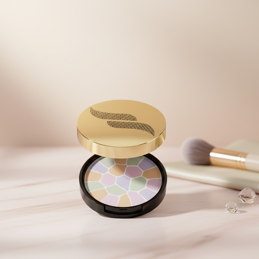
The visible product is a round compact cosmetic case with a hinged lid. The outer body appears to be a black circular base paired with a gold-toned top, while the interior holds a single pressed powder pan. The top surface shows a mosaic or cracked-tile style pattern in pastel shades, which gives the product a more decorative, limited-edition feel than a standard flat powder cake.
That combination is useful in retail for one simple reason: it suggests care. The buyer may not know the formula, but the package tells them the item was designed with presentation in mind. In cosmetics, that matters. A compact built around elegant style can help a brand occupy the middle ground between everyday utility and giftable appeal.
Why the compact format keeps showing up in face powder products
Round compacts have endured because they are practical. The hinged lid is easy to open and close, the single-pan layout is familiar to shoppers, and the format travels well in a purse or makeup bag. For face powder, setting powder, or powder foundation, that portability is often part of the value proposition.
Manufacturing-wise, the compact and the pressed powder are really two related decisions. The outer case has to protect the product, tolerate handling, and look consistent across a production run. The powder filling has to press cleanly, hold its surface, and survive shipping without crumbling. When a decorative top pattern is involved, there may also be extra complexity in how the shades are arranged or layered. That is not always a problem, but it is worth checking whether the aesthetic effect affects fill consistency or waste.
Selection points buyers should not skip
Case quality and closure feel
With any compact, the hinge and closure deserve attention. A lid that opens too loosely or snaps too hard can make a product feel off-brand, even if the formula is fine. Buyers should ask for sample units and test them repeatedly. It is a small detail that becomes a big complaint if shoppers carry the item daily.
Surface finish and visual consistency
The black-and-gold scheme seen here is a classic retail choice, but it only works if the finish is consistent. Glossy surfaces show scuffs more quickly. Satin finishes can hide wear better but may look less luxurious under store lighting. The decision depends on the market, not just taste.
Powder appearance and stability
The patterned pressed top is attractive, but it also raises practical questions. Is the pattern decorative only, or does it reflect multiple shades or zones in the formula? Either way, buyers should verify that the pattern remains intact after vibration, transport, and shelf time. Decorative press work can be a selling point, but it should not translate into a fragile surface that chips before the product is even opened.
Common mistakes when sourcing this kind of product
One common mistake is treating packaging as a separate purchase from the formula. In practice, they should be evaluated together. A dense powder can behave differently in a shallow pan than in a deeper one. A more ornate lid can add visual value, but if the case is too bulky, the product loses its portability.
Another mistake is assuming that a decorative compact automatically fits a premium position. It may look premium, but if the closure feels generic or the print quality slips, the illusion breaks quickly. Buyers should keep an eye on the details that customers touch first: edge alignment, hinge resistance, and how the lid looks after a few openings.
What this style is best for
This compact format fits retail display, daily facial makeup, and on-the-go touch-ups. It also works well for seasonal launches, shade stories, and limited editions where presentation carries extra weight. For brands competing in crowded cosmetics aisles, a compact with elegant style can help create a cleaner shelf presence without needing a complicated package structure.
Still, there is a practical caution: decorative design should not crowd out usability. If the compact is beautiful but awkward in the hand, the consumer will notice. That is especially true for daily-use powder products, where convenience tends to matter more after the first purchase than at the first glance.
A buyer’s quick checklist before moving to production
Ask for confirmation of the compact material, hinge performance, closure feel, and the visual consistency of the powder pattern. Review how the case sits on a shelf, how it opens in use, and whether the decoration survives normal handling. If the powder is intended for broad retail appeal, also make sure the visual language matches the target price band. A product can be elegant without being ornate, but it should look deliberate.
When a product like this is worth developing
If your goal is a portable powder product with a polished shelf presence, this format makes sense. The round compact is familiar, the black-and-gold palette is versatile, and the patterned pressed surface gives the item a more distinctive identity than a plain refill pan. It is a straightforward concept, but in cosmetics, straightforward often wins when it is executed well.
For teams planning a new launch, the next step is simple: compare sample cases, examine the closure under repeated use, and verify how the powder finish looks under real retail lighting. That is usually where the difference between “nice on paper” and “ready for market” becomes obvious.