Why round rigid gift boxes still matter in beauty packaging
When buyers search for MakeupReview, they are often looking for more than a pretty box on a shelf. They want to know whether the packaging supports the product, protects it in transit, and makes the brand feel worth opening. In beauty and gift retail, a round rigid box sits in that narrow space between display packaging and protective packaging. It has to look polished, hold its shape, and communicate value fast.
The round cylindrical format is especially common for cosmetics, fragrance, skincare sets, candles, and seasonal gift items. It is not a catch-all solution, and that matters. A rigid paperboard box can elevate a small consumer product, but only if the structure, graphics, and opening experience are aligned with the item inside. A box that feels premium but is awkward to pack becomes a cost center very quickly.
What this box format is doing on the shelf
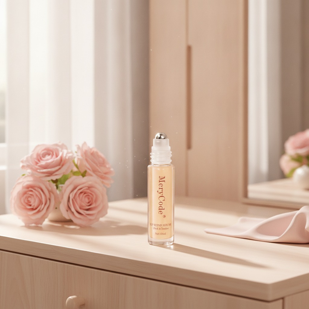
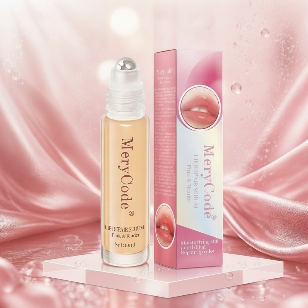
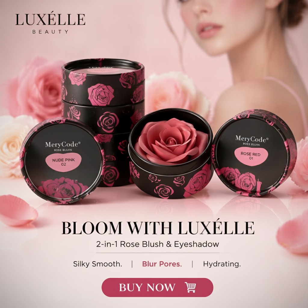
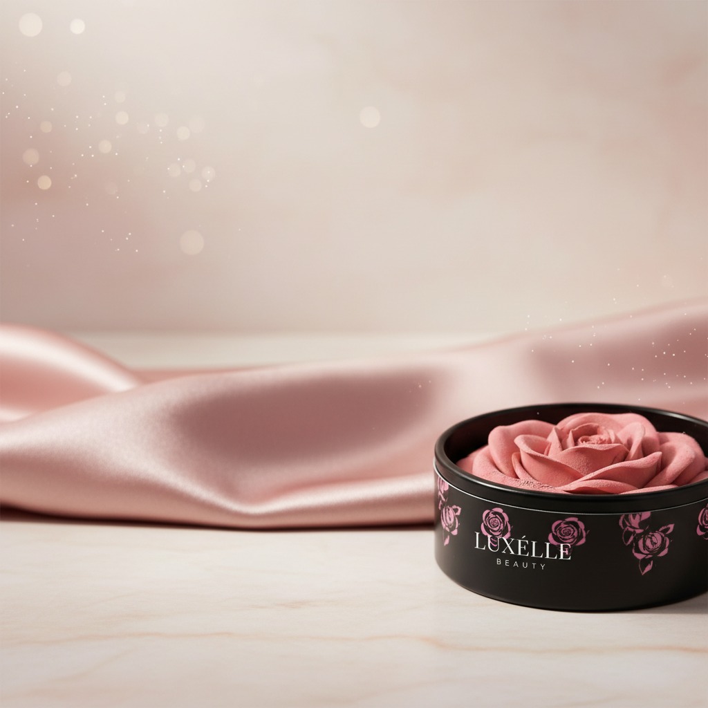
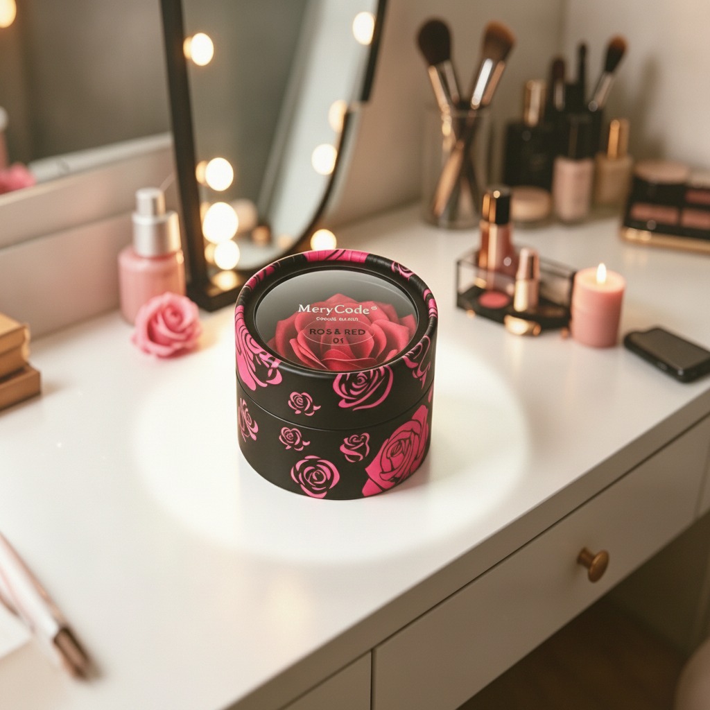
The visible example here is a short cylinder with a matte black exterior, bright pink rose graphics, and a centered transparent top window. Branding on the insert reads “MeryCode” and “ROS & RED,” which suggests a rose-themed beauty or gift presentation. The separate lid and base style gives the package a familiar rigid-box feel, while the round profile softens the look compared with a square carton.
That combination is useful for products that sell emotion as much as function. In beauty packaging, first impressions often do the heavy lifting. A customer may never touch the formula before deciding whether it feels like a gift, a treat, or just another commodity on the shelf. The window adds one more layer: it allows a logo, insert, or even part of the contents to be seen without opening the box.
Typical manufacturing approach for a rigid round cosmetic box
Based on the visible construction, this looks like a printed paperboard or cardboard box built through die-cutting, folding, gluing, and assembly of a lid and base. That is a standard approach in cosmetic packaging because it balances structure with brand-friendly print quality. The matte black finish and rose artwork suggest an outer wrap or printed board designed for retail appeal rather than plain transit use.
The transparent top element is likely a clear film or plastic window, though the exact material cannot be confirmed from the image alone. In practice, windows are used to showcase a product insert, logo disc, or a portion of the package contents. Buyers should be careful here: a window can improve shelf appeal, but it also adds another decision point around adhesion, scuff resistance, and how the box performs after repeated handling.
Where this packaging fits best
This style is especially suited to small-format consumer goods where presentation drives purchase behavior. Common use cases include:
Cosmetic sets and skincare gift packs
Fragrance and perfume presentation boxes
Candles or small home fragrance products
Seasonal promotions, Valentine’s Day items, and rose-themed collections
E-commerce gift packaging where unboxing matters
That said, it is not the best choice for every product. If the item is heavy, fragile, or requires a very tight internal fit, the buyer should review the internal support design rather than assuming the rigid shell alone is enough.
Selection criteria buyers should check before placing an order
Structure and fit
For any round rigid box, fit is the first issue. The outer diameter, lid depth, and internal support all affect whether the product sits securely. Since the exact dimensions are not provided here, sourcing teams would need a sample or drawing before locking in production.
Graphic treatment
The black-and-pink palette is doing a lot of brand work. It reads as feminine, seasonal, and giftable. That can be strong for one product line and wrong for another. A packaging buyer should ask whether the design supports the shelf environment, not just whether it looks attractive in isolation.
Window durability
A clear top window can help merchandise the item, but windows are also a common weak point. Scratches, clouding, or poor adhesion can make a premium box look tired before it reaches the customer. If the package is going into an e-commerce channel, this deserves extra attention.
Common mistakes with decorative rigid boxes
The most common mistake is overestimating what the outer shell can do. A rigid decorative box is not automatically a protective shipping box. It may need an additional mailer, insert, or corrugated outer carton for distribution.
Another frequent issue is designing for visual impact without considering assembly efficiency. Round rigid boxes can be more labor-sensitive than flat cartons, especially if the lid fit, window application, or insert placement is inconsistent. That becomes visible fast in production.
Practical buyer advice
If you are sourcing a package like this, ask for samples, confirm how the lid sits, and test the box with the real product rather than a placeholder. Check how the print looks under store lighting, because matte black and bright graphics can behave differently once they move from screen to shelf. And if the packaging is for a gift set, make sure the unboxing sequence feels intentional; otherwise the premium effect disappears in the first few seconds.
What this box helps a brand decide
For teams evaluating beauty packaging, the real decision is not just “Does it look good?” It is whether the box supports positioning, protects the product, and fits the channel. A round rigid gift box with a window can do that well for the right item, especially when the goal is to signal value and make the product feel presentable straight out of the carton.
If your product line leans toward cosmetics, fragrance, or giftable seasonal sets, this format is worth shortlisting. The next step is straightforward: request structural samples, confirm artwork placement, and test whether the package still looks clean after normal handling. That is usually where the real answer shows up.