When a matte powder blush is expected to do more than add color
In cosmetics, the first sale often happens before anyone opens the carton. That is especially true for matte powder blush, where shoppers judge the shade, the finish, and the package in a matter of seconds. A compact that feels quiet, clean, and controlled can make a powder product look more premium than a loud one ever could. That is why so many brands now think about packaging and presentation as part of the formula story, not an afterthought.
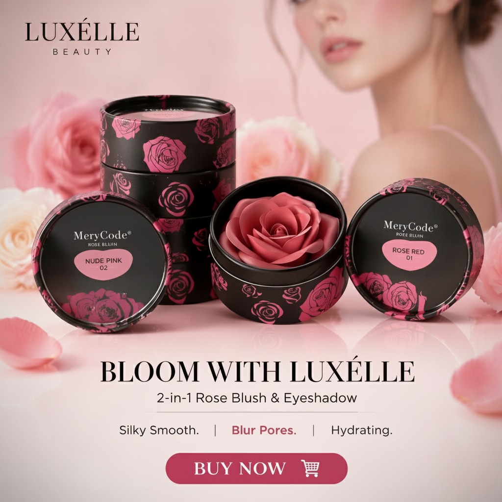
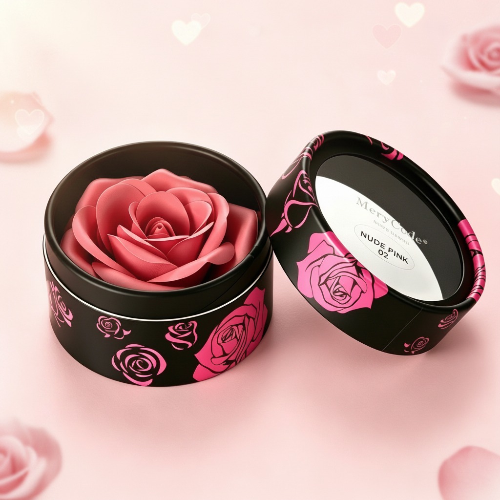
The round retail box described here is a useful example of that mindset. It has a black cylindrical body, rose graphics around the outside, a matching lid, and a white printed insert on top that reads “NUDE PINK 02.” Even without confirming the exact product inside, the visual language is clear: this is meant for gifting, display, or boutique shelf appeal. That matters because a blush buyer is not only choosing pigment; they are choosing a product that should look composed, feminine, and easy to trust.
What the buyer is really deciding
For sourcing teams and product teams, the question is rarely just “Will this package hold the item?” It is more often: will it protect the product, fit the brand, and survive handling without losing its look? In retail cosmetics, that decision can determine whether a matte powder blush reads as everyday make-up or as a small gift-worthy item. A rigid or paperboard presentation box with a removable lid can help create that pause at shelf level, where the hand reaches in before the mind finishes comparing prices.
The box style here suggests a display-first use case. The round form is less common than the standard square carton, which gives it a boutique feel. The floral print adds softness, while the dark exterior keeps the overall look controlled. For a blush line, that combination can support a color story without overwhelming it. There is a practical caution, though: decorative packaging should not make it hard to identify the actual shade, finish, or size. A beautiful box that hides too much product information can frustrate buyers at the point of sale.
Why matte finishes keep showing up in cosmetic packaging
Matte powder blush already carries a visual promise: soft color, low shine, and a more natural-looking finish on the skin. Packaging that echoes that same restraint often feels more coherent. A smooth matte-to-semi-matte exterior, like the one described, tends to communicate calm and modernity. It also avoids the high-gloss look that can sometimes make floral artwork feel too busy.
That said, matte surfaces are not automatically better. They can show scuffs, fingerprints, or abrasion depending on the coating and how the box is handled in transit. Buyers should ask how the printed surface behaves when stacked, boxed, and shipped. For a gifting product, even a small rub mark can change the perceived value more than a minor print variation ever would.
Packaging features that matter in real buying decisions
Round structure and lid fit
A two-piece round box can look elegant, but it also needs a lid that seats properly. If the lid feels loose, the product looks cheap. If it is too tight, warehouse handling becomes annoying fast. Those are the sorts of details that only show up once a buyer has handled samples and watched a team pack several dozen units.
Printed decoration and shade labeling
The visible “NUDE PINK 02” label is a small detail, but it is the kind that saves time in merchandising. Shade naming, batch coding, or variant numbering should be easy to read without crowding the design. For a matte powder blush line, that balance helps both retail staff and end users recognize the product at a glance.
Interior presentation
The dark interior and rose-shaped pink insert suggest a strong unboxing moment. Whether that inner item is a molded soap, wax piece, or another decorative component is not clear from the image, and it should not be assumed. Still, the lesson for cosmetic packaging is simple: the inside matters. Buyers remember how the product opens, especially when the outside box is being used as part of a gift or seasonal campaign.
Common mistakes buyers make with decorative cosmetic packaging
One common mistake is overcommitting to decoration before checking the functional details. Another is choosing a design that photographs beautifully but reads poorly under store lighting. A third is ignoring the relationship between the package and the product name. If the item is a matte powder blush, the box should not suggest a candle, soap, or unrelated gift object. That kind of mismatch can create confusion even if the design itself is attractive.
Another practical issue is reuse. Some brands hope customers will keep the container, but unless the construction supports that use, it is better not to imply it. If a box is for gift packaging or promotional display, say so clearly and let the presentation do its job.
A quick buyer checklist
Before placing an order, ask for a sample and look at four things closely: print consistency, lid fit, shade-label legibility, and how the exterior finish behaves after handling. Then compare the presentation against the price point of the blush itself. A premium-looking box can support a modest formula, but it cannot rescue one that performs poorly. The product still has to justify the packaging.
If your team is developing a matte powder blush line, start with the user experience you want at the counter or in the gift set, then work backward into the structure and decoration. A round floral box can be the right answer for a boutique collection, but only if the packaging aligns with the product story and the practical demands of retail.
Next step for sourcing and product teams
Use a sample review to test the full impression, not just the artwork. Put the blush, insert, and outer box together, then ask whether the set looks coherent from three feet away and whether the shopper can understand it in five seconds. That is usually where the real decision gets made.