Elegant Fashion Starts with Products People Can Actually Use
Elegant fashion is often treated like a runway concept, but in the beauty and accessories market it is really a question of function, finish, and presentation. A product can look refined on a vanity, photograph well in an e-commerce listing, and still fail if it is awkward to carry, messy to use, or difficult to merchandise. That is why a compact cosmetic palette in a gold-toned case matters more than it first appears. It sits at the intersection of elegant fashion, practical makeup use, and retail-ready packaging.
For sourcing teams, product developers, and brand owners, the real decision is not just whether something looks attractive. It is whether the item feels premium in the hand, protects the formula, and supports the way shoppers actually buy cosmetics today: online, on the go, and with an eye for presentation.
What This Type of Compact Communicates
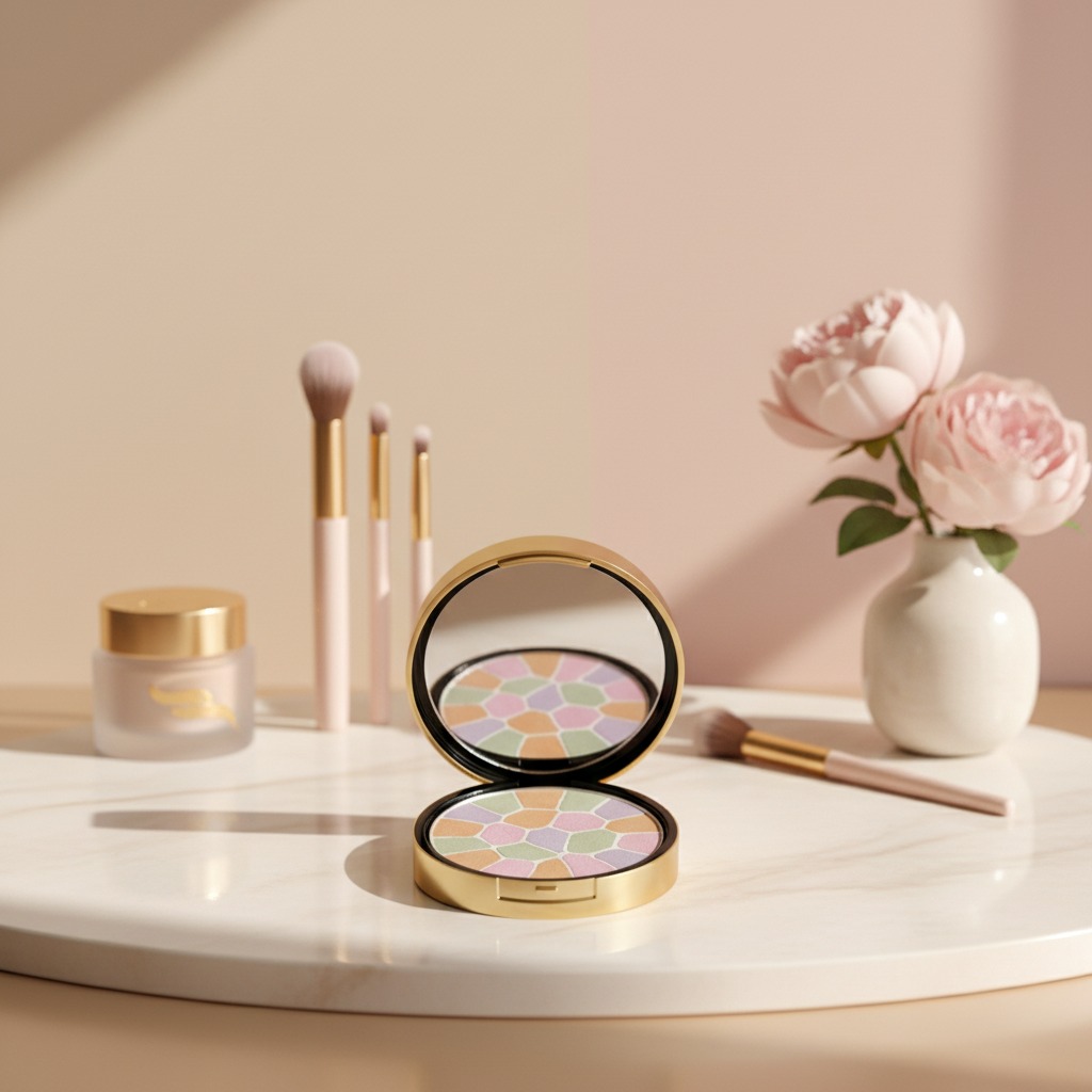
The visible product is a round compact with a metallic gold lid, a black base, and a hinged closure. That combination is familiar in beauty for a reason. Gold reads as polished and decorative; black keeps the profile grounded and more serious. Together, they signal a product that is meant to look neat rather than loud.
Inside, the multicolor pressed surface uses irregular pastel segments in pink, lavender, green, peach, tan, and cream. Even without knowing the exact formula, that mosaic-like layout suggests a complexion product designed for blending, brightening, correcting, or finishing. It may be pressed powder, blush, highlighter, or a color-correcting style palette. The image does not confirm which one, and that caution matters. In beauty manufacturing, surface appearance can hint at use, but it should never be treated as proof.
Why Packaging and Product Form Matter Together
A lot of buyers separate formula from packaging. In practice, consumers do not. If the case feels flimsy, the product is perceived as lower-end before anyone opens it. If the lid reflects light cleanly and closes securely, the palette instantly looks more suitable for gifting, counter display, or private-label retail.
The compact format also supports portability. That is not a minor point. Many beauty purchases are made with travel, touch-ups, and handbag convenience in mind. A palm-sized round compact is easier to carry than loose components, and the hinged design suggests repeated opening and closing without extra parts to lose.
Key Takeaways for Buyers and Brand Teams
If you are evaluating a product like this, focus on a few practical questions:
- Does the visual design support the brand’s version of elegant fashion?
- Will the compact protect the pressed product during shipping and daily use?
- Is the interior layout clear enough for customers to understand the product at a glance?
- Does the item look premium enough for beauty counters, marketplaces, and gift sets?
Those questions sound simple, but they drive conversion. A shopper scanning product thumbnails cannot inspect ingredient lists or texture claims first. They notice shape, color, and finish.
Manufacturing Considerations Behind a Mosaic Pressed Palette
From a production standpoint, a multicolor pressed palette usually requires careful powder filling and compaction control. Different shades need to sit cleanly in their own sections without collapsing into one another. That makes tooling, press consistency, and surface appearance especially important. The aesthetic result may look delicate, but the manufacturing process is rarely casual.
For private-label programs, this kind of format can be appealing because it creates visual value without relying on complex decoration. The product itself becomes the display. That said, buyers should be careful not to overpromise what the formula can do until the actual composition, performance, and stability are confirmed through proper testing.
Common Mistakes When Specifying Beauty Packaging
One frequent mistake is choosing a decorative compact that looks upscale but does not match the product’s intended market. A more refined finish can lift a mid-market item, but it can also clash if the brand language is very minimal or clinical.
Another mistake is assuming that a good-looking palette is automatically suitable for every sales channel. E-commerce listings need visible product detail, while store shelves need strong first-glance recognition. A compact with a dark rim and gold lid may photograph beautifully, but only if the logo mark and interior colors remain legible in standard product shots.
A small practical warning: when a palette uses light pastel shades, buyers should think carefully about how the product will appear after the first use. Smudging, dusting, and pan wear can change the perceived quality quickly if the formula or pressing is not consistent.
What This Means for Merchandising and Private Label
For beauty brands building an elegant fashion image, this kind of compact can fit several selling strategies. It can sit in a seasonal collection, a gift-oriented lineup, or a core cosmetics range aimed at everyday touch-ups. The round form is friendly and familiar, while the mixed-color pan gives it enough visual interest to stand out in a crowded category.
If you are sourcing similar items, ask for exact product specifications, formula details, and packaging options before moving toward artwork or launch planning. The image shows a portable cosmetic compact with a clear retail presence, but the final commercial success depends on much more than the lid color.
FAQ
Is this definitely a pressed powder palette?
Not necessarily. It appears to be a pressed cosmetic palette, but the exact formula is not confirmed from the image alone.
Why does the gold-and-black case matter?
It creates a polished, versatile look that fits many premium beauty lines without appearing overly ornate.
Can this style work for private label?
Yes, especially if the goal is a compact, retail-friendly item with a decorative but controlled appearance.
Next Step for Buyers
If you are considering a similar cosmetic compact for your line, request formula confirmation, packaging samples, and artwork-ready images before approving the final design. That is the safest way to protect both the brand story and the finished product on shelf.