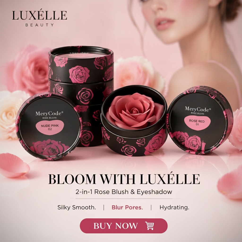
Why compact makeup packaging has to do two jobs at once
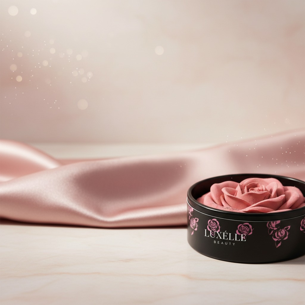
A good cosmetic compact is never just a container. It has to protect the formula, survive daily handling, and still look polished on a shelf or in a handbag. That is where refined aesthetics becomes more than a design phrase. In beauty packaging, it is the difference between something a buyer notices for a second and something they feel confident putting in front of customers.
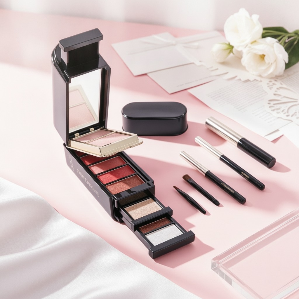
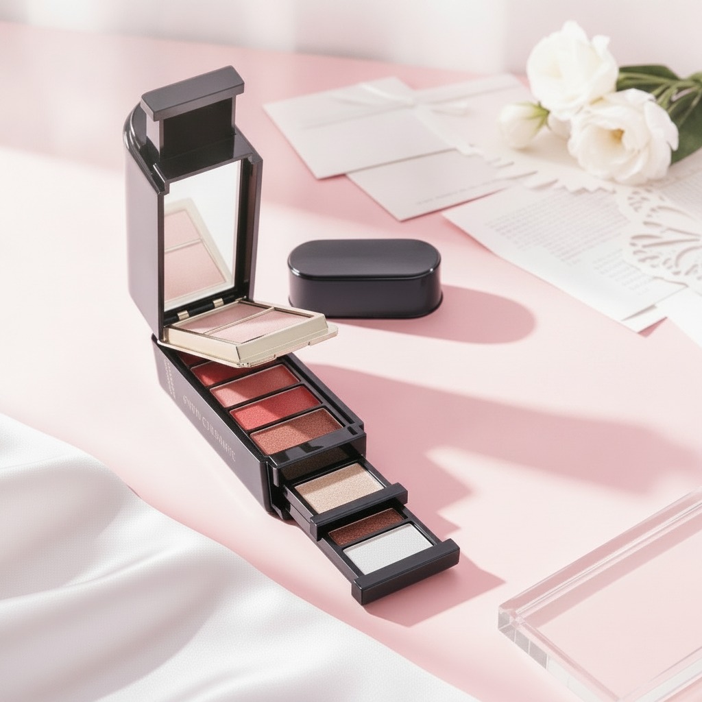
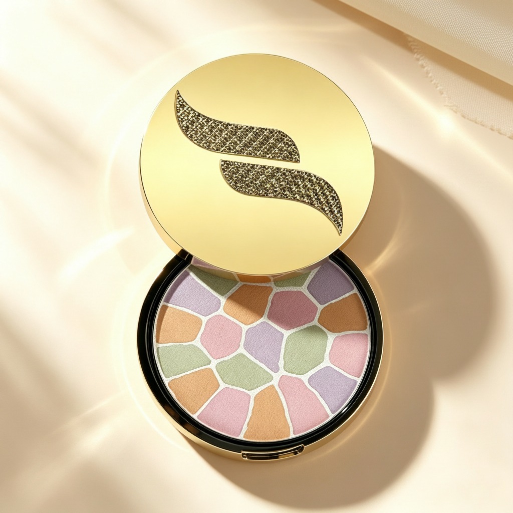
The round compact described here is a useful example. It pairs a gold-toned lid with a black base rim and a hinged clamshell structure, then adds a decorative top emblem and a segmented pastel powder surface inside. Even without knowing the exact brand or formula, the packaging signals a very common beauty brief: make the product feel premium, portable, and easy to trust at first glance.
For sourcing managers and product teams, the real question is not whether the compact looks attractive. It is whether that look supports the product’s use, filling process, retail position, and handling requirements.
What the design is trying to communicate
In cosmetics, visual cues carry a lot of weight. A reflective gold lid suggests giftability, premium positioning, or at least an attempt to stand above basic mass-market packaging. The dark base adds contrast, which usually helps the compact read as more defined and controlled rather than flashy.
The circular shape is also a practical choice. Round compacts are familiar, easy to open, and easy to carry. For pressed powder, face powder, or color-correcting makeup, the compact format supports a daily-use product that moves between vanity drawers, handbags, and travel kits. That portability matters more than some teams admit at the concept stage. A product that is inconvenient to carry often becomes a product people stop repurchasing.
The multi-shade, mosaic-like pan inside suggests blending, tone balancing, or a visually distinctive powder presentation. Whether the pattern is functional or partly decorative, it gives the product a more refined aesthetics profile and helps it stand out in crowded retail environments.
A simple guide to evaluating this type of compact
If you are comparing cosmetic packaging options or developing a pressed powder product, start with four basic checks.
1. Does the closure feel secure?
A hinged clamshell compact should open smoothly and close firmly. If the closure feels weak, the product may rattle in transit or open inside a bag. That is an obvious failure, but it is still one of the most common ones.
2. Does the exterior finish match the positioning?
A gold lid can work well for premium beauty lines, but only if the finish is consistent and visually clean. Any unevenness, visible scuffing, or low-cost plating look can undercut the entire design.
3. Is the interior suitable for the formula?
Pressed powders and multi-shade compacts need a pan layout that supports compacting, filling, and later consumer use. If the visible segmented surface is functional, the product team should confirm how the shades are divided and whether that pattern holds up during production.
4. Does the product size support the target use case?
A compact round case usually favors portability. That makes it a stronger fit for travel, touch-ups, and professional kits than for oversized vanity products.
Common mistakes when developing a cosmetic compact
One mistake is treating packaging and formula as separate conversations. They are not. The pan structure, fill behavior, and lid design all affect how the product performs after launch.
Another is overdesigning the outer shell and forgetting daily wear. Beauty packaging gets opened, closed, slipped into purses, and exposed to fingerprints. A reflective finish can look excellent in photography but less forgiving in real use if it shows smudges too quickly.
A smaller but important issue: decorative details should not interfere with handling. A textured emblem can add visual interest, but it should not make the lid awkward to wipe clean or hard to grip.
What buyers should ask before placing an order
Before moving ahead, ask for clarification on the exact product type, refillability, applicator inclusion, and the intended formula structure. In this case, those details are not confirmed, so a buyer should not assume the compact is refillable or that the mosaic pattern has a specific functional role without proof.
You should also confirm decoration consistency across samples. A compact can look excellent in a prototype and still reveal weak points in mass production, especially around lid finish, hinge action, and logo placement.
Practical takeaway for product teams
If you are designing or sourcing a compact cosmetic product, use the packaging to reinforce the actual user experience. The best beauty items feel coherent: the shape makes sense in the hand, the finish matches the market position, and the interior layout supports how the product will be used.
This kind of compact is aimed at buyers who want portability, visible shelf appeal, and a presentation that feels considered rather than generic. That is the real value of refined aesthetics in cosmetic packaging: it helps the product do its job before the customer even opens it.
Next step
For a packaging or product development review, ask for dieline details, material specifications, closure samples, and filling guidance before approving a final design. Small decisions here tend to show up later in returns, broken units, or disappointing retail presentation, and those are expensive fixes.