What a gender neutral beauty sampler set is really trying to solve
A gender neutral beauty sampler set is not just a prettier way to sell small cosmetics. It is usually a practical answer to a familiar problem: how do you let shoppers try color, texture, and packaging without forcing the product into a narrow gendered story? For sourcing managers, brand teams, and retail buyers, that matters more than it might sound. Sampling drives trial, trial drives repeat purchase, and the wrong presentation can limit the audience before anyone has even opened the compact.
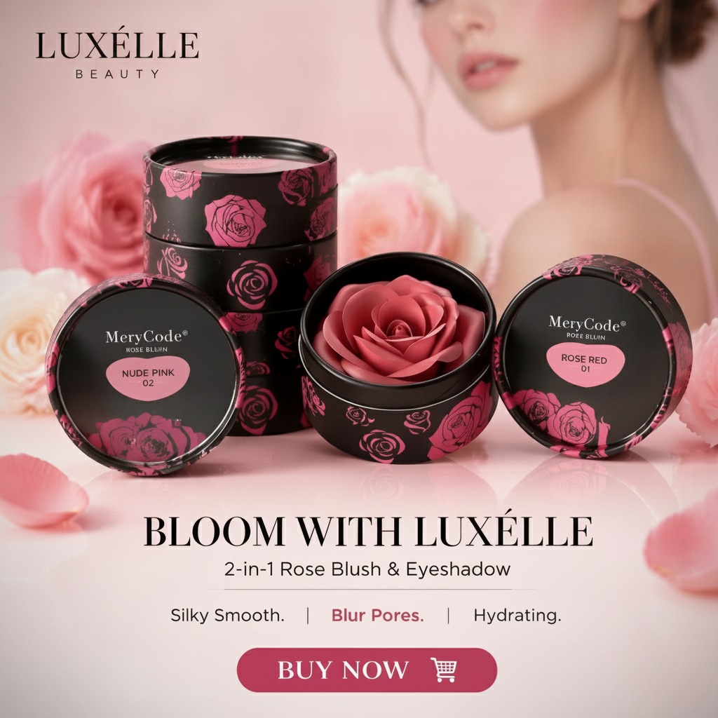
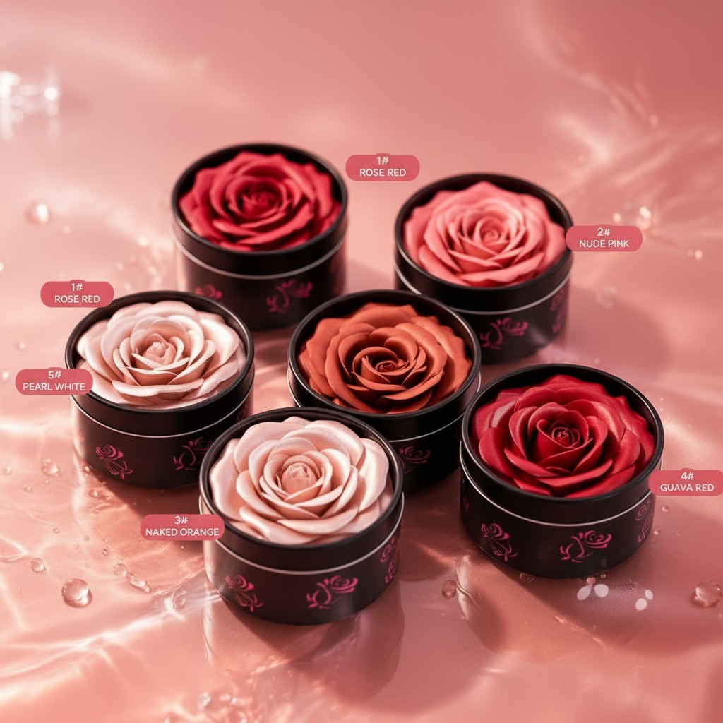
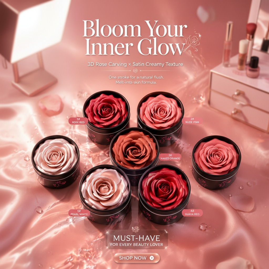
The product shown here sits squarely in that crossover space. It looks like a display-friendly face color item, likely a blush or cheek tint, with a decorative rose-shaped surface and five visible shade options: 1# Rose Red, 2# Nude Pink, 3# Naked Orange, 4# Guava Red, and 5# Pearl White. The visual message is soft and cosmetic, but not especially feminine in the old-fashioned sense. That is exactly why this type of set has become interesting to modern beauty buyers.
format matters more than the label
Beauty sampling used to be an afterthought: a sachet, a tiny pot, maybe a folded card with a color dot. That approach still works in some channels, but it does little for products where texture and finish are the main selling points. A satin-creamy cheek product needs to be seen. A decorative compact needs to be touched, or at least held long enough for the buyer to understand the value.
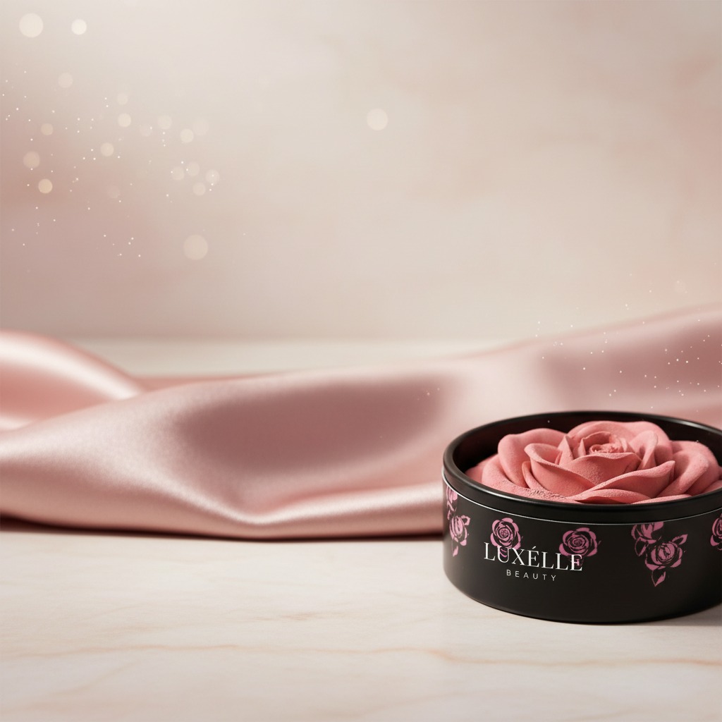
This rose-relief format does some quiet work on the shelf. It communicates craft, giftability, and a certain level of care in manufacturing. The “one stroke for a natural flush” and “melt-into-skin formula” claims suggest a product meant to feel easy and forgiving rather than technical or intimidating. For a sampler set, that ease is part of the business case. If the first interaction is simple, a wider audience will actually try it.
Behind the scenes: what this kind of cosmetic is built to do
The visible construction points to a pot-style color cosmetic with a molded surface rather than a loose powder. The rose shape is not just decoration; it signals a process that has to hold form, accept pigmentation cleanly, and still present a smooth, glossy surface. That combination is often harder to execute than a basic pressed powder, even if the final unit looks small.
A buyer looking at this type of product should think about three things:
1. Does the formula hold its sculpted shape during storage and transit?
2. Does the package protect that surface from scuffing or collapse?
3. Does the set make sense as a retail assortment, not just as a sample tray?
Those are not glamorous questions, but they are the ones that determine whether a concept becomes a sellable line.
What the five shades suggest about merchandising
The color range is useful because it covers more than one buying motive. Rose Red and Guava Red lean more expressive. Nude Pink and Naked Orange sound closer to everyday wear. Pearl White is the odd one out, and that can be a strength if it is intended as a highlighting or finishing shade rather than a cheek color in the strict sense. There is some ambiguity here, and it is better to keep that ambiguity in mind than overstate what the product is before confirming the seller’s intent.
For merchandising, mixed-tone assortments tend to help when the buyer wants a sampler set that feels complete without becoming overly large. A concise set can work in online gift bundles, counter displays, or limited-color launches where the brand wants to test which shades get traction first.
Selection criteria buyers should not skip
A gender neutral beauty sampler set can look polished and still miss the mark if the basics are weak. Before approving a production run, buyers usually want clarity on a few practical points:
1. Texture behavior
The artwork calls out a satin-creamy texture, but that should be treated as a presentation claim until verified in hand. Cream-like products can feel elegant, but they also raise questions around stability, temperature sensitivity, and transport.
2. Presentation quality
The compact design matters because the first sale is often emotional. If the rose mold is soft, uneven, or deformed in transit, the entire value proposition weakens.
3. Shade readability
A sampler set should make each color easy to understand at a glance. If all five shades blur together under store lighting, the set loses its purpose.
4. Packaging honesty
Do not assume the set includes applicators, mirrors, or refill functions unless they are clearly specified. That kind of detail gets missed more often than teams admit, especially in gift-oriented cosmetics.