What buyers really need to know about blush packaging and product format
When teams source blush for cheeks, the decision is rarely just about color. A rose-red compact may look simple on a shelf, but for product teams it sits at the intersection of formula, packaging, application feel, and retail presentation. The wrong combination can make a shade look flat, stain too heavily, or simply fail to translate from carton to counter. That matters whether you are building a private-label beauty line, assembling a gift set, or selecting a retail-ready SKU for a seasonal launch.
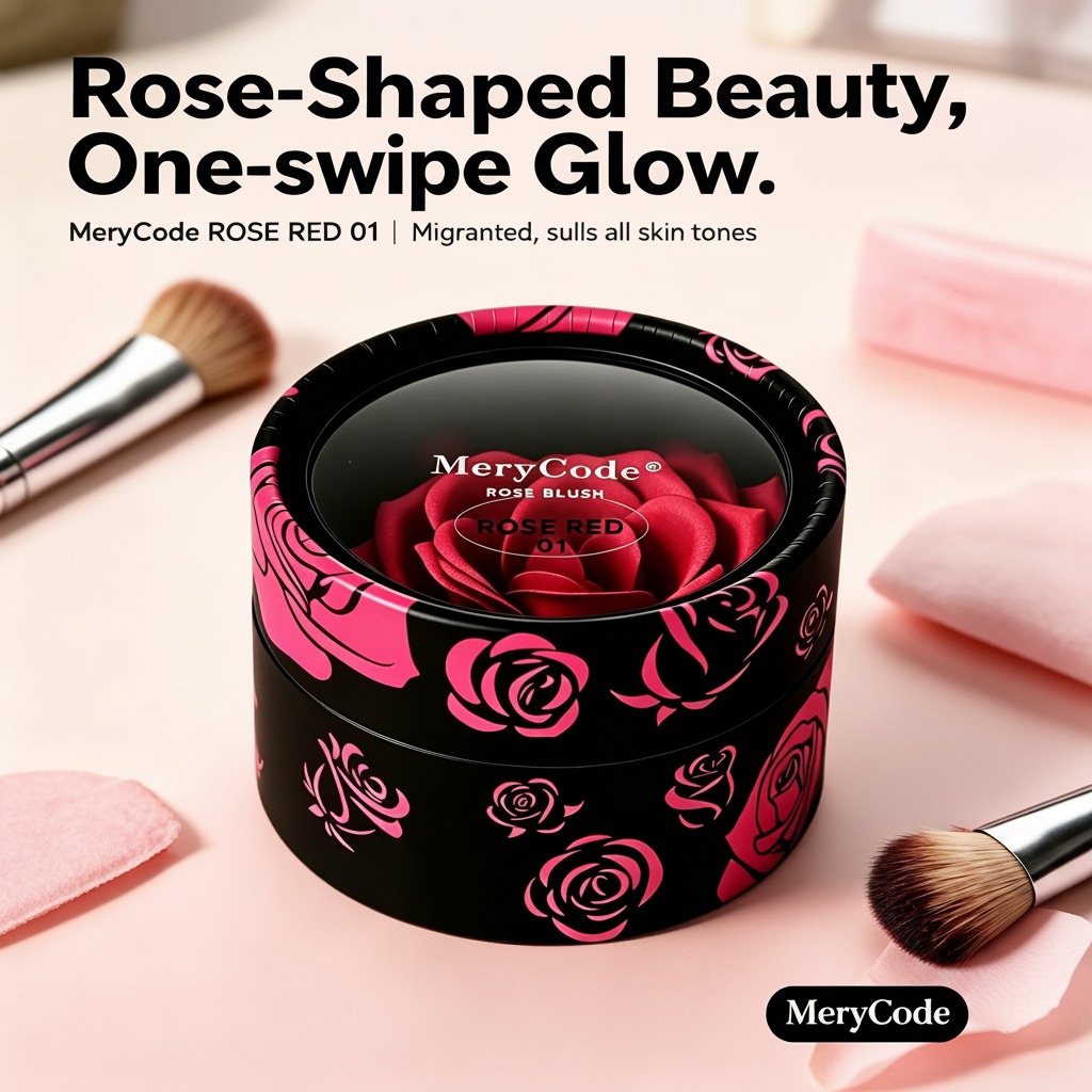
The product referenced here appears to be a round, black compact or jar-style cosmetic container with a clear top/window, rose graphics, and the shade marking “ROSE RED 01.” The visible design suggests a pressed or pot-style cheek color intended for one-swipe application, with a separate brush shown for use. The exact formula is not identifiable from the image alone, so it is safer to treat it as a color cosmetic platform rather than assume a specific powder or cream system.
Why format matters as much as shade
In cheek color, format affects both buyer experience and manufacturing complexity. A pressed blush typically favors clean pickup, consistent payoff, and a familiar retail feel. A cream or molded blush may offer a softer, more luminous look, but it usually asks more from the container seal, stability profile, and filling process. If the product is going into a round compact with decorative graphics, the packaging is doing real selling work before the customer ever tests the pigment.
That is one reason buyers should look past the rose motif and ask practical questions: How does the product pick up on the included brush? Does the surface embossing hold up through shipping and store handling? Is the lid closure secure enough for e-commerce? These details do not sound glamorous, but they decide returns, complaints, and reorders.
What the visible design tells you
The visible black cylindrical container with pink rose graphics signals a more giftable, decorative retail position than a bare functional pan. That is useful if the target buyer shops by look as much as by performance. The “ROSE RED 01” marking suggests a shade system with at least one defined color variant, which is helpful for line extension planning. From a sourcing standpoint, that also means the supplier likely understands shade control and printed-packaging coordination, even if formula specifics remain unknown.
The separate brush included in the scene is a small but relevant detail. Buyers often underestimate applicator choice. A brush can help the consumer use less product and build color gradually, but it also raises questions about hygiene, storage, and whether the brush matches the density of the blush surface. If the brush is too soft for a compacted surface, the experience feels cheap. If it is too stiff, it can disturb a molded finish or create dusting.
Selection criteria for sourcing teams
1. Shade behavior
Ask for drawdown samples under different lighting. Rose-red shades can skew warm, cool, or simply louder than expected once applied. The marketing phrase “suits all skin tones” appears on the product image, but that is promotional language and should not be treated as a verified performance claim.
2. Application profile
Buyers should decide whether they want a one-swipe color hit or a buildable wash. A retail line for broad consumer use usually performs better when the first pass is controlled. Heavy pigment can be an asset, but it can also make a shade unforgiving for casual users.
3. Packaging durability
Rigid plastic is a practical choice for many cosmetic formats, though the exact material here is not confirmed. What matters is resistance to scuffing, cracking, and lid looseness. Decorative lids look attractive in photos, but they need to survive bulk packing, shipping vibration, and repeated handling on shelf.
4. Product identification
Clear shade labeling, brand marking, and consistent graphic placement help retail operations and reduce warehouse errors. That is especially important when a line expands beyond one shade.
Common mistakes when buying cheek color products
One common mistake is overbuying based on visual appeal alone. A rose-shaped blush surface can be compelling, but buyers still need to verify payoff, fallout, and closure quality. Another is assuming a single compact style fits every channel. A prestige gift set and a mass-market checkout item do not want the same package finish or applicator approach.
Another practical caution: if the formula is highly decorative or molded, ask how it behaves after opening. Some products look refined in a sealed photo but lose their surface definition quickly in real use. That may not be a dealbreaker, but it should be understood before commitments are made.
Buyer-facing questions to ask before ordering
For sourcing and product development, the short list is straightforward: What is the exact formula type? What packaging material is used? Is the compact intended for refill or single use? How is the shade consistency controlled across batches? What is the intended consumer segment: everyday makeup, giftable beauty, or trend-led display?
If you are comparing suppliers, request photos, samples, and clear pack-out details. A cheek color product can be visually strong without being operationally strong. The best version does both.
Practical next step
If your team is evaluating blush for cheeks for retail or private-label use, start by separating the visual concept from the manufacturing requirements. Confirm the formula category, packaging structure, applicator fit, and shade naming before discussing shelf appeal. That sequence saves time, and in cosmetics sourcing, it usually saves money too.