Why SettingCakePowder is a different kind of compact
SettingCakePowder sits in that interesting middle ground between everyday face powder and a more specialized complexion product. From the compact design alone, you can tell it is built for more than a single flat shade: the interior shows multiple pastel cells, which suggests a blending or color-balancing purpose rather than a plain finishing powder. For buyers, that matters because the product decision is not just about color—it is about how the powder behaves on skin, how the compact presents on shelf, and how reliably the packaging protects a pressed cosmetic fill in transit.
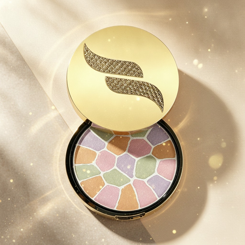
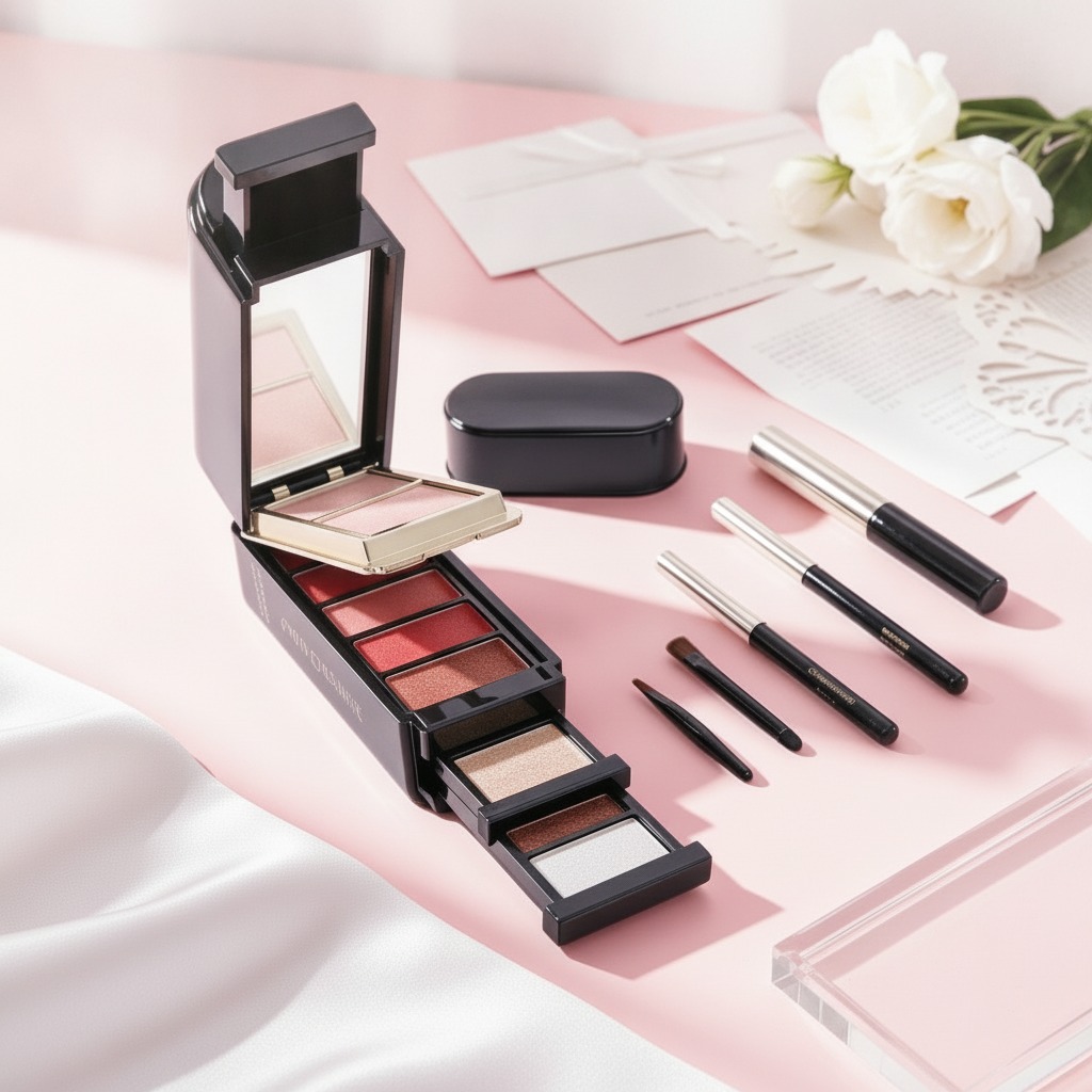
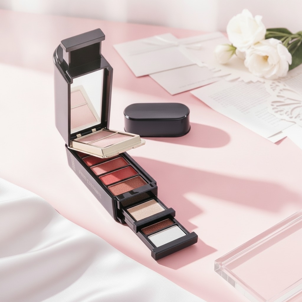
The visible format is a round cosmetic compact with a hinged case, a gold-tone lid, and a black base. That is a familiar retail silhouette, but the decorative embossed “S” emblem and the mosaic-like interior give it a more premium, almost collectible feel. In beauty packaging, those small visual cues can carry real weight. A consumer may never study the hinge specification or the mold geometry, but they will notice whether the compact feels sturdy, opens cleanly, and looks intentional rather than generic.
What the format tells sourcing teams
Even without a full bill of materials, the structure points to a conventional pressed cosmetic packaging route: an outer compact shell, a hinged closure, and an interior pan arrangement designed to hold a finished powder product. That is useful because it narrows the manufacturing conversation. Sourcing managers will want to separate the packaging questions from the fill questions early. Packaging performance is one set of decisions; the powder formula, pressing behavior, and shade layout are another.
The multi-shade interior also suggests careful handling during production. Irregular pastel segments tend to show defects fast. If the press is too aggressive, the surface can fracture or muddy the color boundaries. If it is too loose, the product may chip during opening, closing, or shipping. That makes consistency important, especially for a cosmetic item meant to look attractive right out of the box. A buyer evaluating SettingCakePowder should ask how the shades are formed, whether the pattern is decorative or functional, and what quality checks are used to keep each pan visually clean.
Why the visual layout matters
For products used in facial makeup application, the layout is not just aesthetic. A palette with several tones can support blending, correction, brightening, or soft-setting effects. The visible colors—pink, lavender, green, peach, and beige—are the kind of tones often associated with soft color correction and complexion balancing. The practical point is that a product like this needs to be easy for a consumer to understand at first glance. If the shade story is too vague, the compact may look pretty but fail to convert at shelf.
Buyer considerations before committing to production
For private label or retail development, the first question is whether the product is being sold primarily as a makeup utility item or as a decorative beauty accessory that happens to function as makeup. That choice affects everything from pack graphics to merchandising claims. The image suggests a visually polished compact, but the exact formula is not visible, so it would be risky to assume whether the fill is powder, cream, or another cosmetic medium. Buyers should confirm the product type before locking packaging decoration, because a compact that works for one formula may not be ideal for another.
Another practical caution: hinged compacts are only as good as their closure behavior. If the lid feels loose, the product can seem cheap even when the formula is decent. If the closure is too stiff, consumers may struggle with repeated opening. These are the kinds of small user-experience details that can decide whether a compact becomes a repeat purchase or a shelf casualty. It is one of those unglamorous truths of beauty manufacturing—packaging is part of the product.
Common mistakes when evaluating cosmetic compacts
One common mistake is focusing entirely on the exterior finish. A metallic-looking gold lid and textured emblem can sell the first impression, but the real durability question lies in hinge alignment, lid fit, and resistance to scuffing. Another mistake is ignoring how the interior surface will age. Multi-color pressed patterns often look strong in fresh samples and tired after distribution testing if the formula or pressing method is not stable enough.
Buyers also sometimes overlook how the compact will sit in a consumer’s hand. A round case may feel elegant and compact, but if the opening mechanism is awkward or the case is slippery, the user experience quickly weakens. For a face product, usability is not optional. People tend to notice poor packaging right when they are in a rush, which is usually the worst possible time.
Practical next steps for product teams
If you are assessing SettingCakePowder for sourcing or retail development, start with three checks: confirm the formula type, review packaging durability, and decide whether the multi-shade palette is meant for correction, setting, or both. Then ask for samples that reflect real shipment conditions, not just display units. A compact like this can look refined in a photo and still reveal problems in handling, closure tension, or surface wear once it is moved around.
For teams building a beauty line, this kind of product can be appealing because it combines compact portability with a richer shade story than a single powder pan. That gives marketing more room, but it also raises the bar for consistency. The visual design has to support the product promise, not merely decorate it.
FAQ
Is SettingCakePowder definitely a pressed powder?
Not necessarily. The compact suggests a pressed cosmetic fill, but the exact medium is not visible and should be confirmed with the supplier.
What makes this compact notable?
Its circular hinged format, gold-and-black exterior, and multi-shade interior make it stand out from a single-color face powder.
What should buyers verify first?
Formula type, packaging fit, and whether the shade layout matches the intended makeup use case.
If you are considering a product like this for your beauty line, the best next move is to request a sample and evaluate both the compact feel and the fill performance under normal handling. With cosmetic packaging, the details are rarely decorative only—they usually decide the sale.