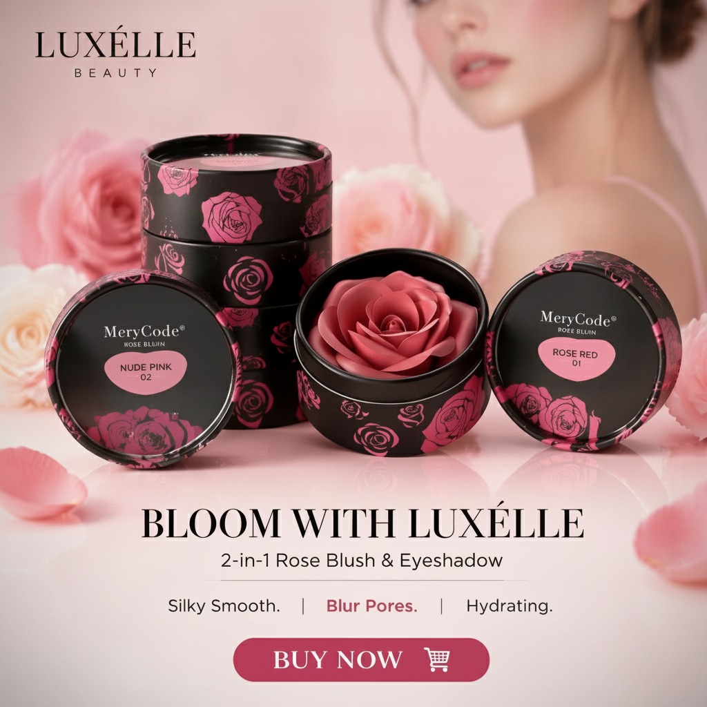
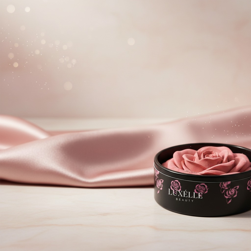
Why packaging like Merycode Beauty matters more than it first appears
When buyers look at merycode beauty packaging, they are usually not just judging a pretty jar. They are deciding whether a product will look credible on shelf, survive handling in transit, and communicate the shade or formula quickly enough for a shopper to trust it. In cosmetics, the container does part of the selling before the product is even opened. That is especially true for small cosmetic jars and pots used for face color products, where the package has to do several jobs at once: protect the contents, present the brand, and make the color easy to identify.
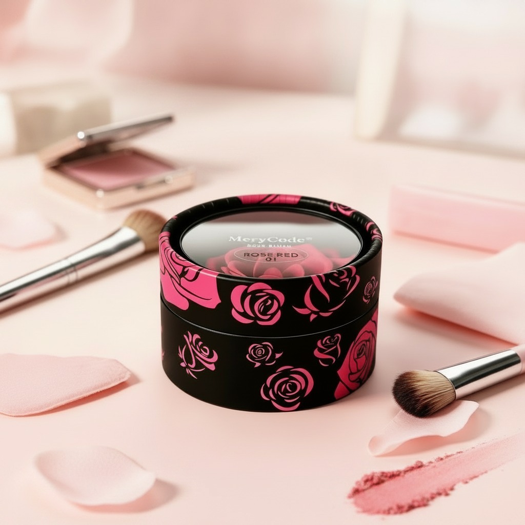
The visible design here is a compact cylindrical pot with a black exterior, pink rose graphics, and a clear flat lid area. The top marking shows “MerryCode” and “ROSE RED 01,” which is useful in a retail setting because it gives the buyer a fast read on the shade. That kind of clarity sounds minor, but anyone who has worked in cosmetic sourcing knows how often a vague label creates avoidable confusion later.
What this style of cosmetic jar is typically used for
This packaging format fits the kind of beauty items that are sold in small, attractive units: loose powder, pressed face powder, blush, pigment makeup, or similar color cosmetics. The product visible through the lid suggests the package is designed to show the shade rather than hide it. For beauty brands, that is a practical choice. Shoppers often want to see the tone before opening the package, especially when the product name includes a color reference like ROSE RED 01.
For sourcing teams, the key decision is not simply whether the jar looks good. It is whether the format matches the product’s handling needs. A low-profile pot may be ideal for compact retail presentation, but it also means the closure style, seal quality, and print durability need close attention. The image does not confirm those technical details, so a buyer would still need to verify them during sampling.
Visual cues that help sell a color cosmetic
The decorative body does a lot of work here. The black outer finish creates contrast, while the pink rose motif adds a softer, more feminine visual language. That combination is common in beauty packaging because it balances premium feel with immediate shelf appeal. The clear top helps the product code and visible shade read quickly, which can reduce confusion in retail display and warehouse picking alike.
There is also a subtle brand-management benefit. A package that uses a distinct pattern and a consistent shade code can make line extensions easier to shop. If a buyer later adds additional blush tones or pigments, the same visual system can be repeated without forcing the customer to relearn the brand. Small thing, but useful.
What buyers should check before placing a packaging order
For cosmetic packaging, the nice-looking sample is only the starting point. Before committing to volume, buyers should confirm the material family, print method, lid fit, and whether the container is suitable for the intended formula. The available data here does not specify exact composition or refillability, so those points should be treated as open questions, not assumptions.
Practical sourcing questions
Does the clear lid stay visually clean after handling? Will the printed rose artwork resist scuffing during cartoning and shipping? Is the shade label permanent enough for retail use? Can the package tolerate the product’s oils, powders, or binders without clouding, cracking, or staining? These are not glamorous questions, but they are the ones that separate a decent sample from a dependable production pack.
Common mistakes when evaluating small cosmetic pots
One common mistake is approving packaging based on the front-facing look alone. A jar that photographs well may still be awkward to fill, difficult to close consistently, or too fragile for high-volume distribution. Another mistake is ignoring how the visible product area will behave over time. If the inner cosmetic shifts, settles, or marks the lid, the retail appearance can change long before the unit is sold.
Buyers also sometimes overlook how the code and branding interact. “ROSE RED 01” is helpful because it is simple and direct, but only if the naming system is applied consistently across the line. In a multi-SKU program, naming discipline matters as much as decoration.
What this format offers beauty brands
For a brand selling face color products or giftable cosmetic sets, this kind of jar offers a straightforward mix of visibility and shelf presence. It is compact, easy to merchandise, and naturally suited to retail storytelling. The rose-themed graphics suggest a soft, polished identity, while the clear lid gives the customer an immediate sense of the shade. That is often enough to tip a buyer toward sampling the product, which is the first real test in cosmetics packaging.
If you are comparing packaging options for a launch or line refresh, start by asking whether the container supports the product, the brand, and the route to market. That may sound obvious, but packaging projects often fail when one of those three gets left behind.
Next step for sourcing and product teams
If you are evaluating a package in the merycode beauty style, request samples, confirm the unknown technical details, and test the jar under real handling conditions before you commit to production. A cosmetic pot can look elegant on a screen and still reveal weaknesses in the fill line, the carton, or the customer’s makeup bag. The right decision is the one that holds up after the product leaves the photo shoot.