Cheek Blush Packaging Does More Than Hold Product
Cheek blush is one of those categories where first impressions do a lot of heavy lifting. A powder, cream, or liquid formula may perform beautifully on skin, but shoppers often decide whether it feels premium before they ever open the box. That is why packaging matters so much, especially for brands positioning a cheek blush as a giftable item, a seasonal launch, or part of a coordinated beauty set.
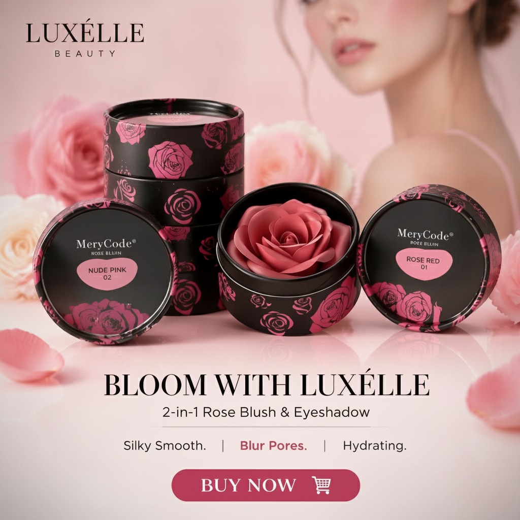
A rigid cosmetic gift tin, like the round metal container described here, is a practical example of how packaging can support the product story. The short cylindrical form, fitted lid, printed matte black exterior, rose graphics, and transparent top window all signal presentation value. For a buyer, the real question is not only whether the package looks attractive. It is whether that package helps the blush sell, travel, display, and survive normal handling without feeling flimsy.
Why Packaging Choice Changes the Buying Decision
In cosmetics, packaging does several jobs at once. It protects delicate product, communicates brand identity, and shapes the perceived value of the item. For cheek blush, this is especially important because the product is often judged visually. Color story, finish, and presentation all influence the purchase.
A printed metal tin can be a sensible option when the goal is to create a giftable set or a retail-ready presentation box. It gives more structure than a folding carton, and it has a more permanent feel than thin plastic trays. That rigidity can be useful for promotional kits, rose-themed collections, perfume samples, or small beauty assortments. It also works for desktop storage after the cosmetic product has been used, which is a small but real advantage for brand recall.
What the Visible Tin Suggests for Cosmetics Buyers
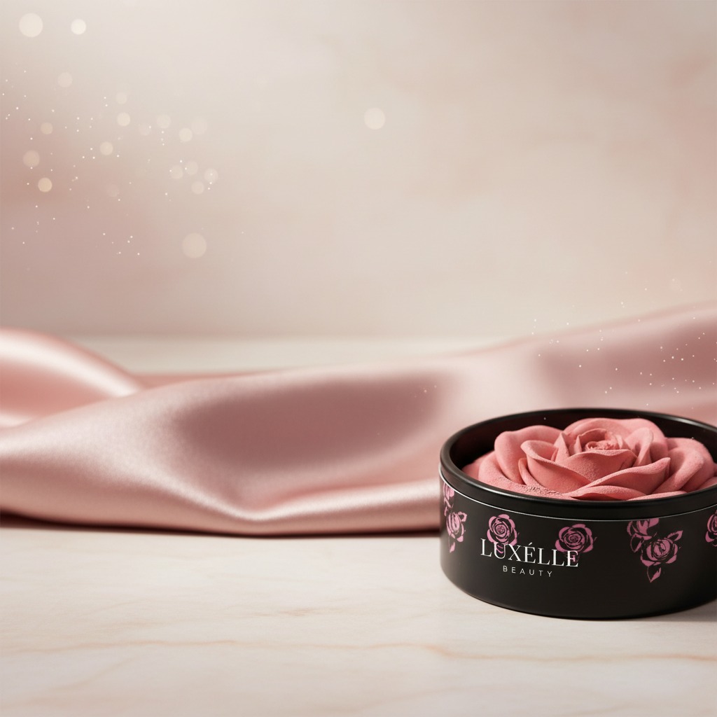
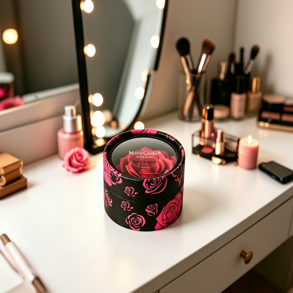
The container shown appears to be a round cosmetic gift tin with a separate lid and base. The fitted lid sits flush with the body, which helps the piece look clean and finished on a shelf. The printed rose artwork supports a soft, feminine product theme, while the dark exterior gives enough contrast for the graphics and label area to stand out.
The transparent top section is worth noting. Even without knowing the exact construction, a clear display area can help buyers preview the contents or reinforce the branding message inside. That can be useful for blush collections where shade identity, rose motifs, or gift presentation matter. It is a detail that feels minor until you compare it with plain packaging. Then the difference is obvious.
When a Rigid Tin Makes Sense for Cheek Blush
Not every blush needs a metal tin. In fact, many direct-to-consumer launches are better served by lighter, lower-cost packaging. But there are clear situations where a rigid container is the better trade-off:
It fits premium positioning. It supports gifting. It can protect small items during transit and retail handling. It can also be reused by the end customer, which many beauty brands now treat as a quiet bonus rather than a headline feature.
For a cheek blush set, this kind of tin is especially attractive when the product is bundled with applicators, mini skincare items, or a seasonal gift card. The box becomes part of the experience, not just a shipper.
Selection Criteria Buyers Should Keep in Mind
1. Decoration quality
Printed metal packaging needs crisp graphics and stable color reproduction. Rose artwork and logo placement should remain legible, even on curved surfaces. A design that looks polished on screen can disappoint once wrapped around a cylinder.
2. Closure feel
The fitted lid should open and close cleanly. Buyers should ask for samples and test the closure by hand, because a lid that feels loose or too tight can undermine the whole product.
3. Product fit
Cheek blush packaging is often limited by the size of the pan, insert, or accessory set. The tin must be specified around the actual fill format, not the other way around. This sounds obvious, but it is where many programs slip.
4. End-use expectation
If the tin is meant for retail display, the top label and window matter more. If it is meant for shipping kits, protection and stackability become the priority. A buyer should decide which role matters most before approving artwork.
Common Mistakes in Cosmetic Gift Tin Projects
The biggest mistake is treating the outer container as a simple decoration layer. In practice, structure, print placement, and closing behavior all affect how the pack performs. Another common problem is overcommitting to a decorative finish that does not fit the rest of the product line. A rose print can be elegant, but only if the brand can support that visual language across the blush compact, insert card, and shipper.
It is also easy to forget storage. Rigid tins are reusable, but they still need to be practical on a vanity or in a drawer. If the package is too bulky for the product inside, the perceived premium can turn into clutter.
Practical Buyer Advice Before You Approve Artwork
Ask for a physical sample if possible. Review the print on a curved surface, not just a flat mockup. Check how the label reads under normal retail lighting. Confirm that the window or clear top area does not create glare that hides the branding. These small checks save a lot of frustration later.
And if the tin is being used for cheek blush as part of a wider beauty gift set, make sure the packaging design matches the product promise. Consumers notice when a package looks expensive but the contents feel mismatched. That is a faster way to weaken trust than many brands expect.
FAQ: Cheek Blush and Cosmetic Tin Packaging
Is a metal tin better than a carton for blush?
Not always. A tin is usually better for premium presentation and reuse, while a carton may be better for cost control and lightweight shipping.
Can this kind of tin be used beyond blush?
Yes. The same structure can work for skincare samples, perfume promotions, small gift items, or mixed cosmetic sets.
What should a sourcing team verify first?
Dimensions, closure feel, print quality, and fit with the actual product insert should be checked first. Those details determine whether the pack succeeds in production.
What This Means for Your Next Launch
If your cheek blush line is meant to feel giftable, collectible, or display-worthy, a printed rigid tin deserves serious consideration. The right container can do more than protect the product. It can make the blush easier to merchandise, easier to remember, and easier to gift. That is not a small thing in beauty, where shelf appeal often decides the first sale.
For brands planning a new cosmetic package, the next step is simple: compare the visual concept against the practical requirements of the fill. Then request samples, inspect the print, and make sure the packaging earns its place on the shelf rather than just occupying it.