What a daily blush buyer is really deciding
When people look for DailyMakeup products, they are usually not just choosing a color. They are deciding how a cosmetic item will fit into a routine, how it will present on a shelf, and whether the packaging will support repeat purchase. That is especially true for a blush compact such as MeryCode ROSE BLUSH in ROSE RED 01, where the product has to do two jobs at once: provide a cheek color that feels wearable and look credible enough for retail or private-label sale.
For sourcing teams, that decision reaches beyond the shade card. You are comparing the visible packaging format, the likely filling process, label clarity, and the way the product communicates its use at first glance. In cosmetics, buyers often underestimate the packaging layer; then they discover that an attractive pan or jar means little if the closure feels loose, the print scuffs, or the shade naming is unclear on the shelf.
Why blush packaging matters more than it looks
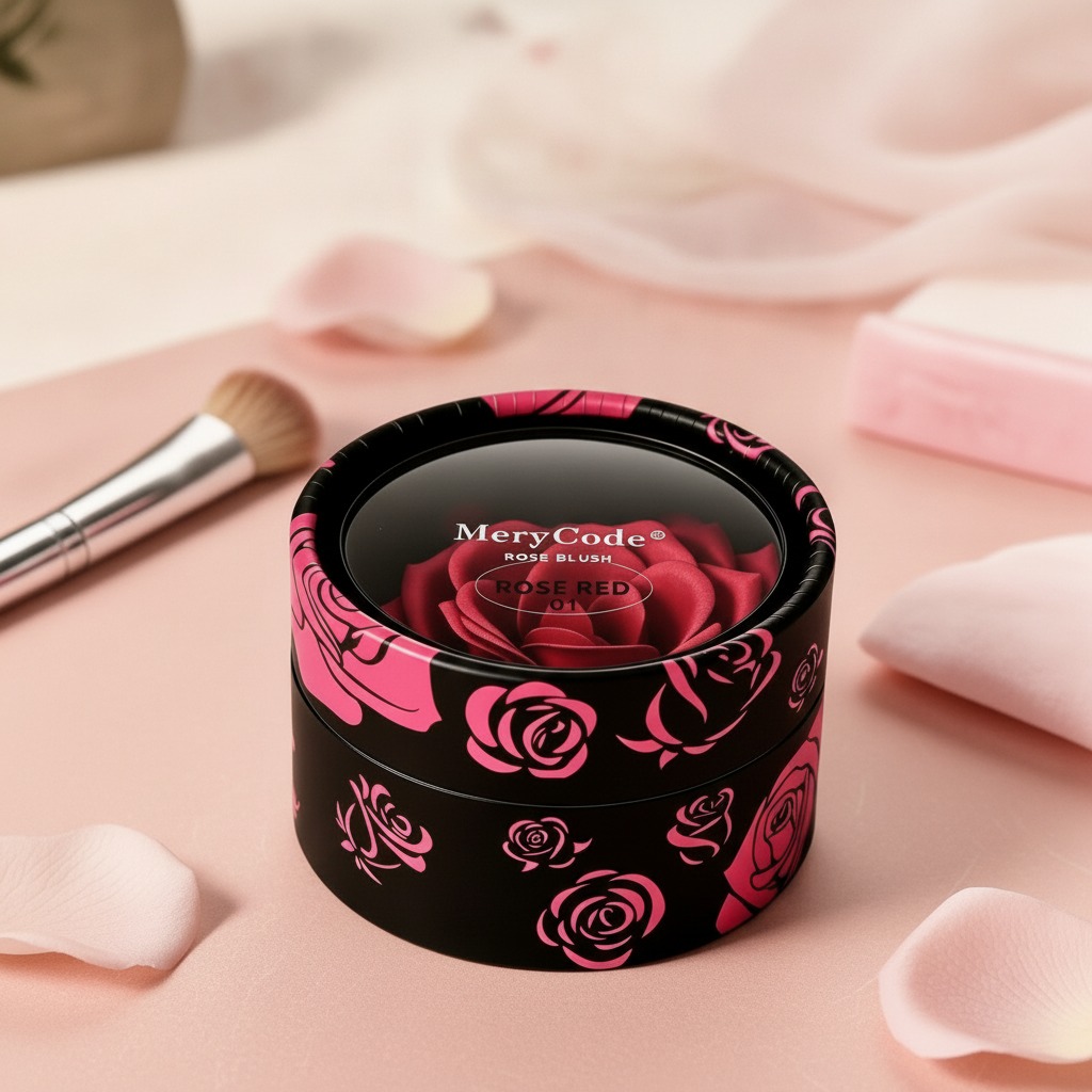
The product shown is a short, round compact or pot with a glossy black body and pink rose graphics around the side. Visually, it reads as a retail cosmetic item, not a backroom refill. That matters. In beauty, the container is not just protection; it is part of the product story. A floral motif and clear shade identifier can help shoppers understand the item quickly, which is useful in e-commerce thumbnails as much as in a physical display.
For a buyer, the practical question is whether the packaging supports the intended positioning. A compact with a decorative exterior can work well for gift sets, counter displays, or private-label lines aimed at everyday makeup use. But decorative finishes also create trade-offs. Printed surfaces can show wear, and a complex lid treatment may cost more to produce than a plain jar. That is not a flaw; it is simply the sort of detail that changes margins and order planning.
Quick read on the product format
Based on the visible information, this looks like a cosmetic blush pot or compact, likely a pressed-powder or cream-blush style product. The exact formula is not visible, so it would be a mistake to assume texture, wear time, or ingredient profile. Still, the outer design gives a useful clue: round, low-profile, and visually decorative, which fits a consumer beauty item meant for frequent handling.
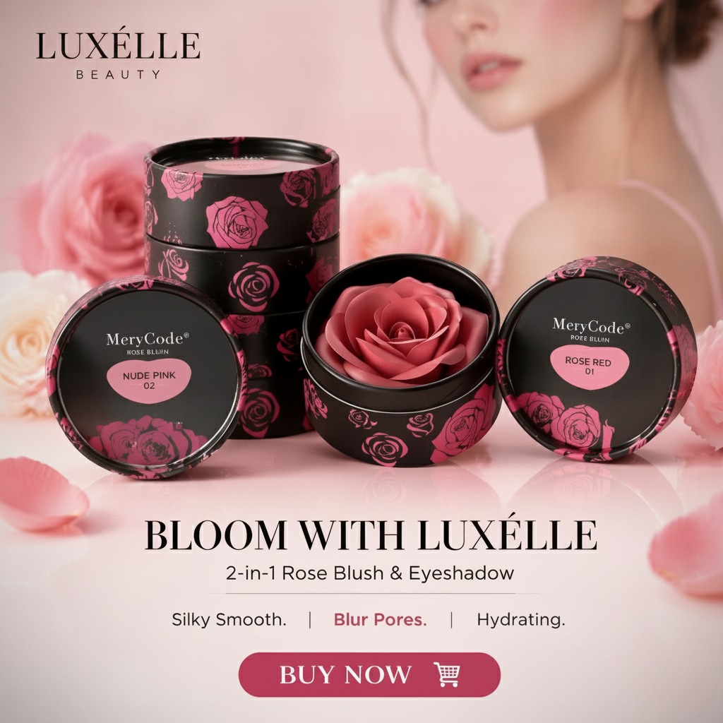
Visible marks such as “MeryCode,” “ROSE BLUSH,” and “ROSE RED 01” are the main commercial identifiers. Those matter because they help retailers organize assortment, and they help customers separate one shade from another without opening the package. There is also an unclear marketing phrase on the image that appears to suggest broad skin-tone suitability, but that should be treated cautiously unless it is confirmed by the supplier. In cosmetics sourcing, loose claims on artwork are common; verified claims are something else entirely.
What buyers should check before placing an order
Packaging construction
The container appears to be molded plastic, but exact resin, wall thickness, and closure type are not visible. For a blush compact, those details affect everything from shipping durability to how the lid feels after repeated opening. Ask whether the closure is snap-fit, threaded, or otherwise secured, and whether the finish will hold up under rubbing in transit.
Print quality and shade labeling
Shade name clarity is important in makeup sales. “ROSE RED 01” is understandable as a consumer-facing identifier, and it gives the buyer a clean SKU anchor. The pink floral side print also supports brand recognition, provided it is applied cleanly and consistently across a production run. Uneven decoration can make a small cosmetic item look cheaper than it is.
Internal product configuration
The interior is not shown, so there is no basis for assuming the presence of a mirror, applicator, or refill system. Those features can change package cost and assembly time substantially. If your channel depends on travel-friendly makeup, that distinction matters. If it is for a gift set, exterior appearance may carry more weight than added features.
Common sourcing mistakes with everyday makeup items
One common mistake is treating a blush compact as a simple commodity. It is not. The same shape can be used for powder, balm, or cream-based formulas, and the filling line, sealing method, and stability requirements can differ quite a bit. Another mistake is approving a sample only for color and ignoring packaging wear. Cosmetic packaging lives in handbags, display trays, and shipping cartons; it needs to survive all three.
Buyers also sometimes overlook the difference between retail-ready presentation and production-ready consistency. A single attractive sample tells you very little about the repeatability of printing, lid fit, or surface finish. For a DailyMakeup item intended for ongoing sales, consistency is often what protects the brand more than one standout prototype.
Practical advice for sourcing and merchandising
If you are evaluating a blush product like this for private label, start with the visible commercial basics: does the shade name read clearly, does the branding feel coherent, and does the package suit the channel? A compact with rose graphics can work nicely for beauty counters and e-commerce listings because the design communicates “color cosmetics” without much explanation. That is useful when product pages are crowded and attention is limited.
Ask for confirmation on the unknowns rather than guessing. Formula type, net weight, applicator inclusion, and closure design all affect the final buying decision. It is also sensible to request production photos or packaging proofs if the product is going into retail. A cosmetic item can look polished in a render and still disappoint once the printed surfaces, cap fit, or shade labeling are tested in real handling.
FAQ buyers usually ask
Is this a powder blush or cream blush?
The image does not confirm the internal formula, so that should be verified directly with the supplier.
Can the shade name be used for stock control?
Yes. “ROSE RED 01” is a practical identifier for assortment management and listing setup.
Is the packaging suitable for retail display?
Visually, it appears designed for shelf appeal, but final suitability depends on print durability, closure quality, and overall packaging consistency.
Next step for buyers
If you are building a DailyMakeup assortment or reviewing a blush line for private label, use the visible packaging as the starting point and not the finish line. Confirm the formula, closure, decoration method, and fill specifications before you commit. In cosmetics, the product that sells best is usually the one that looks good on the shelf, performs acceptably in use, and survives the practical realities of shipping and daily handling.