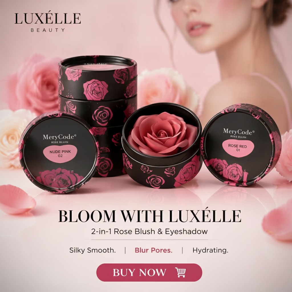
Why compact packaging still matters in color cosmetics
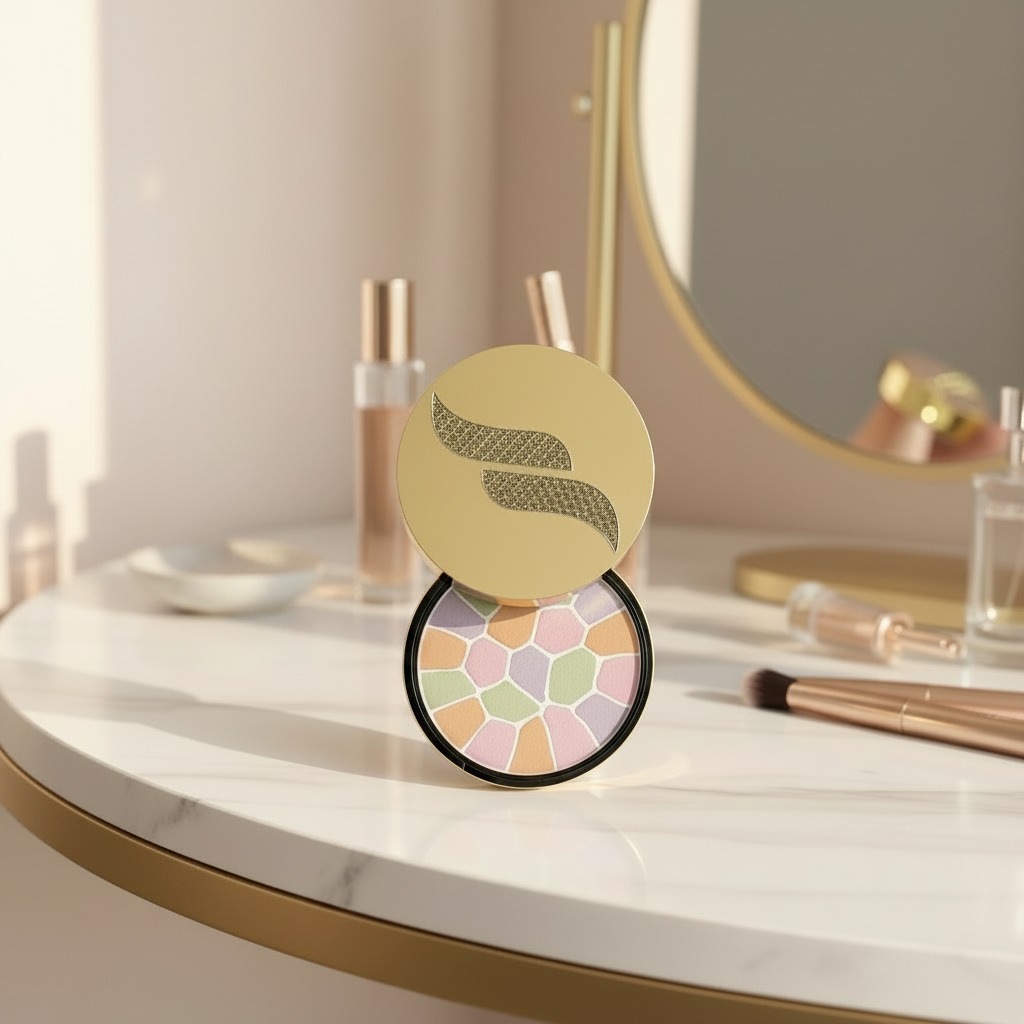
Elegance compact powder is the kind of product people notice for two reasons at once: the formula inside and the compact that carries it. In a crowded beauty aisle, a round compact with a gold-toned lid and dark base does more than hold powder. It signals portability, gift appeal, and a certain level of finish that shoppers often associate with polished personal care brands.
For engineers, sourcing managers, and product teams, the interesting part is not just the look. It is how the package supports the user experience. A compact has to open cleanly, close securely, survive handling in a handbag, and protect a pressed cosmetic surface from cracking or contamination. If the product is intended for touch-ups, travel, or premium retail presentation, those details quickly become commercial details too.
What the visible design suggests
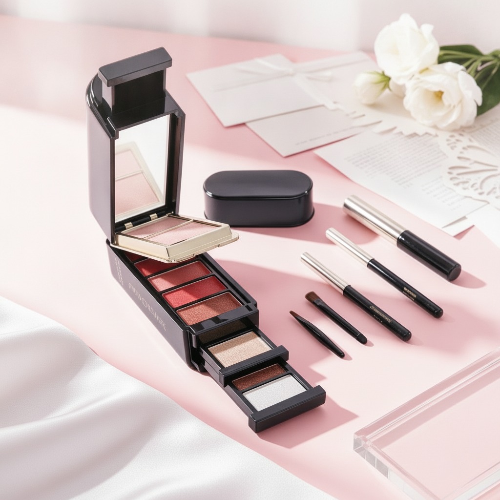
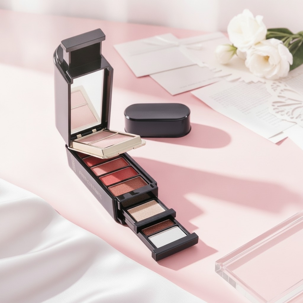
The visible product form points to a circular compact with a hinged two-piece structure. The lid appears metallic or metallic-coated, with a decorative logo mark, while the lower rim is black. Inside, the product surface shows pastel segmented sections or a printed mosaic pattern. That makes the item suitable for several cosmetic categories: pressed face powder, blush, highlighter, finishing powder, or a multi-shade complexion compact.
That uncertainty matters. Packaging and fill design are linked to the formula, and the formula drives nearly everything else: pressing behavior, breakage risk, consumer application, and even how the compact should be merchandised. A pale, multi-color surface can look premium, but if the segments crumble during transit, the visual advantage disappears fast.
Buyer decisions this type of product usually raises
When a brand reviews a product like Elegance compact powder, the core questions are practical ones:
Should the compact be positioned as a daily-use item or a giftable accessory? Does the visual design need to support a luxury cue, or is the main selling point convenience? Is the product meant to be refillable, or is it a sealed single-use presentation? And perhaps most important for private label teams, how much of the appeal comes from the decorative pan design versus the actual performance of the powder?
Those choices shape unit economics more than many new teams expect. Decorative compacts can justify premium shelf space, but only if the outer packaging, closure feel, and in-pan appearance match the brand promise. Otherwise the product can look attractive in a product shot and underdeliver in hand.
Construction and finishing considerations
Outer shell
A gold-and-black color scheme is a familiar premium signal, but it also hides and reveals wear differently than lighter finishes. Gold coatings can show scuffs if the surface treatment is too thin, and dark bases can highlight dust and fingerprints. For beauty packaging, that is not a minor cosmetic issue; it affects shelf presentation and return rates.
Inner pan and fill
Multi-color or segmented powders usually need careful pressing and stable adhesion to the pan. If the design is decorative, the printed or molded pattern must hold up through shipping, display, and repeated brushing. Brands often underestimate how much abuse a “pretty” powder top takes once it becomes a daily carry item.
Common mistakes when sourcing compact cosmetics
The first mistake is choosing packaging before defining the use case. A glamorous round compact is not automatically a good travel compact, and a travel compact is not automatically a good retail gift item. The second mistake is treating the visible design as separate from manufacturing feasibility. Deep embossing, delicate segment lines, or heavily pigmented pastel zones may look clean in renderings but be harder to press consistently at scale.
A third mistake is ignoring the opening action. If the hinge feels loose or the closure is unreliable, the whole product can seem cheaper than it is. That is especially true for compact cosmetics, where the user handles the package every day and judges quality in a few seconds.
Practical guidance for brands and sourcing teams
If you are evaluating Elegance compact powder for a private label line, start by deciding what the compact is supposed to do in the market. Is it a color product, a finishing powder, or a giftable beauty accessory with a strong shelf image? Then build the packaging specification around that answer.
Ask suppliers for clarity on the compact structure, surface finish, decoration method, and fill approach. If the inner design is meant to be segmented or mosaic-like, request production samples that show the actual pressed result, not just a prototype shell. For cosmetics packaging, the sample should tell you as much about manufacturing discipline as the sales sheet does.
What makes a compact worth putting on the shelf
A product like this succeeds when three things line up: the compact looks intentional, the powder performs predictably, and the package survives the realities of daily use. That balance is what buyers should be judging, not only the visual effect.
If your team is comparing compact formats for a new beauty launch, use the decorative design as one input, not the whole decision. The right compact is the one that still feels right after a week in a handbag, not just in a product photo. For sourcing discussions, that is usually where the real difference shows up.
If you are planning a private label cosmetic line or reviewing compact packaging options, start with the product’s actual use case, then match the design, fill, and closure to it. That sequence saves more trouble than chasing a pretty sample ever does.