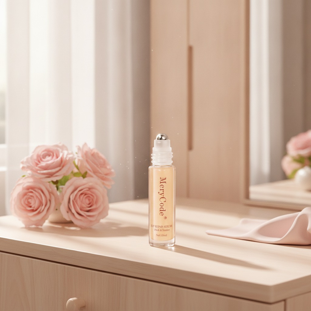
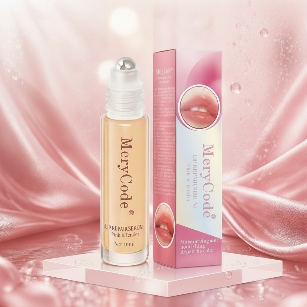
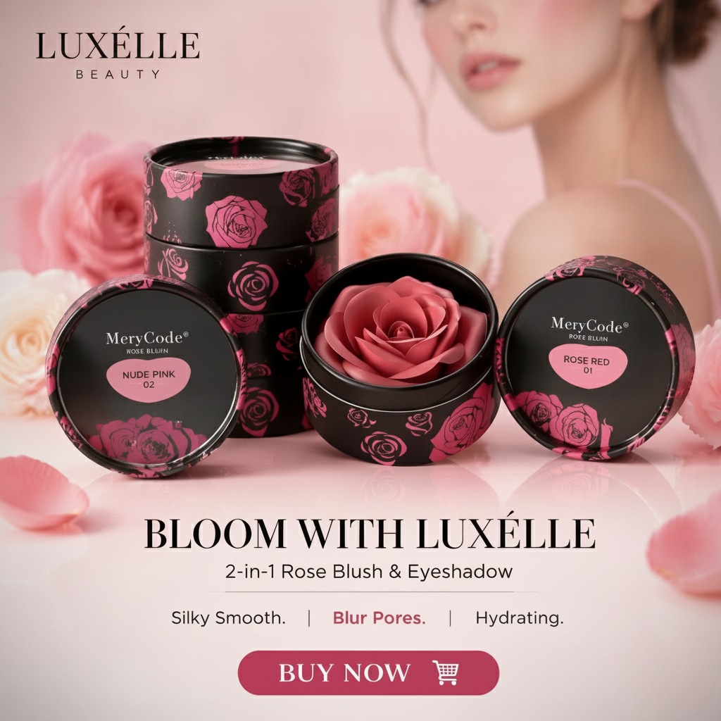
What buyers are really choosing when they specify an Elegance setting powder compact
When sourcing Elegance setting powder packaging or a finished cosmetic compact, the decision is rarely just about appearance. Buyers are balancing shelf appeal, product protection, portability, and the practical matter of how the compact will hold up after dozens of open-close cycles in a handbag or kit. That matters because a beautiful compact that scuffs easily, fails at the hinge, or sheds product dust creates returns fast, and beauty customers notice these failures immediately.
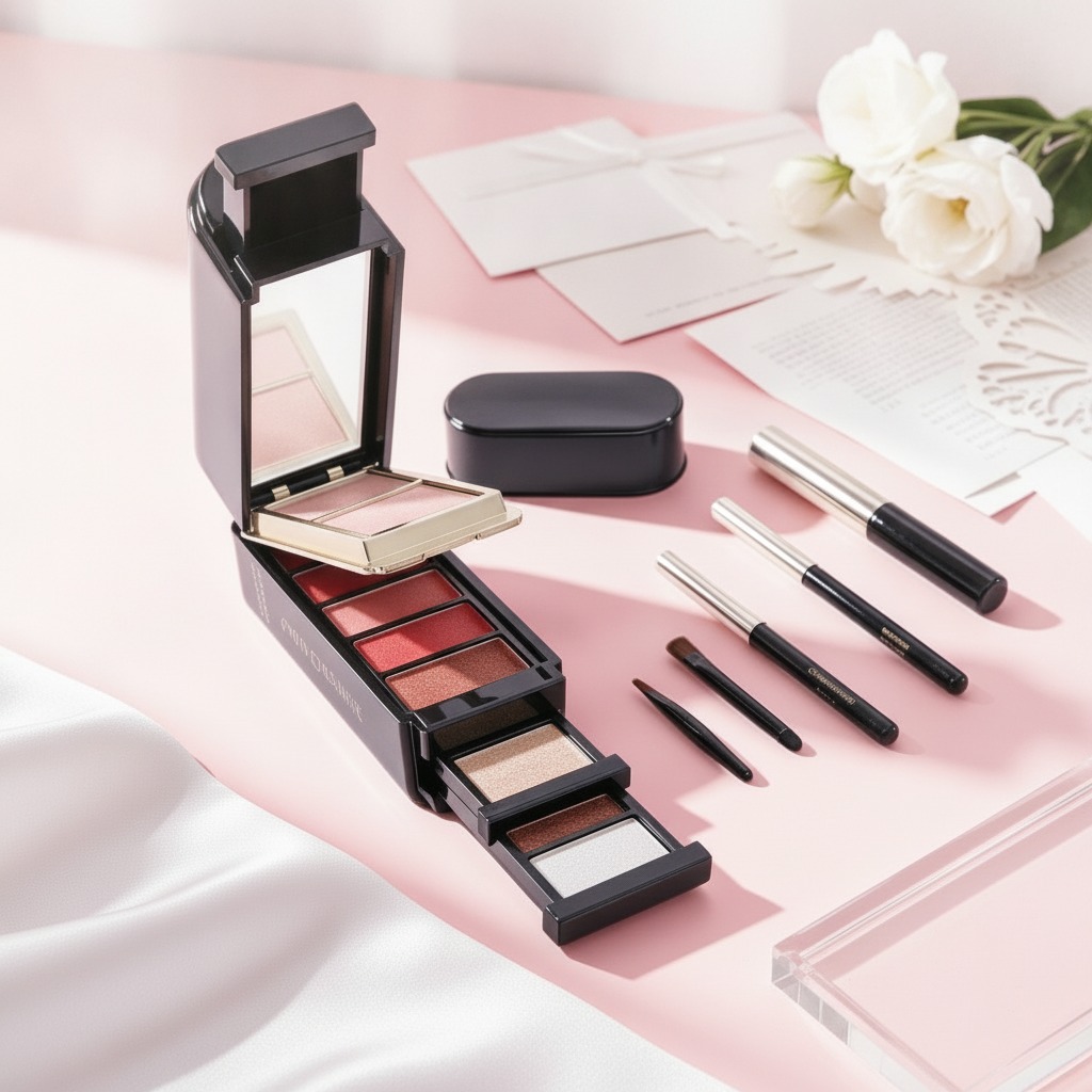
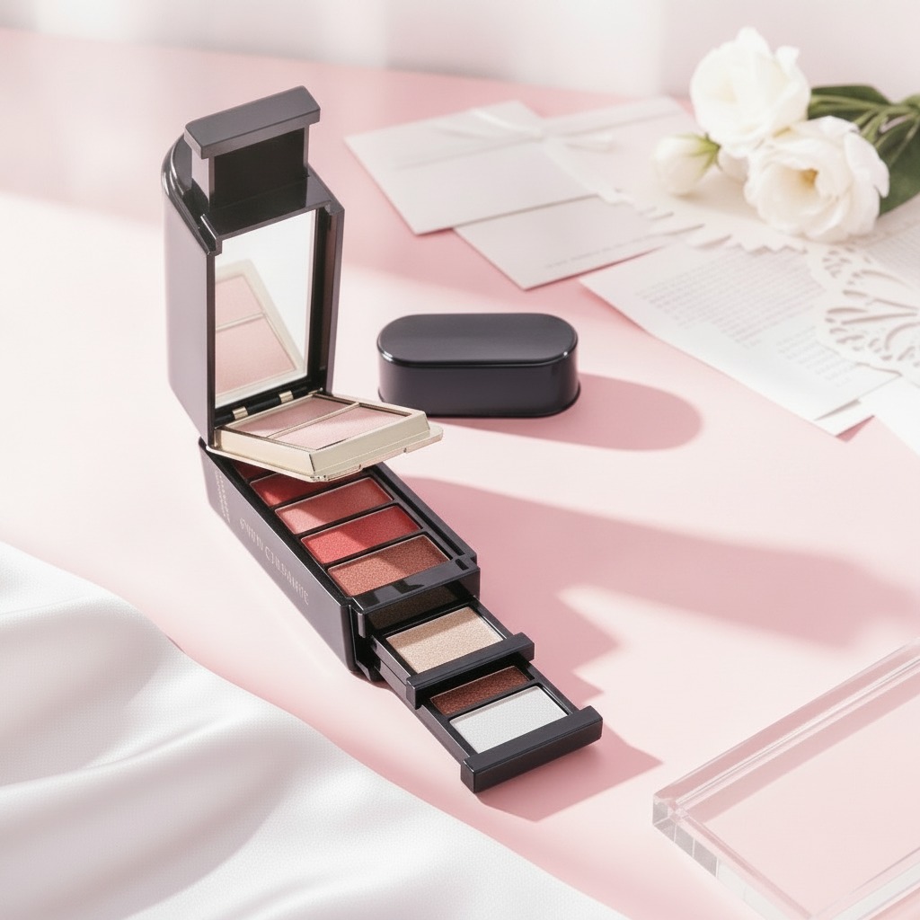
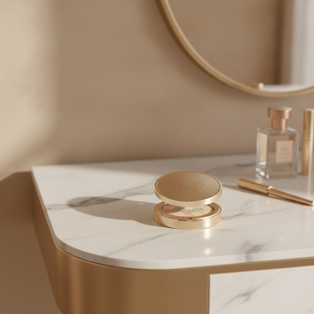
Based on the product details provided, this is a round, low-profile compact cosmetic case with a gold metallic-looking finish, a hinged clamshell structure, and a pressed powder pan inside. It looks suited to pressed powder, blush, highlighter, or eyeshadow applications, though the exact fill should be confirmed by the brand. For sourcing teams, the real question is not “does it look elegant?” It is whether the packaging supports the formula, the target price point, and the way the consumer actually uses the item.
Quick buyer takeaways
The compact appears to be designed for retail beauty presentation and repeated daily use. Its decorative top surface, circular footprint, and rigid case format point toward premium positioning or gift-set use. The visible multi-color pressed product inside also suggests a stronger visual merchandising role than a plain monochrome powder pan.
If you are comparing options, the most important checks are straightforward: case rigidity, hinge reliability, surface finish durability, closure feel, and how the pan is seated inside the housing. Those details often decide whether the packaging feels “premium” in the hand or merely decorative on a display tray.
Why compact construction matters in cosmetics packaging
Pressed cosmetics are sensitive products. They can crack under impact, shed powder if the fit is loose, and lose consumer trust if the lid does not close cleanly. A compact like this has to do several jobs at once. It must protect the pressed fill, provide enough convenience for touch-ups, and still look attractive enough to carry the brand story.
The visible hinge seam and snap or latch area suggest a standard reusable compact format. That is useful, but only if the closure is consistent. In beauty packaging, a weak latch is a small defect that becomes a big complaint. On the other hand, a well-tuned closure gives the consumer confidence every time they open the case at a mirror or in transit. Small mechanical details often matter more than the marketing copy around them.
Materials and finish: what can be inferred, and what should be verified
The product description points to a gold metallic-looking outer finish with smooth reflective surfaces. It may be molded plastic with a metallic coating or an aluminum casing; from the image alone, that cannot be confirmed. Buyers should resist the temptation to specify by appearance only. A metal-look surface can deliver a premium cue, but the underlying material affects weight, dent resistance, and cost structure.
The decorative dotted emblem on the lid also matters from a manufacturing standpoint. Raised surface detail can improve brand identity, but it can also show wear if the finish is thin or if the compact is handled frequently. For private-label brands, this is where a sample run is worth more than a rendering. A finish that looks rich in a catalog may not survive distribution cartons, store handling, and day-to-day use unless the coating process is robust.
How the pressed product changes the packaging brief
The inner pan shows a pastel geometric mosaic pattern in multiple colors. That is a visual clue that the fill may be intended for a more decorative powder product, possibly a face powder or eye color palette. Either way, the packaging needs to support clean product presentation. Pressed cosmetics depend on even compaction and secure seating in the pan, and the case should not flex enough to disturb the product during shipping.
For formulators and brand teams, the compact is part of the performance package. If the formula is soft, the case needs enough depth and protection to reduce damage. If the product is intended for touch-ups, the compact should open easily but not pop open in a bag. The balance is simple in theory and annoyingly easy to miss in practice.
Selection criteria for sourcing managers and product teams
1. User environment
Will the compact live in a vanity drawer, a gift box, or a daily carry pouch? A decorative gold case may be ideal for premium retail, but a more rugged finish may be smarter for travel kits.
2. Brand position
A visually rich compact works well for products meant to feel special at first touch. If the brand promise is minimalist and clinical, the same casing could feel too ornate.
3. Fill compatibility
The compact should match the product’s breakage risk, refill strategy if any, and applicator use. The nearby slim cosmetic tool in the image suggests a use case that may involve precision application or touch-up work.
4. Shelf presentation
Retail buyers often underestimate how much a compact’s top surface influences conversion. Metallic finishes, textured logos, and visible product color all affect perceived value before a consumer ever opens the lid.
Common mistakes when evaluating a cosmetic compact like this
One common mistake is treating a compact as if it were only a container. In reality, it is part of the product experience and part of the protection system. Another mistake is assuming a metallic-looking surface equals metal construction. That may be true, or it may not; the only safe path is to request material clarification from the supplier.
Buyers also sometimes overfocus on decorative elements and underfocus on functional checks. A good-looking hinge that fails after repeated cycles is not a good design. Likewise, a compact with a visually compelling lid but poor closure tolerances can leak dust during shipping. The cost of a few extra validation steps is usually much lower than a quality claim later.
Practical questions to ask before you place an order
Ask what the case is made from, how the finish is applied, and whether the product pan is intended for pressed powder, blush, highlighter, or shadow. Confirm whether the compact is refillable, even if that is not obvious from the image. Check how the closure performs under repeated use and whether the supplier can support consistent branding on the lid surface.
It is also wise to ask for samples under real handling conditions: pocket carry, carton shipment, and repeated opening. Cosmetic packaging often looks fine on a table and then behaves differently once it meets consumer life.
FAQ: Elegance setting powder packaging
Is this compact definitely for setting powder?
Not necessarily. The term Elegance setting powder can describe the product category or the intended use, but the visible compact could also suit blush, highlighter, or an eyeshadow palette. The exact fill should be confirmed.
Is the case metal?
That cannot be verified from the available information. It may be metal-look plastic or aluminum casing. Buyers should request material details from the supplier.
What type of brand is this compact best for?
It fits private-label beauty brands, gift sets, and retail products that want a decorative, portable presentation with a more premium feel.
Next step for buyers
If you are evaluating a compact like this for an Elegance setting powder line, start with a sample, not a spec sheet alone. Confirm the casing material, closure behavior, decoration method, and compatibility with your pressed formula. Once those basics are settled, you can judge whether the packaging is genuinely premium or just visually attractive in the first impression. That distinction tends to decide whether a product stays on the shelf or gets reordered.