When a cosmetic product has to look good before it even touches the skin

The phrase long lasting hydrating lip oil usually brings one thing to mind: a glossy, comfortable lip product that can hold up through part of the day without feeling sticky or drying. But in the real world of beauty manufacturing, that kind of product rarely stands alone. Brands often build an entire retail story around finish, portability, shade appeal, and how a product presents on shelf or in a social feed. A compact like the one described here — round, gold-toned, hinged, and filled with a mosaic of pastel powder segments — shows how much packaging and product design still matter in cosmetics, even when the formula itself is the main performance driver.
For sourcing teams and product developers, the useful question is not whether a compact is visually attractive. It is whether the format supports the intended use, whether the assembly is practical at scale, and whether the product category matches the brand message. That decision is especially important in beauty, where texture, packaging, and consumer expectation can drift apart quickly.
What the compact format tells buyers at a glance
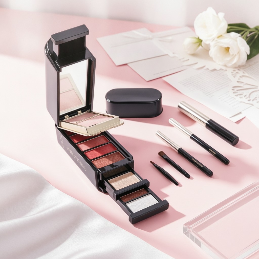
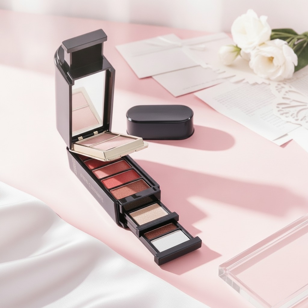
This visible product is a round makeup compact with a polished gold exterior and a hinged lid. Inside sits a pressed powder pan divided into irregular mosaic-like segments in pastel shades such as pink, lavender, green, beige, peach, and light yellow. That structure points to a product designed for more than a single flat color payoff. It may be used for finishing, complexion correction, or decorative face application, but the exact function cannot be confirmed from appearance alone.
What matters operationally is the format itself:
- Portable enough for retail and consumer use
- Suitable for visual merchandising because the multicolor pan is immediately noticeable
- Dependent on compact assembly quality, hinge durability, and lid decoration consistency
A buyer looking at a product like this should ask whether the visual design is intended to sell the first purchase, while the powder structure and performance secure repeat purchase. That split is common in color cosmetics. It is also where many private-label projects either become memorable or fade into generic shelf clutter.
Why formula and packaging have to work together
Cosmetic buyers sometimes treat packaging and formulation as separate stages. In practice, they are inseparable. A pressed powder product must survive compaction, transport, consumer handling, and repeated opening and closing without excessive crumbling or pan breakage. The compact case must protect the product while still feeling refined enough for the target price point.
The visible gold finish suggests a premium-leaning presentation, though that alone does not guarantee premium quality. The decorative engraved or inlaid marks on the lid also signal brand identity, which is often crucial in beauty. A decorative lid is not just ornament. It can be the difference between a product that looks mass-market and one that feels curated.
How this category fits alongside lip care products
It may seem odd to discuss a powder compact in the same conversation as a long lasting hydrating lip oil, but buyers in cosmetics rarely source one item in isolation. A brand planning a lip oil launch may also need face products that match its aesthetic, ingredient positioning, or seasonal campaign. A glossy lip oil and a pastel mosaic compact can sit in the same collection if the brand is building a softer, skin-friendly visual language.
That matters for merchandising. Consumers often buy across categories when the packaging cues are consistent. A line that balances lip comfort with complexion finishing products can feel more complete than a single hero SKU surrounded by unrelated items.
Selection criteria that save money later
Before approving a product like this for private label or retail development, sourcing managers should look beyond the sample tray.
Check the product story
Is it a setting powder, color-correcting powder, highlighter blend, or decorative face product? If the claim is vague, the regulatory and marketing teams will have to clean it up later.
Check the compact construction
The hinge, closure, and lid decoration need to survive shipping and store handling. A beautiful compact that opens too easily is a nuisance, not a feature.
Check consistency in the pressed pan
Irregular segments can be a visual advantage, but they also demand tighter process control. Uneven pressing, weak adhesion, or shade migration will show up quickly in production.
Common buyer mistakes
One frequent mistake is assuming the decorative pan layout is enough to justify a retail price. It is not. Consumers notice texture, payoff, and wear very quickly. Another mistake is approving packaging first and leaving formula development vague. That often leads to awkward compromises, especially if the product needs to fit a particular compact cavity or survive distribution without edge damage.
There is also a branding trap: many teams overbuild the packaging and underbuild the product story. In beauty, that usually means a good-looking sample and weak sell-through.
Practical next step for brands
If you are developing a beauty line, start by deciding whether your priority is lip comfort, complexion finishing, or a collection that links both. A long lasting hydrating lip oil may carry the daily-use hero role, while a compact powder product like this one can support the rest of the assortment with visual appeal and functional balance.
For buyers, the next step is simple: request a sample with the finished compact, confirm the intended claim language, and review how the product looks after handling and transport. In cosmetics, that early check often tells you more than a polished rendering ever will.