When a makeup gift set is doing more than looking pretty
A makeup gift set has to do two jobs at once: it needs to sell the idea of beauty in a few seconds, and it needs to survive the practical realities of shipping, stocking, and being opened by someone who may not know the brand yet. That sounds obvious, but it is where a lot of small cosmetic launches either get quietly elevated or slightly missed. The product may be solid, creamy, or pressed; the formula matters, of course. Yet for the buyer, the packaging often makes the first decision for them.
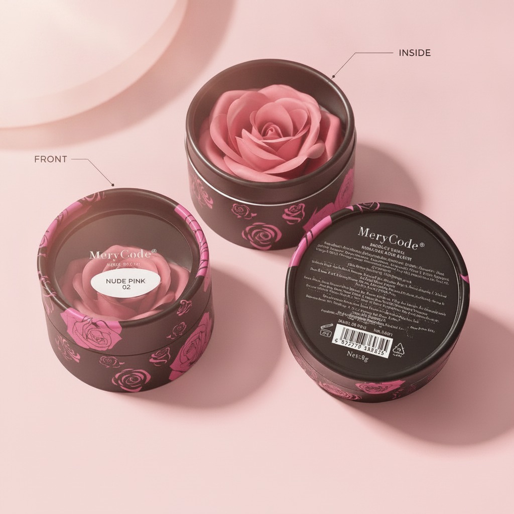
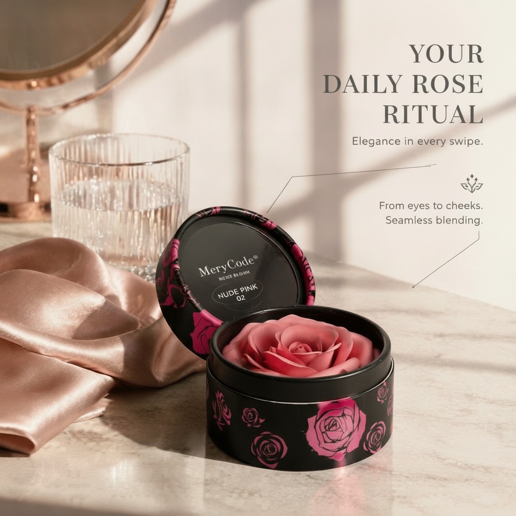
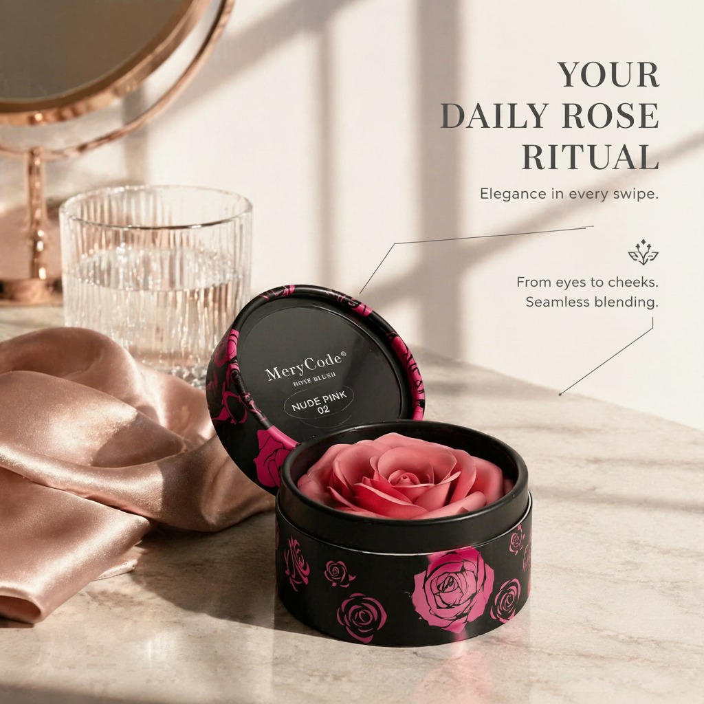
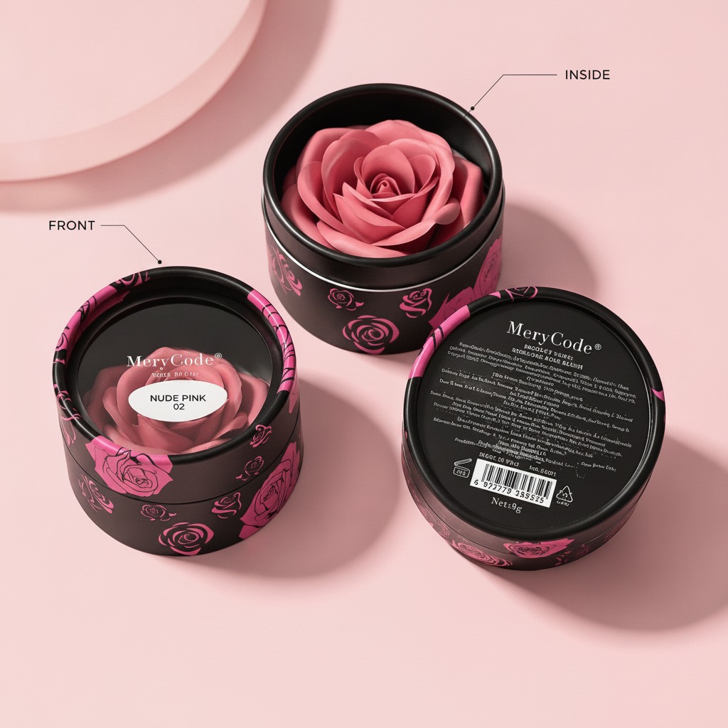
The example here is a good one to study because it is clearly built as a giftable beauty item rather than a plain refill. The visible MeryCode packaging uses a matte black cylindrical tin or rigid jar, printed with pink rose graphics and a shade callout reading “NUDE PINK 02.” Even before you know exactly what sits inside, the message is familiar: this is meant to feel collectible, display-worthy, and easy to give.
Why packaging matters so much in this category
In beauty, packaging is never just a shell. It shapes the perceived price point, the unboxing experience, and sometimes the buyer’s confidence in the formula itself. A round tin or jar can suggest a compact, controlled portion, which suits single-shade items, small-format cosmetics, and decorative products sold as gifts.
That matters because gift buyers shop differently from repeat users. A replenishment order is often driven by performance; a gift purchase is driven by presentation, shade naming, and whether the item feels “finished” enough to hand to someone else without extra wrapping. The black-and-pink contrast in this product does some of that work already. It reads feminine without being overly delicate, which is a useful middle ground for broad retail appeal.
What the visible details tell a sourcing team
There are a few practical clues in this product that are worth noticing.
The container appears to be a rigid cylindrical tin or jar, which is usually a sensible choice for small cosmetic solids because it offers decent shape retention and a premium feel without the fragility of glass. The matching lid helps create a tidy silhouette on shelf. The rose artwork around the sidewall adds decorative value, but it also increases the need for clean print execution; a soft or blurry floral print can make a product look cheaper than the formula actually is.
The internal product appears to be a molded rose shape in pink. That sort of form usually signals an intentional casting, pressing, or molding step. Buyers should treat that as a design feature, not just decoration. When the inner form is sculpted rather than plain, it becomes part of the product promise. The downside is that a decorative shape can be more sensitive to heat, pressure, or handling, depending on the material.
Where this kind of product fits in the market
A gift-oriented cosmetic item like this is often positioned for:
Seasonal retail
Holiday sets, Valentine’s launches, and limited-color collections often benefit from a distinctive format.
Entry-level discovery
If a brand wants to introduce a shade or finish without asking for a full-size commitment, a compact giftable unit makes sense.
Display-driven sales
Boutiques, beauty counters, and online listings all reward products that photograph well. The rose motif and the “NUDE PINK 02” label help create that quick visual read.
Selection criteria buyers should not skip
If you are sourcing a makeup gift set or any similar beauty compact, look beyond the artwork. Check whether the container closes securely and whether the lid alignment is consistent. Examine print durability, especially around edges and curved surfaces. If the product is meant to be mailed, ask how the pack performs under vibration and temperature fluctuation. A pretty jar that shifts inside its packaging can create avoidable returns.
You should also make sure the shade naming is clear. In this case, “NUDE PINK 02” is straightforward enough to support online merchandising, but shade confusion becomes a real issue when the color family is subtle. Small differences matter in cosmetics, and buyers do not like guessing.
Common mistakes with giftable beauty packaging
One mistake is assuming decorative packaging can compensate for weak product hierarchy. It cannot. If the brand, shade, and use case are not legible at a glance, the design is working too hard.
Another is overpacking a small item. Gift sets should feel substantial, but too much secondary packaging can raise cost, complicate recycling, and make the product awkward to store. There is a balance to strike, and it is usually gentler than marketing teams first imagine.
A third mistake is ignoring tactility. Matte black can look premium, but it also shows fingerprints and scuffing depending on finish. That is not a deal-breaker, just a buyer-facing warning worth testing early.
A practical buying takeaway
For sourcing managers and product teams, the right question is not only “Does this look attractive?” It is “Does this format support the formula, the price point, and the occasion?” This MeryCode-style tin suggests a product designed for gifting, shade visibility, and shelf appeal. That is useful if your launch strategy depends on quick recognition and a polished first impression.
If you are comparing options, ask for sample units, print proofs, and close-up photos of the lid fit and sidewall decoration. Small details decide whether a cosmetic gift item looks thoughtful or merely decorative.
FAQ: what buyers usually want clarified
Is this definitely makeup?
Not from the visible information alone. It appears to be a beauty or cosmetic solid, but the exact formula is not clear.
Why choose a cylindrical tin?
It offers a compact, gift-friendly form with a strong visual presence and generally good protection for a small-format product.
What should be confirmed before ordering?
Formula type, fill weight, print durability, closure performance, and packaging suitability for your sales channel.
Next step
If you are developing a makeup gift set or evaluating a similar packaged beauty item, start with the sample in hand. Check the closure, judge the shade presentation, and make sure the outer design matches the story you want the product to tell. That small round tin may be doing more of the selling than the copy ever will.