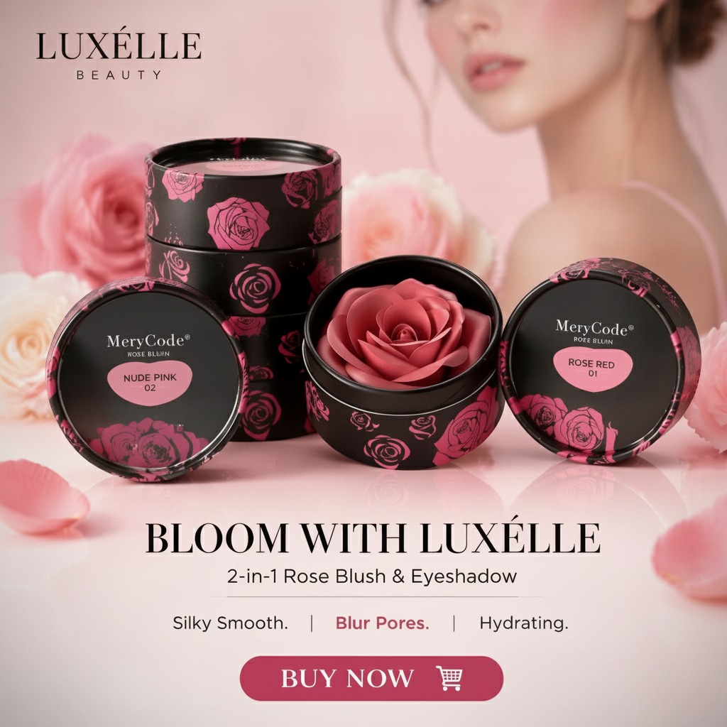
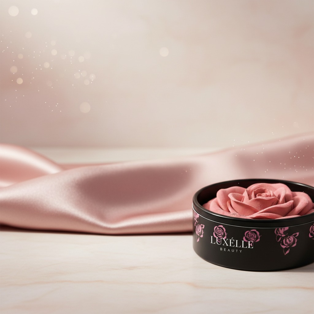
RoseBlush packaging and what buyers should notice first
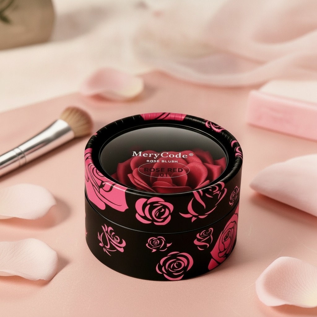
RoseBlush is the kind of cosmetic product that lives or dies by its first impression. In blush, the formula matters, of course, but the compact is the handshake. If a retail buyer, product manager, or private-label sourcing team is scanning a shelf or an online listing, the packaging has to communicate color, category, and brand personality almost immediately. Here, the visible cues are straightforward: a round compact-style container, a bold rose graphic, the MeryCode name, and the shade marking ROSE RED 01. That is enough to tell a shopper what the product is meant to do before they even open it.
That matters because blush is often purchased with limited handling. Customers see the lid, the artwork, the shade label, and maybe a thumbnail image on a product page. If the branding feels unclear, the product gets passed over. If the container looks tidy, portable, and easy to identify, it has a much better chance of ending up in a cart.
What the visible design says about the product
The RoseBlush pack appears to use a short cylindrical format with a fitted lid and a glossy printed exterior. That is a familiar structure in beauty packaging because it is compact, easy to display, and simple to place in a vanity drawer, makeup bag, or counter display. The rose artwork gives the pack a softer, more decorative tone, which fits a cheek color product well. Blush is not usually sold on utility alone; it is sold on mood, color, and presentation.
The top label is practical in a way some brands overlook. “ROSE RED 01” gives buyers a shade reference, which helps with both retail browsing and internal assortment planning. Even if the exact formula is not visible, the label creates a clear SKU identity. That may sound minor, but in beauty supply chains, small labeling decisions can make stock handling much easier.
Why the compact format still works
A round compact has a few advantages that keep it popular. It is portable. It feels familiar to consumers. And it offers a clean, contained surface for branding. For e-commerce, that can be a real plus, because the product silhouette is easy to photograph and recognize. The tradeoff is also familiar: if the packaging is too generic, the product can disappear among a crowded field of similar jars and compacts. RoseBlush avoids that risk by leaning into the rose-themed exterior.
For sourcing teams: what you can and cannot assume
One practical caution is worth stating plainly: do not assume more than the packaging shows. From the visible information, RoseBlush is a cosmetic makeup blush in a compact or jar-like format, but the exact formula is not confirmed. It could be pressed powder, cream, or another texture, and the finish is not identifiable from the packaging alone. The same caution applies to weight, refillability, applicator inclusion, and the exact container material.
That is not a problem if you are evaluating the item for merchandising or catalog purposes. It becomes a problem only if procurement, regulatory review, or launch planning starts leaning on assumptions. In cosmetics, packaging sometimes suggests a product type that the interior construction does not fully support. It is worth checking the technical pack before treating the item as a settled specification.
How a blush product like this is usually judged in the market
Buyers tend to look at three things first: shelf appeal, clarity of identification, and practicality. RoseBlush seems to score on all three at a glance. The rose imagery adds a feminine, giftable feel. The brand and shade name are readable. The compact shape suggests easy handling and low shipping complexity compared with more elaborate cosmetic packaging.
For beauty retailers, that combination is useful. It can fit a standard cosmetics aisle, a seasonal gift set, or a small e-commerce assortment. For private label teams, it also points to a packaging direction that is relatively safe: recognizable without being loud, decorative without becoming fussy.
Common mistakes when selecting blush packaging
One mistake is overdesigning the outer package so much that the shade information gets buried. Another is choosing a pack that looks attractive in the render but feels awkward in the hand. Cosmetics are tactile products, even when sold online. A customer still imagines opening the lid, checking the mirror or pan, and dropping the compact into a bag.
A second mistake is ignoring label hierarchy. If the brand name is visible but the shade code is hard to spot, replenishment and variant management become harder than they should be. RoseBlush gets that part right from the visible labeling: the product name and shade are easy to read.
Buyer takeaway
If you are evaluating RoseBlush as a retail item, sample product, or cosmetic packaging reference, the main value is in its clear, compact presentation. It signals a rosy cheek color product without requiring explanation, and the packaging style is familiar enough to fit mainstream beauty channels.
If you need to move from visual appeal to purchasing confidence, the next step is not guesswork. Ask for the full technical specification, confirm the formula type, verify the material and closure details, and review label compliance for your market. In cosmetics, the difference between a nice-looking compact and a sellable SKU is often hidden in those details.