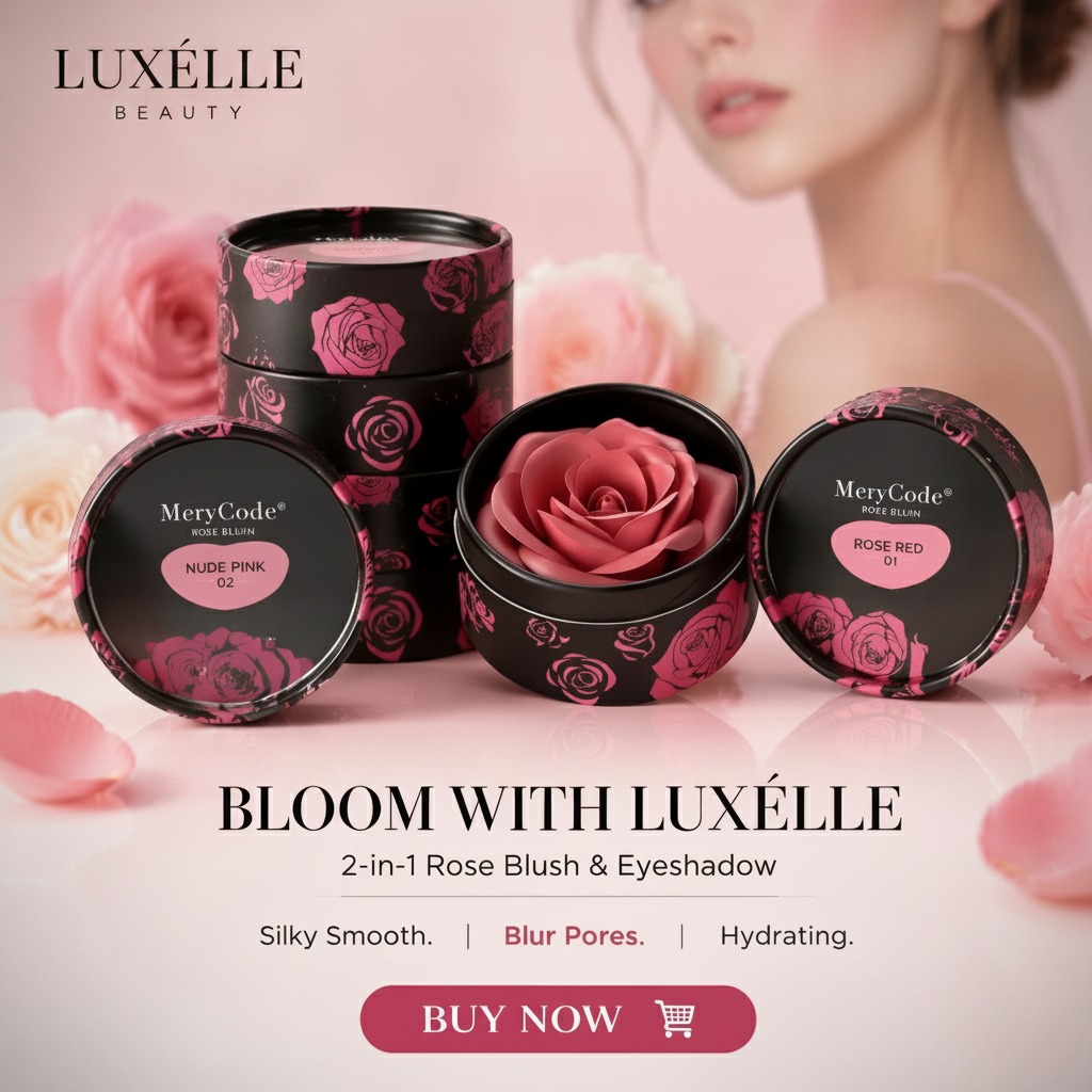
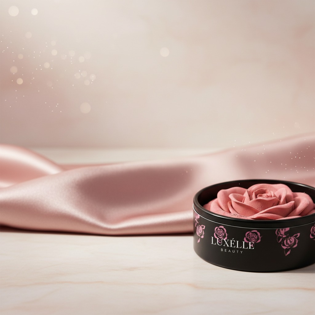
Soft Rose Blush packaging: what buyers should notice first
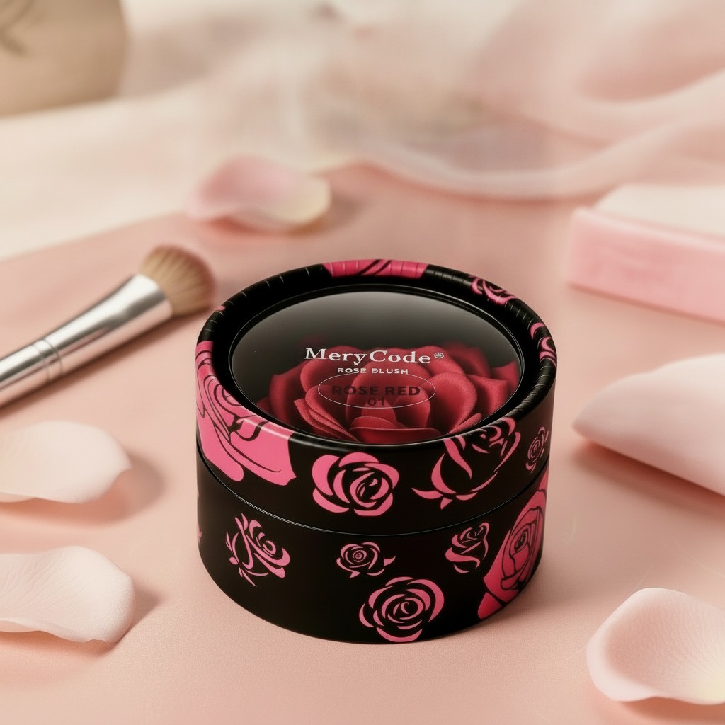
When teams shop for Soft Rose Blush, they are usually judging more than shade. The compact, the print quality, the lid feel, and the clarity of the shade marking all shape how the product reads on shelf and online. In a crowded color cosmetics market, a blush jar has to do two jobs at once: protect the formula and sell the mood of the shade. That is why a small round cosmetic tin or jar, especially one with a rose graphic and a clear shade label such as “Rose Red 01,” can matter as much as the formula inside.
The visible packaging in this case points to a black, glossy, lidded container with printed branding. It is the kind of format many beauty teams use for pressed blush, cream blush, or even a sample-size face color product. The exact formula cannot be confirmed from the image, and that distinction matters. A supplier conversation should separate the decorative outer package from the product system inside, because the purchase decision often involves both.
Why the package design matters in color cosmetics
For blush, the shade story is everything. Customers do not just buy “pink” or “rose”; they buy a promise about how the color will look on skin, how modern it feels, and whether the product appears premium enough to justify the price point. A compact with a black base and pink rose artwork gives a strong cue: feminine, polished, and retail-friendly. The gloss finish adds visual depth, while the round shape keeps the format familiar. That familiarity is not trivial. In cosmetics, consumers often trust a package that looks easy to understand.
There is also a practical side. Shade labeling such as “Rose Red 01” helps retail teams, distributors, and warehouse staff distinguish variants without opening units. That sounds basic, but it reduces errors during picking and store replenishment. It also helps online buyers compare shades when they cannot test the product in person.
What the visible structure suggests about manufacturing
The product appears to use a compact, single-item cosmetic package with a rigid outer body and a lid or top window area. That usually means a molded plastic component or a similar rigid packaging structure, though the exact material is not confirmed here. For buyers, the real question is not just what it looks like, but whether the structure suits the intended formula.
Questions to ask a supplier
Does the closure feel secure enough for shipping? Will the print resist scuffing in transit? Can the surface carry fine graphics without losing sharpness? If the blush is creamy, will the container protect it from drying or contamination? If it is pressed, does the pan fit cleanly and stay stable? These are the details that separate a decent cosmetics pack from one that creates returns or complaints later.
How to evaluate a blush jar or tin before ordering
Buyers often focus on color first, but packaging failure is what creates avoidable problems. A few checks are worth insisting on:
First, confirm the package type matches the formula format. A pressed powder blush and a cream blush do not need the same internal design. Second, review print placement and legibility. Decorative rose graphics should support the brand, not clutter the shade name. Third, test how the lid closes and reopens. Even a nice-looking compact becomes a liability if it feels flimsy. Finally, think about shelf presentation. Small round packages can look elegant, but they also disappear quickly if the artwork is too dark or the shade reference is too subtle.
Common buying mistakes with rose-toned blush packaging
One common mistake is assuming that attractive artwork equals retail readiness. It does not. The package may look strong in a product photo and still fail on drop resistance, print wear, or consumer handling. Another mistake is overloading the face of the pack with branding. In a category where the product already needs to communicate shade, finish, and identity, too many visual elements can make the unit harder to read. Buyers should also be cautious about choosing a format purely because it is compact. A smaller container may fit logistics goals, but it still has to match the formula and the customer’s use pattern.
Who this type of packaging suits best
This style of blush packaging is a natural fit for indie beauty brands, private-label cosmetic lines, and retail collections that want a soft, feminine look without moving into overly ornate territory. It also works well for sample programs or entry-level SKUs where the goal is to create strong shelf recognition quickly. The black-and-pink contrast gives the item a clear identity, while the rose motif anchors the shade story.
Practical buyer advice before you place the order
If you are sourcing a package like this, ask for a sample with the intended artwork and closure system, not just a blank shell. Then inspect the label clarity, hinge or lid action, and the feel of the finish. If the product is intended for export or multi-channel sales, make sure the visual design still reads well in small thumbnails, because many blush purchases now begin online. It is a small point, but one worth checking early.
For teams evaluating Soft Rose Blush as a product direction, the next step is straightforward: verify the formula type, confirm the packaging structure, and compare a few sample packs under store lighting. That is usually where the real decision gets made.